A shocking subject line and email led to a simple, yet effective video landing page
Yesterday I got an email from Early to Rise, a blog and email newsletter for people who are looking to be more wealthy and successful. On most days, I tend to browse over their emails, even though they are a great resource for excellent copywriting samples. Really, if you’re a copywriter you should absolutely subscribe to their email newsletter to bask in the brilliance of some of their promotions.
With that said… yesterday I got an email entitled: “The offensive video sent to you”.
Who doesn’t love offensive videos right? So you read the subject line thinking, oh my, they’ve been hacked. Someone send me a dirty video through their account and they’re apologizing.
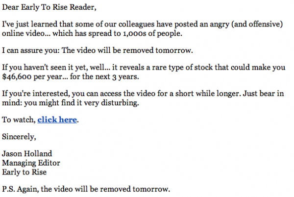
So I curiously opened the email to see what all the fuss was about. What follows is a very convincing and intriguing introduction that ultimately leads to a link. If you’re a copywriter, you’ve realized by the time you get to the link that this is a promotion, but nevertheless, the email reads:
The link in this email brings you to a video landing page (surprise, surprise).
The funny thing about this landing page is that the video is literally all text. Not only is it all text, but it’s the copy to an alternate landing page, which you’d see if you viewed the page on a mobile phone that doesn’t play video.
 The video of this salesletter is no shorter than the salesletter itself – which is 5,285 words long. However, by doing it this way, they are able to promote it as an “offensive video” which is much more convincing than calling it an “offensive salesletter”.
They also added audio testimonials where appropriate and a few graphics. Great copywriting in addition to a personal voice that convinces you that he’s so mad about the way some brokers work, that he “keeps a punching bag in his garage” makes this a highly effective landing page.
The downside to this landing page is that there’s no immediate call to action. Like I said, it’s a long video. 5,285 words long. I couldn’t finish watching, but when I stopped it was around the 15 minute mark.
The drawback? While entertaining and easy to keep your attention for some time, there should be a simple button below the video that brings the viewer to the next step whenever they feel like they’ve been convinced to buy a $600 membership to Extreme Value.
So, have you gotten any ideas from this? How can you use video to enhance a landing page?
[text_ad]


