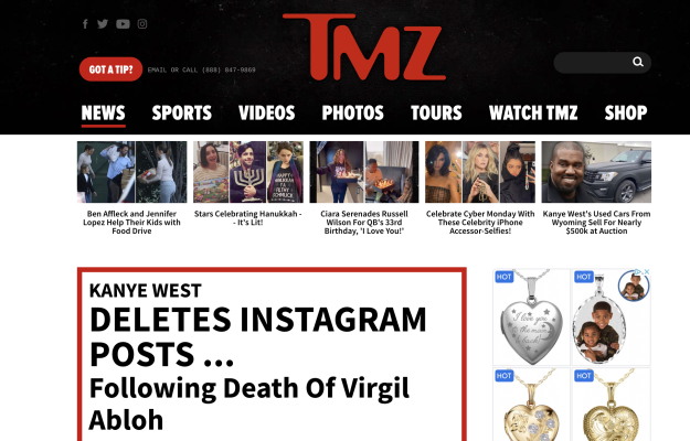
On December 8, 2005, AOL’s expected press release announcing the launch of the new entertainment site, TMZ.com, hit the buzz-makers.
The commentary? Only that AOL needed a massive influx of traffic, and that even in the crowded online entertainment space the subsidiary of Time Warner should be able to put up enough interesting new tidbits to draw in the ever-celeb-hungry masses.
TMZ.com, which stands for the “Thirty Mile Zone” around Hollywood (apparently in people know these sorts of things), claims to be a “new, first-of-its-kind 24/7 on-demand entertainment news network.” The interesting word choices here are “on-demand” and “network.” TMZ.com does lives up to these claims, if falling a bit short on others.
[text_ad]
We had Terri Edmonston do a website design review of TMZ.com to see how they fared on the Mequoda Website Scorecard.
Her review points out some of the following best practices:
- A free content site with great content (continuously fresh headlines, exclusive videos and a well-stocked archive) and a good ratio of Advertising to Editorial exhibits an excellent implementation of Strategic Intent.
- Aesthetically TMZ.com is struggling with finding just the right style—no best-dressed awards here.
- Usability is near perfect, with As in Readability, Affordance and Labeling and Language—the extensive online experience of parent AOL is obvious.
- TMZ.com’s overpowering parent AOL gives the site a leg up in the world by bringing an entire network’s worth of technology and skill to the newly launched site, but TMZ.com has to be allowed to stand on its own Brand to really fly.


