
Each of these newsletter subscription websites illustrate how to collect and convert website visitors into paid digital subscribers
If you sell a print newsletter, considering a newsletter subscription website is a business-critical decision. Consumers expect to access their periodical subscriptions digitally, and they’re willing to pay more for access when it includes back issues they don’t need to pay $3 – $20 for to receive in the mail.
Designed for premium members, newsletter subscription websites offer full access to a publication’s content, including archives. Customer service and product sales are also performed here.
Research shows that more than two-thirds of the reading public prefer digital platforms for the materials they subscribe to. Another reason for the growth of the newsletter subscription website is the increase in the number of consumers using tablet computers and tablet apps today. A reported 33%, in fact.
So the necessity to build a newsletter subscription website is there. These five elements will help make yours sell.
[text_ad]
Newsletter Subscription Website We Love: First Class Flyer
Lesson: The higher the price point, the longer the copy.
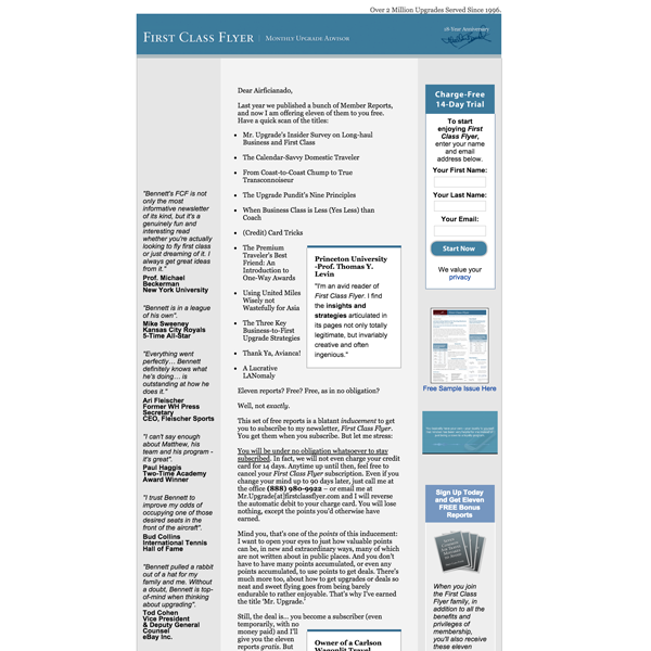
First Class Flyer is an excellent example of a long-copy newsletter subscription website. The home page for this newsletter, written by expert Matthew Bennett, helps business travelers get the best fares and discounts and is fairly short. However, the 14-day free trial has 4,400 words. Why? Because the subscription is $197 per year, ($247 if you want a print copy too).
But it doesn’t matter whether you’re asking for $20 or $2,000, long copy always always wins, or at least ties. And the higher your price point, the longer your letter should be.
When your prospect is ready to buy, he will buy. If you stopped writing, before you convinced them to make the purchase by overcoming their objections and addressing their needs, they will simply click away. Long copy is not about writing a letter, of which every word will be read. Great online copywriting, like all great direct response writing, is about meeting needs and overcoming objections. The more objections you overcome and needs you meet, the better your chance of closing the sale. Long copy wins because it offers a greater diversity of reasons to buy.
We also like the emphasis on testimonials for First Class Flyer, alongside the main sales letter.
Testimonials that reinforce the copy have always been a great way to boost direct response conversion rates. Online copywriters are addressing an audience that has come to rely on user comments to make purchasing decisions at stores from Amazon to Blue Nile. So now more than ever, great testimonials help readers decide to purchase. Like most research, gathering testimonials starts with accumulating way more data than you need. The copywriter must then look for patterns that represent the reasons people buy. Finally they must select the ones that are articulate, complementary, and realistic. Gathering testimonials actually precedes writing copy. Then the benefits described in the copy are simple restatements of the testimonials that will be used to reinforce that copy. It’s a great example of beginning with the end in mind.
Newsletter Subscription Website We Love: Natural Health Advisory
Lesson: Offer a table of contents with as much as you can give, without devaluing your product.
Tom Vick, CEO and Publisher of Natural Health Advisory was our Rocket Award Winner this year, based on their 368% growth year over year. Their newsletter subscription website gives just enough away for visitors to whet their appetite for the content behind the paywall.
Since NHA sees tremendous organic traffic from search, his Portal (more on this later) catches the majority of that traffic through his high-quality free articles, and then Tom’s outstanding website architecture takes visitors through the funnel to download a free a report. Only once NHA meets and greets this reader through a free download, will they ask them to purchase a subscription to NHA Letter (no strings attached though, of course).
Their newsletter sales letter is long and robust like Matthew Bennett’s First Class Flyer sales letter, even at a more affordable (consumer) price point starting at $19.97 per year. It answers every question a customer might ask, including what to expect in every issue.
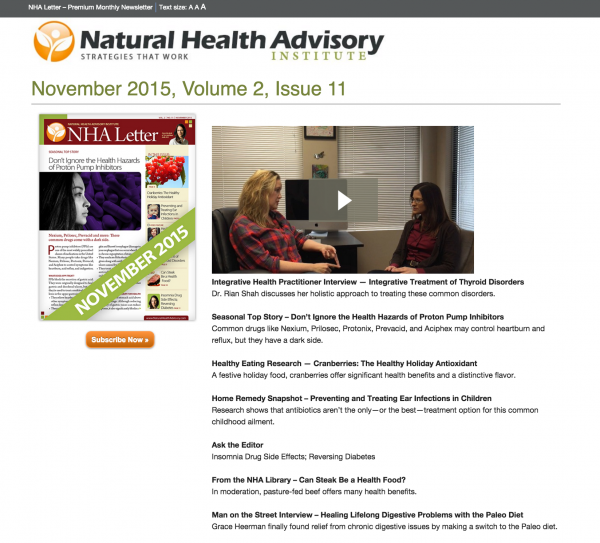
But the sales feature we’re highlighting here is their subscription website index page. If you click to visit the NHA Letter on Natural Health Advisory’s site, you get direct access to the main portal with all the content you’d view as a subscriber. If you’re wondering what type of content you’d receive, what better way to figure it out, than with a sneak peek? You can’t actually read the newsletters, but you can go as far as reading the table of contents for every issue, which is hugely helpful to landing sales from curious potential customers.
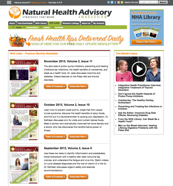
On this index page is a link to a video from NHA’s team, describing what’s in the most recent issue, including a brief teaser of their featured articles. This isn’t something you see every day on a newsletter subscription website, but we love it. In this video below, one of NHA’s editors is interviewing a doctor featured in this month’s newsletter.
Newsletter Subscription Website We Love: The Successful Investor
Lesson: With no free content, how will you attract highly-targeted new website visitors most likely to buy a subscription?
It’s a Mequoda best practice to build a free Portal to go with every paid subscription website. It allows your paid subscription website to keep one job: sell the subscription. Meanwhile, the Portal gets to have all the fun, giving away free content and eBooks in exchange for an email address, so that you can promote the newsletter subscription website later.
It’s kind of like being the “fun aunt” while mom goes off to work. The fun aunt gets to fingerpaint and make blanket forts for the afternoon, while mom focuses on working hard to bring home the bacon. The kid in this scenario is your business. It takes the fun and the bacon to keep a kid happy and fed.
In order to make sure the Portal is actually helping the Newsletter Subscription Website bring home the bacon, it must be equipped with 3C zone architecture. A “zone” is basically a topic, or in WordPress, a category. It means that when you publish an article called, “Is gold bullion a good investment?“ in your category titled “Mining Stocks,” that as the reader runs down the page, he sees several ads for your free report, Mining Stocks: How to Spot the Best Uranium Stocks, Metal Stocks and Junior Mines. He sees it as a visual ad at the top of your article, he sees it as a text ad in the middle of your article, and when he arrives on the page, he gets a floater for it.
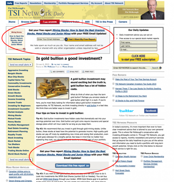
The Portal is where your search engine optimization comes into play. Each piece of free content will utilize industry keywords visitors search for. Each will also be properly tagged and infused with links. The user experience will be pleasant and helpful, keeping folks glued to the page. As the amount of free content and user engagement grows, so too does your ranking in search engines, and the more traffic you get to your Portal, the more email subscribers you’ll get, and the more newsletter subscriptions you’ll sell.
The Successful Investor offers their visitors powerful (potentially wealth-increasing) information on their Portal. The value of TSI is high for the visitors, who can assume the value can only be higher when you get direct access to portfolio manager Pat McKeough.
Offering this amount of great free content builds trust with the visitor. They will assume that a paid membership must be even more beneficial to them. When they see that TSI members get personal email access to investing experts and even more exclusive reports if they subscribe, they will.
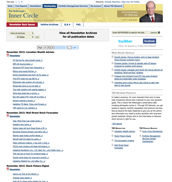
A newsletter subscription website’s best bet is to spoil their visitors with great free content, and then, of course, spoil their paid members even more. TSI definitely accomplishes this, and with several premium newsletters that offer direct access to Pat through Q&A, any great investor can spot this as a great investment. As is the primary function of a newsletter subscription website, all the archives can be accessed digitally, and old newsletters can be downloaded as PDFs.
Like First Class Flyer, each newsletter has a long sales letter, and like Natural Health Advisory, they have a table of contents for each issue in front of the paywall so potential subscribers have even more to work with when deciding.
Newsletter Subscription Website We Love: The Dark Report
Lesson: Use teasers to increase conversions
If you’re looking for a good niche media newsletter example, a splendid example is The Dark Report. Like all Mequoda-compliant websites, it’s paired with a free portal, in this case The TDR Insider, to drive traffic and keep the audience engaged.
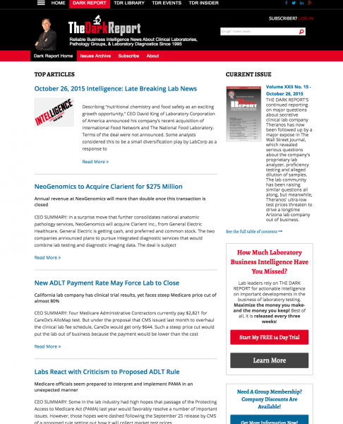
The Dark Report gives away even more on their newsletter subscription website homepage than the examples we’ve run through so far, and in fact if you look at their newsletter subscription website, you might even think it’s a Portal (it’s not — the content is not free and it’s not mixed with free content.)
Each of those “stories” lead to a paywall. A paragraph or so that tells them the content is for subscribers only. Having it set up this way also offers existing subscribers the benefit of reading their news like a feed of premium content, instead of paging through it. But for those who enjoy paging though, the site is organized by issue and offers a clickable table of contents for each issue.
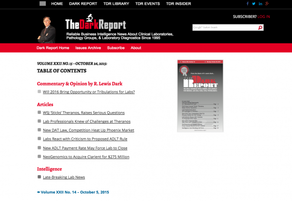
We’re also fond of the conversion architecture, which, on a Portal would all point to a free product, but on the paid newsletter subscription website, all point to the newsletter. There’s no chance someone would arrive on this site without seeing a call to action, where they’ll find a robust sales letter landing page for their $15.77 to $22.97 per week subscription product (the larger price includes print and web).
Newsletter Subscription Website We Love: Natural Health Advisory (encore, encore!)
Lesson: Use contrast pricing to increase sales for your largest bundles
Well since Tom won our Rocket Award, we can’t resist including him on this list twice because he’s leveraging contrast pricing, the best way to increase sales on your largest subscription product package.
In order to take advantage of contrast pricing, you need a true newsletter subscription website with a library of old issues in an archive. Then you can offer three different prices: one for the newsletter, one for the library, and a bundle for both.
The trick to contrast pricing is making your bottom price low, and the middle price significantly higher. However, the third price is only slightly higher than the second.
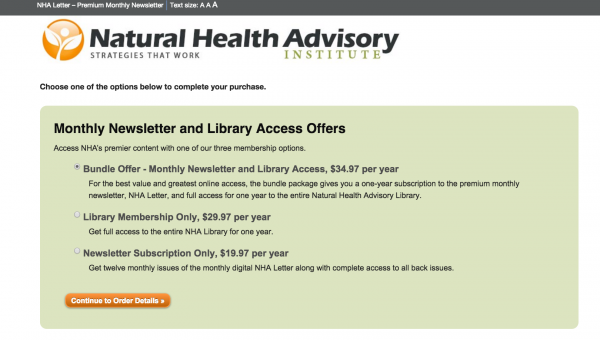
So for example, when a user comes to subscribe to Tom’s newsletter, he could get just the newsletter for around $20 bucks. If he wants the library, it’s $10 more. But sheesh, if he wants the whole shebang, it’s only $5 more. $5 sounds good, doesn’t it sound good?
Publishers have great success with this pricing model and we recommend every newsletter (and magazine) publisher give it a try.
Other Business Models to Incorporate for Premium Subscribers
A best practice note for newsletter subscription websites is to consider other profitable website business models to pair with it (of course as long as you pair it with a Portal, you don’t need to expand.) These paid premium business models include Library Websites, Classroom Websites, Lead Generation Websites, Directory Websites, Event Websites, and Retail Websites. These business website models are built and supported by Mequoda and may offer new ways to recycle content across platforms (Library, Classroom, Event, Retail), or accept advertising dollars (Lead Generation, Directory).
Do you have any other favorite newsletter subscription websites? Be sure tell us about them in the comments.


Comments are closed.