How to conduct heuristic and cognitive usability tests to create more usable websites

Even though you might associate usability with website design, it’s been an important factor in our everyday life for at least a century. Frederick Taylor’s Principles of Scientific Management, published in 1911, is the first instance where the world started paying attention to how people use things, and how we can help them be more efficient. In 1936, Frigidaire cited “usability” as a key feature of their new refrigerator. In 1943, Alphonse Chapanis made the case for redesigning airplane cockpits in order to reduce errors.
But it wasn’t until 1985 that Computer Usability Testing & Evaluation was published by Richard Spencer. Of course, by this point, usability wasn’t anything new, so designing computers that were most usable was a given. In fact, the war of operating systems, mainly between Microsoft and Apple, has been centered on usability since the beginning.
When home-accessible internet arrived and websites became the next usability feat, Steve Krug published Don’t Make Me Think in 2000. I think we can all agree web designers everywhere desperately needed this book back in 2000, and the web has become better for it.
[text_ad]
Conducting usability tests
 There are many different types of digital usability tests, like heat map tracking tools for instance, or you can do remote testing, or you can plop someone in front of a computer and track their eye movements. But there are inexpensive, pen-to-paper types of usability tests also.
The most important thing to remember when conducting any type of usability study with real users (as opposed to an expert review) is that your main duty during the test is to pay attention to the user. You are scoring the website, not the user. These are your goals:
- Make the user feel comfortable
- Be careful how you phrase your questions
- Do not lead the user
- Tell the user to “think out loud”
- Pay attention to facial gestures
- Identify frustration and emotion
- Keep track of hesitation and time delays
- Refrain from attempting to assist the user
Cognitive vs. Heuristic usability testing
There are two types of testing methods when it comes to real users, cognitive and heuristic. During a heuristic evaluation, the study is usually conducted one-on-one with a moderator and user with an advanced working prototype of the website. With a cognitive walk through, you may have many more users involved and it may be more of a theoretical prototype evaluation.

Depending on your test, the people who should be in the lab during the process may vary. You will always have the lab moderator, but you may also have an assistant who is most familiar with the site, and possibly the stakeholders, if requested. Be careful not to invite anyone who is “close” to the design such as the web designers and architects, as there is more opportunity for distraction and intimidation for the user.
[text_ad]
Paper Prototyping Usability Test
If you are only testing usability after your site has been developed, you are only looking for validation, not actual usability. But how can you test a website that has not even been written in a line of code so far?
Paper prototyping includes a mockup of the user interface using paper, and sometimes cardboard (for mobile interfaces). The user is able to arrange topics, articles, and other critical elements of your website in a way that makes sense to them. Using a paper prototype, you and your team can often “walk-through” your design concept and how well it will work with actual users and tasks.
The paper prototype is a “low-fidelity” model of your website. Because no one could possibly mistake it for the real thing, you are likely to get a wealth of feedback about what process might work better or what labels and functions make more sense to the user.
Using a paper prototype, you and your team can often “walk-through” your design concept and how well it will work with actual users and tasks.
[text_ad]
Card-Sorting Usability Test
This test is especially helpful if you have a lot of categories or sections and you want to know how users expect to see those organized.
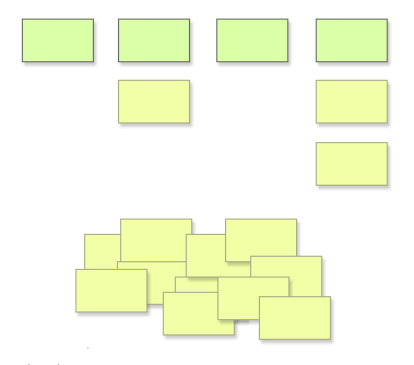
As the name implies, a card sort requires the test participant to sort cards, each with a word or statement printed on it, according to the user’s mental model of the relationships between the words or statements. The test facilitator then records the sort in a spreadsheet or in one of the online sorting tools. A cluster analysis of the results from several test participants gives designers an excellent view into what is important to the user and how they refer to it in their own language.
Card sorts can be conducted with individuals and groups depending on what kind of information you are trying to elicit. In either case it’s important to leave some blank cards available, as users might want to use words you have not provided.

Image source: markboulton.co.uk
Link Affordance Usability Test
A great affordance test is to print off web pages in grayscale, give a test user a yellow highlighter and ask them to highlight anything on which they think they could click. The first thing you will notice is that anything that is underlined will get highlighted. Those words that may or may not be colored but that are not underlined will most likely not look like links to your test user.
Headlines that are not linked might also get highlighted because they are different in size, weight, and location to the main content, all possible visual cues to a desperate information seeker. Users may also highlight images that are not linked while overlooking images that are linked based solely on subtle cues like outlining, drop shadows, and 3D effects.
Heuristic Evaluation (one-on-one)
A heuristic evaluation is a more modern method of usability testing and takes place with a functional website, likely in the last stages of development or right before a redesign. We’ve talked about this before in How to Conduct a Usability Lab, and it requires a computer with a webcam and usability software (Silverback, Morae and/or Invision), a moderator, and a user.
In this usability test, you are required to come up with 5-10 major tasks such as:
- Subscribe to the email newsletter
- Download a free report
- Subscribe to the RSS feed
- Purchase a book
- Unsubscribe from email list
The user is then recorded via webcam and the usability software while being timed performing each task. You will want to set a time limit for each task, from 60 seconds to three minutes. In general, if a user takes three minutes to find and subscribe to an email newsletter, the site has failed this task. Come up with a scorecard to document these times and scores.

Why is usability testing important to your website? When designers are confronted with these test results they often resort to the “But they will learn where things are by using the site!” defense. After all, one of the driving forces for designers is to create something that’s never been done before or a look that is intriguingly unconventional. Unfortunately, it is not at all important to a user to find out how to use a clever design. What is important to the user is to get in and get the information they want.
This post was originally published in 2008 and is updated frequently.


