Stay focused, be quick, and write well
The other day my husband had to fetch a magnifying glass to read what was printed on a box of gourmet chocolate milk mix.
It was in tiny, light brown type on a dark brown background.
Somewhere, a designer and the executive who approved it are vastly proud of their handsome design. So elegant, so refined.
So useless.
As much as I love the designers I’ve worked with over the years, it pains me that so many people think fancy design is the best way to sell products and appeal to consumers. And this is especially true on the Internet, where flashy, cluttered, bewildering – and expensive! – design seems to dominate. It seems never to have occurred to anyone that confusing visitors with bells and whistles is a lousy way to sell products.
Don’t get me wrong. At Mequoda, we’re quite fond of creative landing pages. But when you have just a few seconds to convince a new visitor to stick around and hopefully complete some action that you’ve established – subscribing to a free newsletter or buying a product – the last thing you want to do is let a designer loose!
Creative landing pages can also be effective landing pages, but only when you restrain the design, layout and copy with some proven guidelines.
Creative landing pages should always be focused, easy to use and, most importantly, above the fold.
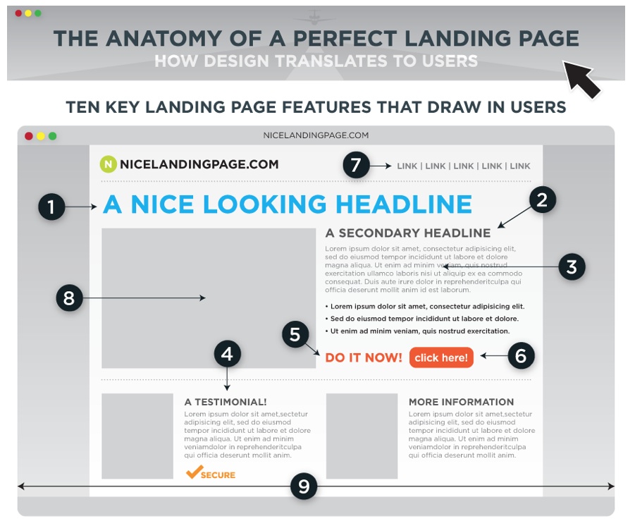
To make all of this more visual, check out the graphic at formstack.com, which gives you the anatomy of a perfect landing page.

With that visual in mind, let’s look at Mequoda’s specific rules for creative landing pages.
Creative landing pages Tip #1: Keep it clean, efficient, and focused.
Creative landing pages should create an immediate sense of comfort and well-being. Accomplish this by choosing a clean, efficient design with an easily discernable central focus. Use lots of white space, choose comforting colors and readable fonts. Avoid speckled backgrounds, unreadable type fonts and a bewildering assortment of buttons, animations, drop down or pop up menus and multiple frames.
Creative landing pages Tip #2: Write strong, engaging headlines.
Don’t distract the visitors by confronting them with rotating banner ads for other products. Instead, write a forceful headline to capture their attention and interest.
Far too many landing pages fail almost immediately by offering up lackluster headlines and subheads. A good landing page delivers a compelling headline for a single product or service.
Creative landing pages Tip #3: Don’t make them wait!
If you only have 10 seconds to capture the attention of your visitor, then your page had better load quickly. If it takes more than 20 seconds to load, many visitors will bail out before reading your message.
You can speed the loading of your landing page by eliminating unnecessary graphics, especially photographs. (This helps you keep the page uncluttered, too. See Tip#1!) Review every image on the page carefully, and include only those that are absolutely necessary. The graphics that you must use should be minimized using an image compression program.
Also, avoid using offsite page counters, news feeds and other resources that slow down the loading of your main page.
[text_ad]
Creative landing pages Tip #4: Make it easy to navigate.
Use a standardized navigation system throughout your site. Easy-to-use navigation helps visitors feel comfortable about exploring your site.
Avoid using hard-to-read graphic buttons, hard-to-find drop down menus, or any other programming tricks that do more to prevent visitors from exploring than encouraging them to do so.
Creative landing pages Tip #5: Keep it fresh.
Make sure the headlines, text, and other information on your landing page are always up to date. Visitors are usually interested in current news, reviews, and information, and will leave your site if they get the impression it hasn’t been updated in months.
Check your navigation links. Most visitors will abandon your site after encountering just two broken links.
Creative landing pages to admire
Now let’s take a look at some creative landing pages I like from around the Web.
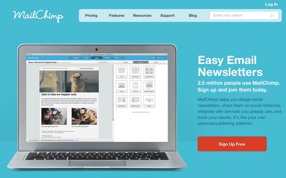
Mailchimp has a page that’s almost exactly like the formstack.com example of creative landing pages. Simple, easy to read, and boasting a big red “Sign up free” button. A bold image to the left, brief sell copy on the right. The designer followed guidelines for making the page user-friendly instead of succumbing to the urge to over-design.

Now let’s look at the copy (this is a copywriting blog, remember?):
Easy Email Newsletters
2.5 million people use MailChimp. Sign up and join them today.
MailChimp helps you design email newsletters, share them on social networks, integrate with services you already use, and track your results. It’s like your own personal publishing platform.
My only complaint: I’d add a benefit to the headline.
Make buyers love you with easy email newsletters!
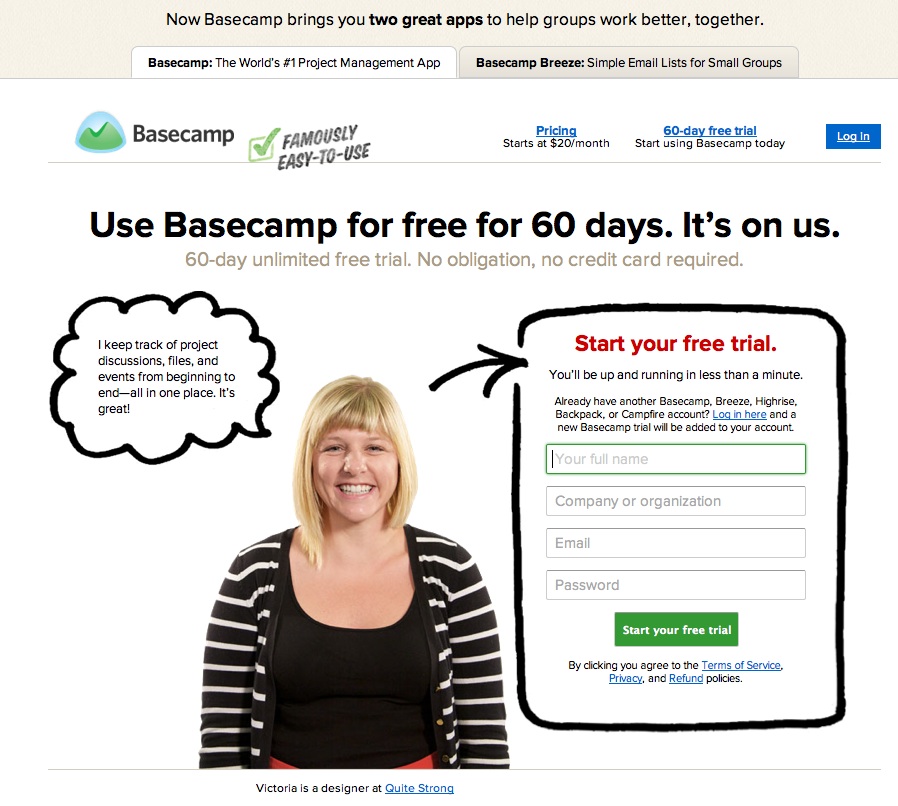
Here’s another example of incredibly creative landing pages from Basecamp. What I love: the benefit is the testimonial is the image. A photo of a smiling young woman, identified as “Victoria is a designer at Quite Strong” (with a link to her company for added credibility), plus a speech bubble: “I keep track of project discussions, files, and events from beginning to end – all in one place. It’s great!”

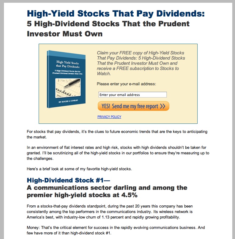
Of course, at Mequoda, we also advocate long sales letters, on the theory that you shouldn’t stop selling too soon. If someone wants to buy right away, fine – but if you stop selling right away, you’ve lost all the others who needed more persuading. And our test data has always shown that long copy outperforms short copy four out of five times. Here’s the quintessential Mequoda long-form landing page from Investing Daily for a free e-book, High-Yield Stocks that Pay Dividends. Above the fold, you get the title of the e-book, which, because it’s been optimally written, includes the benefit (you get high dividend). Then there’s the high-visibility call to action complete with orange button to click. It’s all followed by a well-crafted, very long letter. Following the rules for creative landing pages, it’s still clean and uncluttered, and makes it easy for the visitor to figure out what to do.
What’s more, I ran this page through the Motoricerca keyword density tool to check for search engine optimization, and found that the letter is ideally optimized for eight – count ‘em, eight – keyword phrases that Investing Daily probably wants to rank on.

Remember, the copy is just as important as the design in creative landing pages. In fact, one of the things I’ll be teaching at our next Internet Marketing Intensive is how to write a long-form sales letter, because good copy is the foundation on which all sales are based. (I’ll be talking about emotional copywriting, one of Mequoda’s trademarks.)
In the end, the most creative landing pages combine user-friendly design with persuasive copy, and never rely entirely on one or the other. They’re hard to find on the Internet, believe it or not, so I’d appreciate it if you share any pages you like! I can never have too many in my Admiration File!


As usual, I love these tips from Mequoda. However, I would have liked it more if the newsletter version of this post had included the live links or at least the graphics you include on the blog to illustrate what you were saying. Without those, reading the newsletter copy was frustrating.