An eye-opening session from SES in New York
Have you every wondered where your users are looking on your website? Are they paying attention to your most important content, the advertisements on your site or the images you display?
Knowing where your audience looks on your webpages will help you better serve them with content. This, in turn, will help build a strong community around your website.
When it comes to your website, placement matters.
To decipher where people look, eye-tracking has been used online for about the last 15 years. Eye-tracking is done to monitor:
-Where users’ look
-Why they look in certain areas
-To predict where they will look next
-Where users do not look
-The sequence they follow while browsing your website
At SES in New York, I attended a session entitled Placement Matters: How Eye-Tracking Helps Improve Display Advertising. Kate Kaye, Senior Editor at ClickZ News, moderated this session while speakers Leslie Chacon, Founder of User First and Kim Krause, Founder of Cre8pc, shared their insight.
One important piece of information taken from this session discussed how users often ignore very large images that are associated with top stories.
Users are typically browsing sites with the following concepts:
-Where am I currently?
-Am I in the right place?
-Where can I go next?
-How do I get there?
[text_ad]
These questions aren’t necessary conscious thoughts, but they do describe how the user interacts on web pages. It’s important to keep users engaged and make sure they aren’t confused by the content you are displaying.
Results
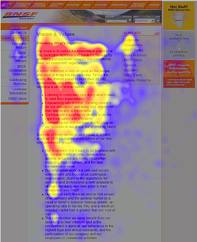
Traditional studies have shown the “F Pattern” as a tendency of how users look on websites. See the image below for an example.
Users often look at the upper left first, over the top of the page and then down. The way the eyes move within the page creates the “F Pattern”.
Tips for better site engagement
According to the presenters, images influence where the eyes go. However, don’t include ones that are incredibly large. Make them comparable to the other content on the rest of the page.
Be careful with stock photos. Many people tend to ignore them.
When laying out pages, use limited font types and stick with plain text if possible. If you are going to show images of humans, faces and cleavage tend to attract the most attention.
Biggest problems with advertisements
Ads that look like website images are not accepted well with users. People do not like to be fooled and they feel deceived when it happens.
The allocation of words and images can be an issue if they are not located close enough to each other. You do not want to make the user to have to look back and forth as this may create frustration and prohibit further engagement.
Fun facts from the session:
-When human beings have trust for something, their eyes dilate. The same happens with cats as well.
-Looking at site maps of how the cursor moves alone the page may not be accurately describing where the user is looking.


Hello to every body, it’s my first pay a visit of this website; this web site consists of remarkable and genuinely good stuff
for visitors.
This can produce the app slower when returning from history.