Membership websites are hot for 2013
All the sudden in 2013 I found myself hip-deep in subscription and membership websites.
Perhaps it’s the tablet market evolving, the publishing market maturing, the continuing problems of advertising models or the renewed interest in the renewable revenue of continuity websites.
The nine errors below are serious. If you commit one, it’s enough to put your project on the ground before you get in the air. The list of deadly membership website mistakes and the nine types of subscription websites both deserve a review.
While we’re normally launching six to eight new Mequoda Method website networks each year, historically less than half have included a membership website. For reasons that I’ll point out, the surprising thing is that virtually every project we’re working on now includes a portal and membership or subscription website.
I’ve sat through more than a dozen planning meetings in the past six months and virtually everyone makes me review the different types of membership and subscription websites. I’ve also found that virtually every publisher has committed one of our nine cardinal mistakes.
For this reason we’re republishing our list of nine membership website mistakes.
Nine deadly membership website mistakes
Deadly membership website mistake #1: Choosing the wrong format for your membership website.
Deadly membership website mistake #2: Having too much content.
Deadly membership website mistake #3: Lacking content.
Deadly membership website mistake #4: Charging too much.
Deadly membership website mistake #5: Charging too little.
Deadly membership website mistake #6: Lack of market access.
Deadly membership website mistake #7: Ignoring legacy business model.
Deadly membership website mistake #8: Ignoring organic marketing.
Deadly membership website mistake #9: Lack of cost-effective paid marketing.
Learn about all nine deadly membership website mistakes when you download a free digital copy of Membership Website Strategy.
[text_ad]
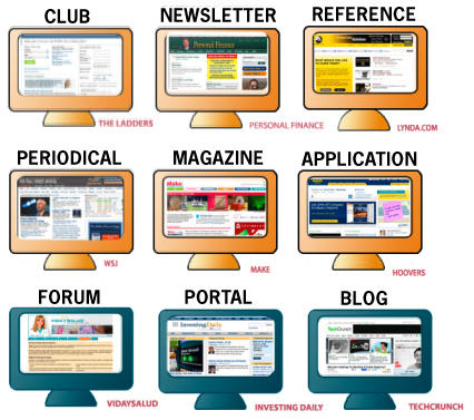
Nine most valuable subscription website models
Subscription website model #1: Newsletter
Subscription website model #2: Club
Subscription website model #3: Magazine
Subscription website model #4: Periodical
Subscription website model #5: Application
Subscription website model #6: Reference
Subscription website model #7: Blog
Subscription website model #8: Portal
Subscription website model #9: Forum
Learn about all nine subscription website archetypes when you download a free digital copy of Building Subscription Websites.
We’re not new to this. We’ve written two free reports on the subject
By the way, you may be wondering why one report uses “membership websites” and the other uses “subscription websites.” The marketplace uses both interchangeably. And we’re very interested in ranking on both.
So we’ve created two different reports. We use the words interchangeably. They mean the same thing to us.
We as publishers need to use both to accurately meet our market needs. And there is search traffic on both.
Our free reports on membership and subscription websites have been downloaded more than 20,000 times. We suggest these are required reading before you begin the process of building.
And if you’d like the help, this is a subject with which we’re infinitely familiar and extremely interested in. We think these should be part of every online publishers business plan if economically viable.


Don,
Very interesting article.
I am currently developing a subscription/membership website and this brief introduction certainly helps clarify the various models.
Curious, what would you consider media sites such as ‘Audible.com’, ‘iTunes’ or even ‘Netflix.com’ – Club, Portal, Application or Reference?
Also, it would be great to see more in-depth information that would include closer analysis of multiple examples, further definition of each model in the context of advantages vs. disadvantages, and which are the most profitable.