These subscription website homepage ideas will help you provide a better user experience through website design
Mequoda has long quantified its own best subscription website homepage ideas, which we put into action with all of our clients. Having recently launched several brand-new websites, this is an excellent opportunity to show you how we put our subscription website homepage ideas into action.
All of our subscription website homepage ideas are geared toward encouraging audience engagement. Google recognizes social signals and wants to provide search results that engage its users with great content.
[text_ad]
Below are eight subscription website homepage ideas using Mequoda clients as examples, which can help you offer a better customer experience. These homepage ideas are needed elements to website homepage design, especially if you want to increase time on site and pages per visit.
Subscription Website Homepage Ideas, Example #1:
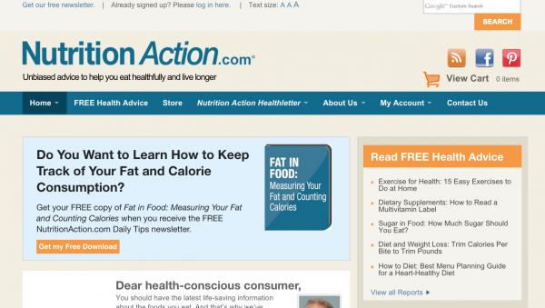
Strategic Intent – This concept relies on two main points: You need to know what your users are trying to do when visiting your site. And you need to know what you want your audience members to do at your site. If you’re sending search traffic to conversion pages, the audience member clearly has interest in the content aligned with the free report you’re offering. They want the content and you want to convert them into email subscribers. In this instance, the strategic intent is met.
NutritionAction.com wants its visitors to sign up for its free email newsletter, to eventually sell those subscribers premium content. When you arrive, you can’t miss the order form in editorial (OFIE) at the top of the page that encourages visitors to sign up for a free newsletter by offering them a free special report on an aligned topic.
Another way to do this is demonstrated by Leadercast, using what we like to call a “Death Star” floater to encourage newsletter signups.

Have you considered trying different usability tests to determine how users interact with your site?
[text_ad]
Subscription Website Homepage Ideas, Example #2:
Relationship Building – In today’s social Internet, if you’re providing content an audience loves, they may want to have a relationship with you. Make this possible by offering multiple ways your audience members can stay in touch, like Twitter, Facebook, email, and through blog comments, as Harvard’s Program on Negotiation does at the top of their portal.
[text_ad]
Subscription Website Homepage Ideas, Example #3:
Community Building — Mequoda-built websites ask users to create content for the site in the form of comments. Invite people to get involved as Remonsy ETF Network does by prominently displaying the “Hot Topics” that people are talking about most, in the right rail of their portal.
Subscription Website Homepage Ideas, Example #4:
Persistent Navigation – Help your visitors get around and help them get better acquainted with the breadth of your content by making clear, persistent navigation easy to find and easy to use. Warfare History Network has the quintessential Mequoda navigation: simple, consistent and easy to understand.
Visitors can quickly find tabs to take them to the store, the free briefings that convert visitors to subscribers, the magazines, and finally, to the individual sections that are unique to Warfare History Network.

Subscription Website Homepage Ideas, Example #5:
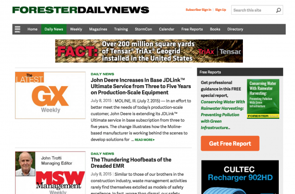
Affordance – Words and buttons that are linked need to be clear and accurate. Don’t confuse users by making it appear that content is linked if it isn’t. At Forester Network‘s website, the links are always in green to alert readers that related content is just a click away.

Subscription Website Homepage Ideas, Example #6:
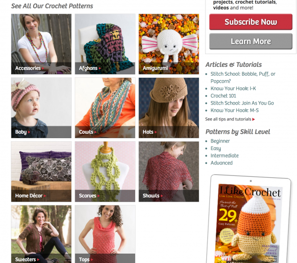
Labeling and Language – The wording on your site needs to be understood by your key audience members. Don’t be cute and jargon-y when labeling the sections of your website. Miscommunication can lead to a smaller audience. I Like Crochet avoids the easy temptation, translating the industry jargon into normal English.
Subscription Website Homepage Ideas, Example #7:
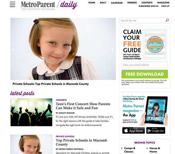
Readability – A few key components go into readability: a lack of clutter, adequate column width and white space, legible type face and size, and a reasonable balance of text and graphics. For tips on using images to increase clicks, check out this article.
You can’t get much more readable than Metro Parent. Clean, simple, crisp design is soothing to the eye and completely reader-friendly.
Subscription Website Homepage Ideas, Example #8:
Content Freshness – Google likes digital publishers who provide new, relevant content frequently. Die-hard content fans also love frequent up-to-date content. That’s why all Mequoda-built sites deliver daily posts (which are also sent out as newsletters). All the Mequoda portals above are illustrated by exactly that: daily posts to keep readers interested and engaged. Natural Health Advisory is another great example of daily content.
Have you experienced better relationships due to the subscription website homepage ideas listed above? Any other subscription website homepage ideas to add? Please share your story with the community in the comments below, and also, enjoy studying these three shiny new Mequoda-built websites for ideas beyond the homepage.


Great ideas for increasing subscription website engagement… which can be tested and measured!