Does your website homepage design meet the expectations of your visitors? We often find website homepages so busy with content, they leave users overwhelmed and uncertain of where to click or what action to take. Additionally, because the majority of a publisher’s organic website traffic lands on individual article pages, we view the website homepage as a parsing page—a page a user clicks on after they’ve read an article to get familiar with the website and figure out what, if any, additional action they want to take.
For nearly two decades, Mequoda has been exploring and expanding the evolving art and science of digital magazine publishing. And while building and studying how users move through our websites, and through the development of dozens of business plans and subsequent website redesigns, we have come across three of the most important tasks that users engage in on website homepages.
[text_ad]
The Most Important Tasks a User Should Be Able to Accomplish From Your Homepage
User Task for Website Homepage Design #1 – Learn More.
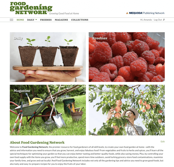
When a user arrives on your homepage, do you make it clear who you are and what they can accomplish on your webiste? On the website homepage of Food Gardening Network, we start by displaying visual tiles representing each of the critical sections of the website. For Food Gardening Network and most of the systems we operate, there’s typically:
- There’s a tile representing the free Daily tab where we publish SEO’d content seeking to answer the questions users have about food gardening
- There’s a tile for Freebies, which are the free incentives we give away to encourage visitors to subscribe to our email newsletter
- There’s a tile for the premium Magazine section of the site, where visitors will find HTML-based monthly issues of our magazine
- There’s a tile representing our premium Collections, where users can learn everything they need to know about how to grow, harvest and enjoy over 40 different foods from their garden
Below the tiles, there is an About Us section, placed deliberately ‘above the fold’ so that users see it and don’t need to scroll when they’re on a desktop.

User Task for Website Homepage Design #2 – Subscribe.
This doesn’t just apply to the homepage, there should be a permanent place for someone to subscribe on every page of your website if they are not already logged in. You might be thinking, “wait, why would anyone subscribe from the homepage before they’ve even seen any content?” Well, there are a few good reasons:
- They have likely gotten to your homepage after visiting other pages from search or social, and asked, “Hey, what’s this site all about?”
- This might not be their first time coming to your website
- They may have been sent by a friend who told them to subscribe
Plus, sometimes people just want to see your offering, even if they don’t plan to subscribe immediately. And if subscription revenue is your main source of revenue, why would you hide the call to action?
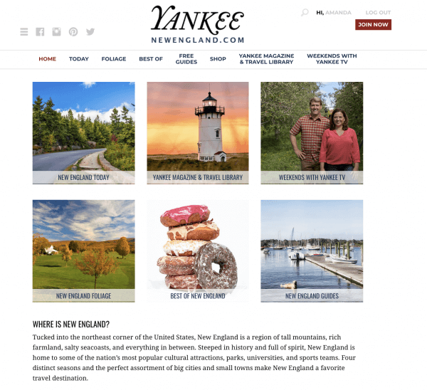
For Yankee magazine, the big red “Join Now” button is how they entice people to become subscribers. Their subscription is more of an all-inclusive membership that includes the magazine, hence the “join” language.

User Task for Website Homepage Design #3 – Search.
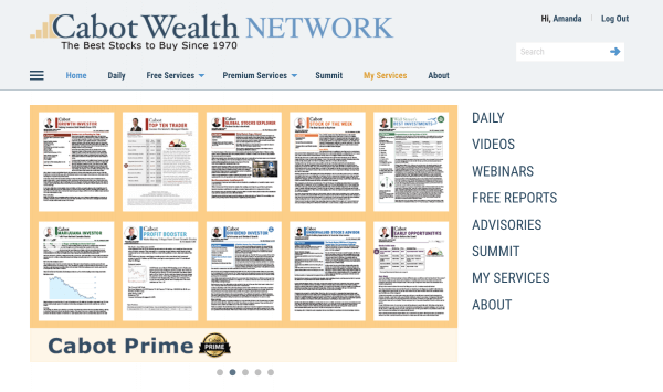
In usability studies, if you tell a user to find something on your website, whether it’s a topic, article, or product, the first thing a user will look for is your search bar. And if you look at the analytics behind your search bar, you’ll get lots of insight into what people feel they can’t find themselves. Giving users a search bar signified by the global symbol for search—the magnifying glass—or making sure it says “Search” will keep visitors on your site longer and trust your product more.

The age of the Internet has created many subscription websites that are like older homes—remodeled repeatedly with no master plan for making the rooms work together. Many pitfalls are waiting to ensnare the overworked, over-extended website publishing team. Brand integrity, clear messages, easy-to-use order flows, and intuitive navigation fall victim to the race to keep up. It may give you some relief to know that best practices in website homepage design and execution are often a simple case of common sense—that, and an understanding of your audience’s expectations and perspectives.
Every subscription website is unique to its own audience, so you can’t make blanket rules for homepages like the best colors to use, or anything that will tell you exactly how to design a homepage, however, no matter what magazine or content you sell, the three user tasks must be able to be fulfilled quickly and easily.
Is there another user task you think is important? What would you add?
[text_ad]


