How to use magazine design principles to MINIMIZE periodical website traffic, usability and reader satisfaction
Mistake #1: Bury your frequency
Mistake #2: Hide your content
Mistake #3: Avoid keyword phrases
A week in Singapore…
For five days last week, Greg Jones and I worked with about 80 Asian magazine publishers, editors and marketers to help them extend their legacy brand to the Internet. Virtually all of them have websites and many were making the same common, but deadly, website design mistakes. Designing magazines and designing websites are as different as night and day. But since both use pages, words and pictures, many people assume the mechanics of good design for magazines and websites are the same. However, they are not even close when viewed through the eyes of the average user.
Magazines are an episodic linear medium
As a magazine designer, I am creating a package of information that is delivered to the user periodically. Each issue has a theme and flow that begins with the cover. The cover story of a magazine sets the tone for the issue and is almost always the best-read article in the issue. The cover story also impacts the readership of every other article in the issue. Magazines are experienced like books are read and movies are watched… they have a beginning, a middle and an end. The editor manages the flow with that in mind and expects that a serious reader will spend an hour to two hours with each issue before filing it away for reference. The issue is prepared so that it can be read completely and finished like a book or a movie.
Periodical websites are on-demand reference sources experienced randomly and selectively
A periodical website is not a magazine. Its closest dirt-world cousin, in terms of information architecture, is a loose-leaf reference book that gets regular updates. A periodical website includes a number of website templates. Most of these templates, including the home page template, are indexes of the article or post pages that contain the website’s minimum information units, or MIUs. Every great periodical website is a filing and retrieval system that allows users to quickly locate the information they seek. The average successful periodical website visit lasts less than five minutes and covers five or so pages of content, including index pages and article pages. Every article page is tagged with keywords, topics, authors and dates to facilitate successful content retrieval. Thus, a website does not start with home page design, it starts with a taxonomy that will define all its index pages.
With that as a short background, let me share the three most common website design mistakes we encountered last week in Singapore.
[text_ad]
Website Design Mistake #1: Bury your frequency
Bad Website Design: The upper left quadrant of your website homepage and topic pages are dominated by a feature story or stories that update at a much lower frequency than the rest of your periodical website. Many of the websites we reviewed were updating their lead story once a week or once a month, treating the homepage like a magazine cover. This design shows users that you update your entire website at that frequency. It also sends the message that there is no reason to visit more often.
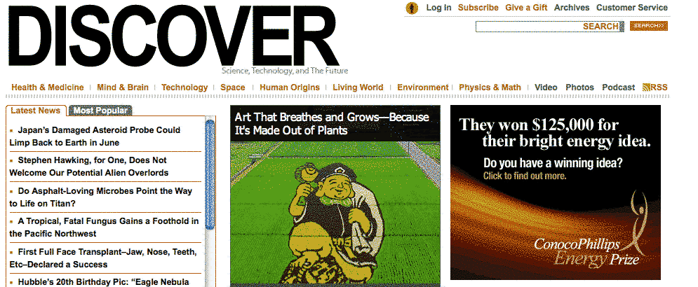
Good Website Design: Websites that include their most current posts in a list from newest to oldest in the upper left website homepage quadrant are using the homepage properly by showing users what is new at the website, or new in a given topical section of the site. Check out the upper left quadrant of the Discover Magazine periodical website for a great example of how to let users know what’s new and thus encourage them to visit often.
Website Design Mistake #2: Hide your content
Bad Website Design: Websites that only allow users the internal search to find content discourages users from browsing. It also stops external search engines like Google, Yahoo! and Bing from giving the perma-link topic page URLs they need in order to index and show your content by keyword cluster.
Good Website Design: Use perma-link topic pages, tag pages and author pages. Example: Your website may have dozens of listings for seafood restaurants in the Back Bay area of Boston, but unless you have a perma-link topic page with a URL that ends with “.com/boston-restaurants/bay-bay/seafood,” you force the search engines to choose between the posts for your individual listings (MIUs). Search-generated URLs inside your site will make your site virtually invisible to search engine users. Make sure you use perma-link pages to index your content in every way possible.
Website Design Mistake #3: Avoid keyword phrases
Bad Website Design: Use the cleverest headline and navigation terms and you can be sure to make your content hard to find.
Good Website Design: If you have a section of your website dedicated to restaurants, DO NOT label it “Dining Out” or “Places to Eat” because that is not how users search for restaurants. Filing a restaurant review post in a topical section called “Places to Eat” is like storing soap in the refrigerator… Only you will know where to find it.
Good Website Design: Use the free Google Keyword Tool to research how users really search for the content on your website and use the most popular keyword phrases in you taxonomy, tags, headlines and body copy.
Getting more revenue from your magazine content
Websites are not magazines. However, magazine content can be the basis of a successful periodical website that follows the basic rules of periodical websites design and content management.
Join us May 4th at 12:30 PM for our live Website Homepage Design Workshop… can’t make it? Pre-order the program on CD or register for encore access for all our webinar programs with Mequoda Pro.
Editor’s Note: Don Nicholas wrote the original subhead above, however, I assumed he had really meant to say “maximize” instead of “minimize”. So, if anyone noticed, this subhead is different from the email version.


