Wired, Seventeen, The Chicago Tribune and other publishers build like-worthy landing pages
You have all the control in the world getting people to “like” you when they’re visiting your website. Host a dominant “like us” button, hope it gets clicked, and you’ve earned yourself a new subscriber. On Facebook, you can gain that same type of control with a Welcome Page. Welcome Pages are designed to convince the visitor to “like” your page in the same way you use a landing page to get someone to sign up for your email newsletter.
And like those landing pages, publishers have been using all kinds of familiar, but creative tactics for getting more likes. Let’s take a look.
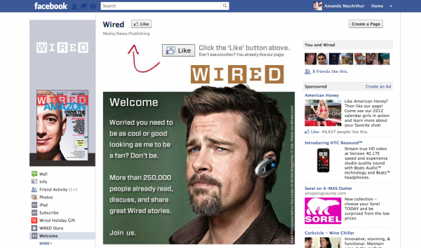
1. Wired Uses A Big Head, Witty Banter and Social Proof
We already know that using a face is the best way to draw someone’s attention and feel comfortable with the content that surrounds it. Wired uses this strategy on their Welcome Page, which is the first page someone will see when they visit the Wired Facebook page.
Next to Brad Pitt’s giant head, they write, “Welcome, Worried you need to be as cool or good as me to be a fan? Don’t be. More than 250,000 people already read, discuss, and share great Wired stories. Join us.” A little bit of witty banter and 250,000 fans worth of social proof is enough to get most fans to click the like button.
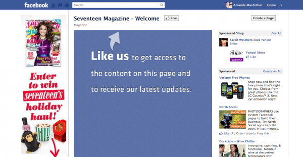
2. Seventeen Goes Big, Bold and Branded
Seventeen knows what they want to do with their Welcome Page, but they just haven’t decided yet. Give away something for free? Offer a promotion? Nobody knows, but “we’ll add content to this page soon” sounds… promising? Also, they’ve branded the page in Facebook colors and fonts, so that while they’re making up their minds on what to give away once someone likes the page, potential fans are encouraged to just go with the flow.
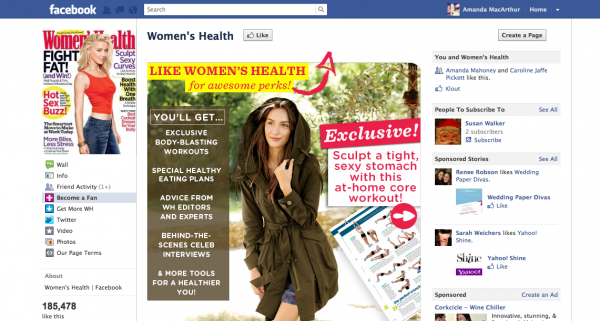
3. Women’s Health Tries Freemiums
Nothing works better at gaining a subscriber than free stuff, and Women’s Health gets it. That’s why their Become a Fan page offers new fans instant access to a one-page download with a couple of core at-home workout moves. Once they’re subscribed, their fans will be constantly updated on Facebook-excusive freemiums like workouts, eating plans, behind-the-scenes interviews and other tools.
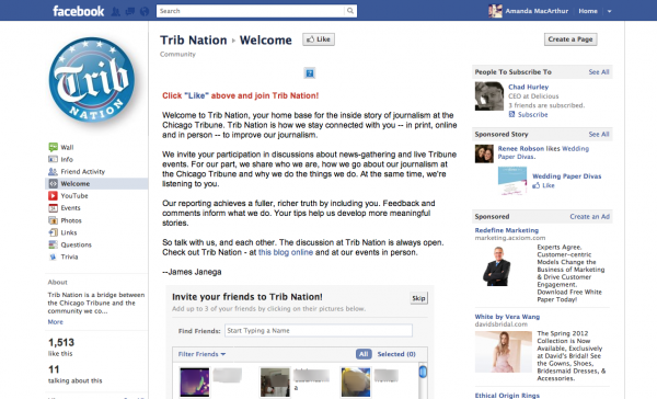
4. The Chicago Tribune Gets You To Get Your Friends Involved
The Chicago Tribune isn’t happy with just getting new visitors to become fans, they want those new fans to invite all of their friends too. In fact, The Chicago Tribune has a secondary online persona called Trib Nation that focuses entirely on digital transparency. On Facebook, their updates have little to do with promoting content on their main website, and everything to do with gathering feedback and turning subscribers into active participants through live events and intranet-style blog posts and videos.
Because of this forward-thinking dynamic, it’s no wonder they took an extra step to building more fans on their Welcome Page. After laying out a short and sweet, but incredibly convincing letter to visitors, new fans are asked to “Send a Trib Nation Request” to their own friends too and share the love.
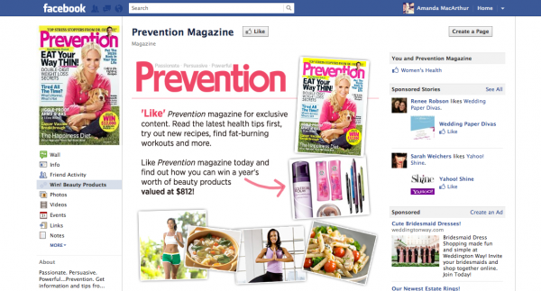
5. Prevention Gives Access to a Contest
Contests, especially ones held by large organizations, tend to flop because consumers simply don’t believe that they’ll win—given the assumed quantity of entries. That’s why this fan-exclusive contest by Prevention works. Once a visitor clicks the like button, they’re given exclusive access to a contest where they can enter to win a year’s worth of beauty products. Extra points for adding an email subscribe form to the bottom of the contest!
Your turn. Have any good “like” pages to share, or stories to tell about your own promotional efforts? What worked? What didn’t? Let us know in the comments. And remember, if you don’t have the tech savvy to build a page on your own, you can pay for Shortstack (less expensive) or Wildfire Apps (more expensive) to help you build one quickly.
