According to SimplyMeasured, brands are seeing a 46% increase in user engagement with the new Facebook timeline.
The Facebook Timeline isn’t official until March 30th, but most businesses have early access at this point and are able to design and even publish right away. Last week I rolled over the new advertising opportunities Facebook will be offering soon, but there’s also an entire new fan page design to work with that your designers might like to get their hands on.
Additionally, there’s a whole new set of rules that marketers won’t be too happy about, including an absence of the ability to host “welcome” pages that ask people to “like” your page. Let the new marketing loopholes begin!
Featured Image & Profile Images
After looking at the featured timeline images for a few publishers, there are a few hits and lots of misses.
Rather than calling anyone out, let’s just note that it’s important that your image is designed to fit the 850 x 315 pixel rectangle. A stretched, blurry, and brand-less image isn’t doing you any favors.
There are rules about designing your cover image, too. It’d be smart to get yourself thoroughly familiar with their Page rules in general, but according to Facebook’s terms, “Covers can’t be deceptive, misleading, or infringe on anyone else’s copyright. You may not encourage people to upload your cover to their personal timelines.” Additionally:
- price or purchase information, such as “40% off” or “download it on socialmusic.com”;
- contact information such as a website address, email, mailing address, or information that should go in your page’s “about” section;
- references to Facebook features or actions, such as “like” or “share” or an arrow pointing from the cover photo to any of these features; or
- calls to action, such as “get it now” or “tell your friends.”
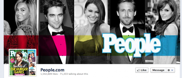
People Magazine, a publication that usually hits the mark in terms of best practices didn’t miss a beat with their cover image. In the assigned 850 x 315 pixel rectangle, they have a made-for-Facebook image that features everyone’s favorite celebrities. They’ve also chosen the most recent issue of their magazine to feature as their main profile image in the 180 x 180 pixel slot.
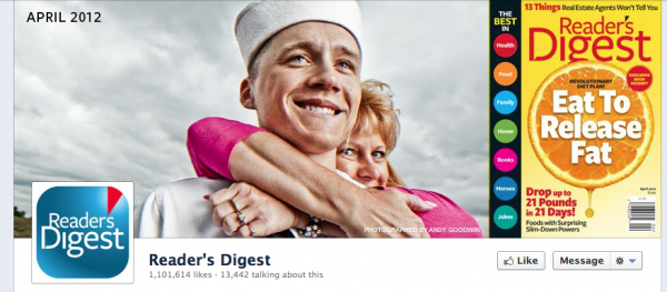
Reader’s Digest keeps it current with a striking image and a copy of their current/upcoming issue as their featured image. As for the profile icon, they’ve gone with using their logo, since the magazine is already highlighted much larger up top.
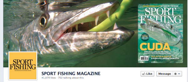
Sport Fishing has a similar approach on a drastically different topic.
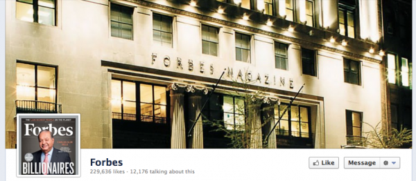
 Forbes went personal and is using an image of their HQ as their cover image.
[text_ad]
Application Images That Click
While your Facebook tabs were once somewhat hidden on the left of your profile page, they’re now given great attention. This means that you’re going to need to choose which three applications you want to show up (there are four, but you can’t remove your photos from the first slot). You’re also probably going to want to change the text that shows up underneath them, and the featured image.
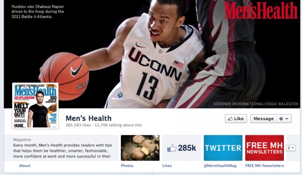
Men’s Health, another best-practice online marketer not only rocked out their profile with a (possibly rotating) fact-filled featured image, but they also determined that the two applications they want people to view most is the link to their Twitter feed, and to their free newsletters. Building subscriptions on all platforms is clearly their main goal.
They also designed these new application images perfectly at 111 pixels wide by 74 pixels high in vibrant brand-matching colors. As a note, you can still design your own applications and “tabs” as you could before, however the canvas is now significantly larger at 810 pixels wide.
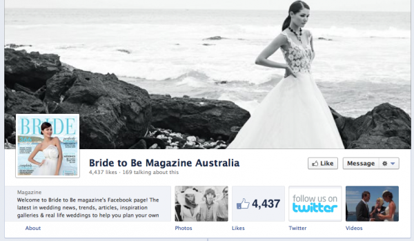
Bride to Be Magazine decided that links to their Twitter feed and videos made the most sense for their front page. Across all of the wedding magazine brands, videos and events were especially popular for these slots.
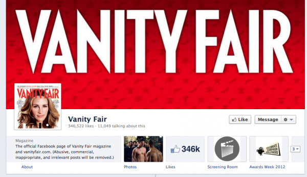
Vanity Fair made custom icons to represent their Screening Room and Awards Week tabs.
About Us With a Call to Action
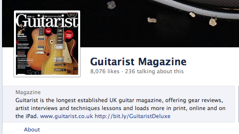
With such a prominent “about us” box to play with now, it’s important to get everything you can above the cut, which may include adding links back to your site. Guitarist Magazine includes two links in theirs, one to their website and the other to their iPad app.
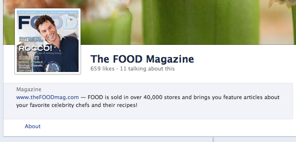
The Food Magazine doesn’t even get to the “about” before throwing in a link back to their website.
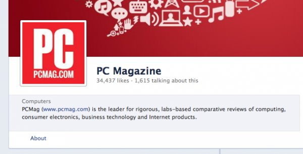
PC Magazine follows suit by throwing in a link a little more casually in the copy.
So how are your new Facebook pages coming along? If your pages are still a work in progress, drop me a comment with any questions, feedback or observations.


Goodness Lisa, humbled by the fact that nobody caught that until now!
Thanks for the sneak “peek”…
Haven’t started my new one yet, but this was great information I needed right at my tips. Plus, the ideas you provided helped me choose how I want mine set up. Thanks for a timely and applicable post.
Our Facebook page is still very much a work in progress but have got some great ideas from the 10 popular pages shown above. Thanks