Usability and design are two key factors in publishing great websites. You may have a clear strategy and great content, but if your site is unusable and unattractive, it will be:
- difficult for users to find what they’re looking for,
- difficult for you to get users to do what you want them to do and
- difficult to get users to become loyal customers and revisit again and again.
Creating user-centric websites begins by following the 14 Mequoda Website Design Guidelines.
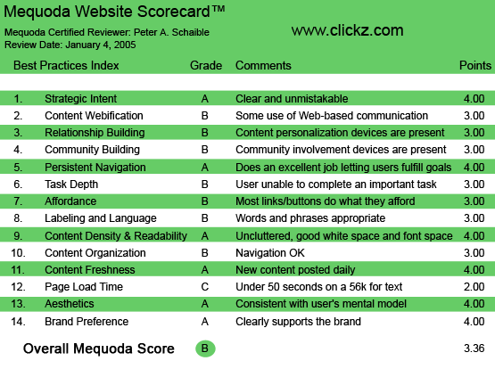
After reviewing hundreds of websites, interviewing dozens of website publishers and conducting a series of expert usability reviews and actual user tests, we developed these 14 best practices for creating user-centric websites—along with a Mequoda Website Scorecard that you can use to evaluate the overall effectiveness of your own site.

A sample Mequoda Website Scorecard
This article was written by Don Nicholas with the help of Jane E. Zarem. It is just one part in a series on the Mequoda System. See below for the rest of this series:
1. An Introduction to the Mequoda System
2. Mequoda System Habit #1: Implement a Strategic Management System
3. Mequoda System Habit #2: Build a Mequoda Media Pyramid
4. Mequoda System Habit #3: Build a Mequoda Website Network
5. Mequoda System Habit #4: Organize Content Around the Customer
6. Mequoda System Habit #5: Create User-Centric Websites
7. Mequoda System Habit #6: Implement a Mequoda Marketing System
8. Mequoda System Habit #7: Make Metric-Driven Decisions
9. Repeat the Continuous Improvement Cycle
To see our latest revitalization of the Mequoda System, download our most recent FREE Online Publishing Secrets white paper.


