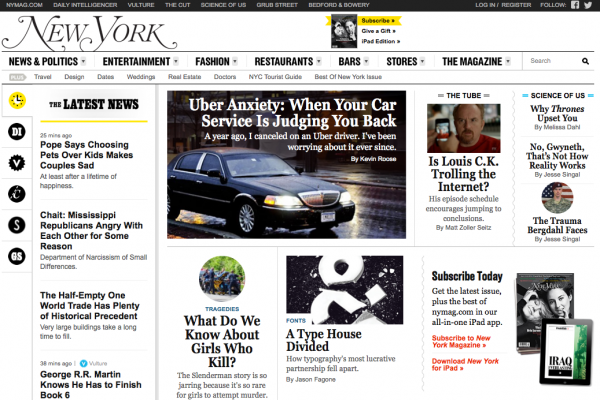
 Publishers are ditching full-fledged redesigns in favor of periodic tweaks and phased-in changes, Digiday reports.
Large-scale shifts in presentation can sometimes do more harm than good, despite their high PR value. Big changes can annoy readers, overrun budgets, and interrupt workflow.
“It’s a huge lift to try and overhaul your entire site at once, so we decided that wasn’t the best way to approach it,” New York Magazine‘s Ben Williams told Digiday. “It’s much better to focus on small areas of the site, try something in one place and later roll it out to other parts of the site. You can be more nimble that way.”
Publishers are trying to mirror tech companies in terms of fluidity and rapid responsiveness, as digital magazines like Slate now have internal teams whose responsibilities are confined largely to keeping the site’s design in line with “technology, readership, and advertising trends,” Ricardo Bilton writes.
To read more about publishers’ shifting philosophy on resdesigns, visit Digiday.
[text_ad]


