App-less in Seattle: the next frontier of multi-platform mobile development doesn’t involve apps
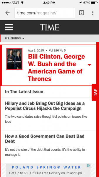
Appearing erudite and august themselves, the August 3 cover of Time magazine features Presidents George W. Bush and Bill Clinton.
At TIME.com, a photo caption explains the two former leaders of the free world recently attended ceremonies at the Bush Presidential Center for the first class of Presidential Leadership Scholars. A teaser says they are also talking to Time about the 2016 election.
…and if readers want more story content, they need to sign in or subscribe.
[text_ad]

Tap to read the article.
Relaunched in 2014, the new TIME.com was intended to promote reading of their magazine on multiple platforms, including responsively on mobile.
TIME‘s new site design came with a 100% increase in traffic, and offers an abundance of white space with large headlines and font, which is becoming more common on blogs these days. Gone are the days of 10pt Verdana font.

Tap to go back to the TOC.
They said a serif font would never be a frontrunner for online reading, but every article page is written in Georgia.
On the left of every article page you’ll find a list of popular articles, resembling a table of contents. This is a good-looking, mobile-friendly web magazine. No app necessary.
More multi-platform mobile development examples
While this type of multi-platform mobile development is standard fare for Mequoda clients, not all publishers do it well, lacking the mindset to fully embrace and execute the multiplatform user experience—or context vs. content. Until recently, in fact, some believed (even us) it was lost on TIME.com. But their web magazine has put them back in the game, in our eyes.
Also, with figures for mobile app growth (smartphones; tablets; phablets) eclipsing those even for desktop growth, what’s clear is that to remain financially viable, publishers must become editorially fluent in shapeshifting, chameleon-like environments that facilitate and maximize user experience in all “languages.”
To paraphrase a primary tenet of modernist architecture, “form ever follows function”—it should never precede it.
For the Midwest’s MetroParent.com, the progeny of free, sponsor-supported Metro Parent magazine, a focus on mobile design provides users with a variety of options to access content, calendar, contests, daily posts and the magazine itself.
Metro Parent’s web magazine, like TIME, is not constrained to the box of a newsstand app, so their native advertising content can be trumpeted in social media and e-newsletters as well, with visitors and other logged-out users able to access some content such as the publication’s advertorials because of their location: outside the firewall.
These bylined articles written by experts in their fields (teachers; health and fitness authorities; dieticians; merchants) serve to promote products, goods or services—generally with the words “Sponsored Content” or “Advertising Sections” somewhere in the space. By placing them outside the firewall, the magazine is able to increase its marketing efforts.

But multi-platform mobile development goes beyond your digital magazine
“In examining how consumers access digital content, there seem to be few surprises. More of us are using multiple devices. The devices we use to read the news, play games, and watch TV content are often smartphones and tablets,” Millennial Media’s new report on the migration from PC to mobile states.
Designing your site, and your content to be mobile-first, means that app or not, your customers and readers can consume your content.
Forbes recently redesigned their website to be mobile-first, with a big focus on native ads. Chief Product Officer Lewis DVorkin wrote a blog post about the redesign, saying, that first of all, a “new desktop tool belt (the vertical strip on the left) makes for easier navigation, sharing and commenting. The browser adjusts to fit device sizes, and these navigational elements adjust accordingly.” Simple, but good so far. Focusing “mostly on the smartphone experience,” DVorkin says another big play was “a modified continuous scroll that delivers trending headlines rather than posts, a move that provides for a better mobile scanning experience and also makes ads more viewable.”
Better Homes & Gardens already has 9 million unique monthly visitors, but a move toward a mobile-first strategy has the Meredith property hoping it can capitalize on an audience that’s trending younger, with 49% under the age of 44, Folio: reports.

“Our goal with the new website was to have a more modern design that showcases the BHG imagery. We wanted to improve our mobile experience, improve the user experience around content discovery; daily content programming and we wanted to increase the page speed to make our users happier. So those are kind of the bigger goals that we had for the new site,” General Manager of Digital Lory Stewart tells Caysey Welton in an interview.
“We’ve moved more to a modern usability feature so we have infinite scroll on our channel and category pages, more card layout, we’re better serving our content so videos, articles, slideshows, blogs, all of our content is going to be surfaced higher on the page so it gets to the user right away. The channel and category pages are by far our biggest change with the infinite scroll and card-type layout. … Our mobile environment wasn’t that great so we really focused on improving the mobile site experience with a responsive design. As I’ve said before we’ve moved to the more usable features by surfacing the content so we’re really thinking of mobile first.”
We think their mobile ads must be more effective too, as they encompass the whole screen.
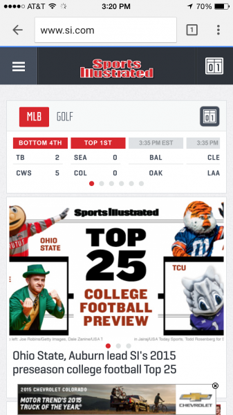
Sites like USA Today‘s FTW, theScore, and Sports Illustrated face challenges in the wildly varying consumption habits of sports fans, reports Digiday.
“It isn’t just good enough to take content from other platforms and reproduce it for mobile,” theScore‘s Benjie Levy tells Digiday. “You really have to re-imagine this experience from the ground up and think of how would you create content in the first instance.”
More than 95% of theScore‘s traffic comes from mobile. In response, the site launched “MyScore, a Facebook Newsfeed-like feature it introduced in May that lets readers follow scores, teams, and even the movements of individual players from a single feed,” Ricardo Bilton writes. Levy attributes theScore‘s 33% increase in year-over-year third quarter traffic to the new feature.
 But although their mobile-first website is indeed, image centric and mobile friendly, there are calls to download the app at every corner, as if the app is better than the mobile website. Does it need to be?
Sports Illustrated doesn’t think so. They took the next step and redesigned its mobile-first site “with a strong emphasis on … the habits and preferences of mobile users,” like a scorecard at the top of the site.
They’ve freed their content from the confines of an app!
“The goal all along was to create a progressive platform that would allow us to showcase the best of Sports Illustrated — breaking news, opinion and analysis from reporters with access, longform journalism, video storytelling, riveting photography — that you expect from us in a more visual and intuitive way no matter what device you’re using,” they published on their blog, announcing the redesign.
“The site is designed to get you the news, analysis and visuals as quickly as possible. The mobile website is specifically designed for users on phones and tablets, with scores front and center on the home page and section fronts and always one touch away through persistent navigation no matter where you are on the site.”

Under the Fan Nation banner, SI also launched a “mobile-first daily fantasy game, in which you can set your lineup and invite your friends to play in less than 60 seconds.”
“Looking at the marketplace, we decided it made a lot of sense for us to go into daily fantasy. People can play multiple games per day but you can pick it up and put it down,” he said. “It’s a segment of fantasy sports that’s starting to really take off. We think it’s about to explode and get even bigger,” said Jim DeLorenzo, vice president and general manager of SI Digital.
“We want to be able to best serve the sports fan no matter what they’re doing online, whether that’s watching videos, or playing fantasy or consuming the award-winning content from SI through SI.com,” Mr. Lorenzo said. “Everything that we’re pumping out now we’re certainly making sure it’s mobile first, then seeing how it extends back to the desktop.”


