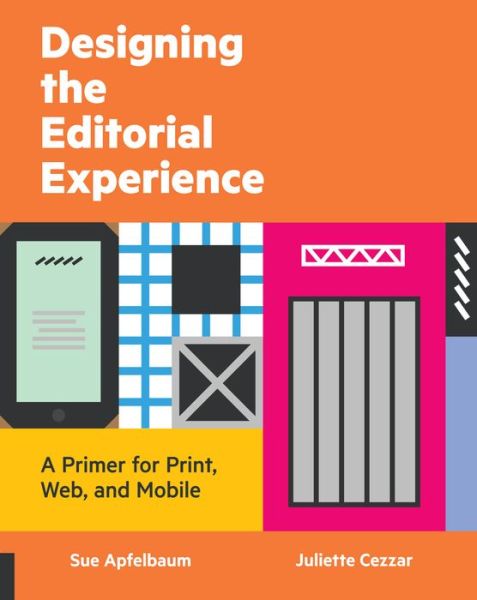
Digiday recently interviewed Juliette Cezzar and Sue Apefelbaum – authors of the new book Designing the Editorial Experience: A Primer for Print, Web, and Mobile – to discuss the state of digital magazine design.
Cezzar and Apefelbaum said they believe online editorial design is as strong as it has ever been, but that there are countless ways in which publishers can improve. These include doing away with the “hamburger menu” style of navigation, focusing more resources on typography as it relates to respective platforms, and allowing for more flexibility while still maintaining a brand.
“Everyone knows now that readers are coming in through the side, not front door. The structural metaphors from print have hindered progress in a lot of ways,” Cezzar told Digiday. “Changing our minds about how we read online is really difficult. At the same time, people still have reading habits that we have to respect. You have to do away with some of the structural metaphors, but there are some of the procedural metaphors, like where articles begin and end, that are important to keep. That’s where a really good design comes in.”
To read more about the state of online editorial design, visit Digiday.
[text_ad]


