Spend some time in your archives to discover magazine promotions and copy that can be recycled
There’s something about antiques that can make you nostalgic, even if you weren’t alive during the era the object was used. Maybe that’s a past life for you, or maybe it just makes you think of a movie you liked once.
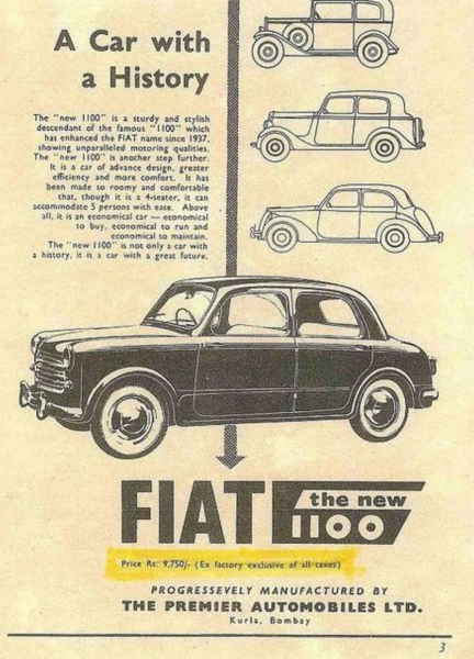
Copywriting and magazine promotions from decades ago can be truly nostalgic, don’t you think?
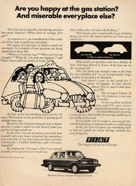
Just look at the Fiat. Here’s a full page ad that’s like a pause in time, back to when copious amounts of copy sold products, and when copywriters were still encouraged to tell stories. (Part of that is still true – we’ll get to it later).

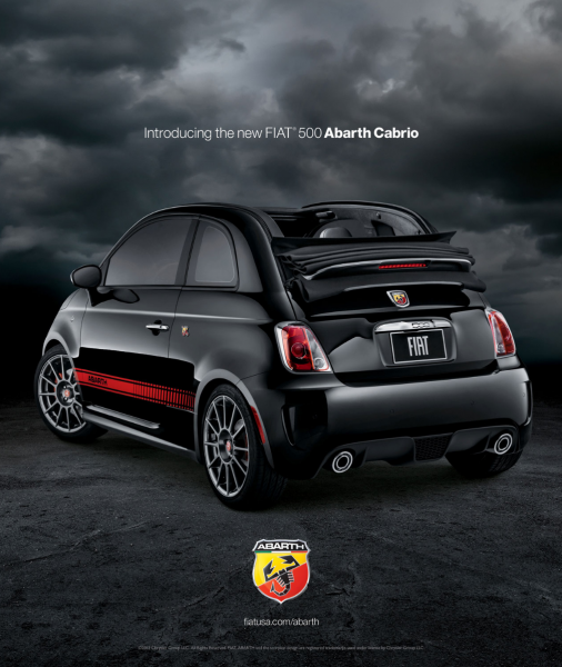
Looking back at that ad, they could still convince me to buy a Fiat today. But flash-forward to today’s advertisements (albeit, in color) and words don’t seem necessary to Fiat. Or are they?

Ten years ago, the web was a combination of bright orange bubble logos and forms on websites were short and slick. Less was more, and the orange, can we talk about how much orange was on the web for a while there? Well let’s not, but let’s get back to those short, slick forms. Those short slick forms were the equivalent of this Fiat ad.
But as consumers have begun to trend toward buying on substance (see: “shop local” and “artisanal goods”), sales copy is starting to come back into vogue on the web. I say “sales copy” referring to words that are more than headlines. And I say “on the web” because in direct mail and print, a collection of words on a page have historically been prevalent. The more costly the product, the more words you needed. It’s the reason why native ads work so well, too.
That ad for Fiat above, may actually be a native ad, but you can see from this advertisement that a story had always been incorporated in their marketing.

I recall that back in 2007 or so when we were developing sales pages, it pained Kim (our EVP) and Amanda (our Communications Team Leader) to be publishing long-form sales letters for the webinars we were hosting back then. Because in those days, it was all about the quick sign-up, and it seemed to be working for most companies. Most online forms were short on details and quick on getting people’s data, very much like the glossy Fiat ad above. But as a research firm, we continually tested our sales letters against shorter letters, and our clients tested, too. Nine times out of 10, long copy won.
Flash forward to 10 years later, where “content is king” and words and storytelling are embraced. When done well, of course, the more the better. With so much content abundant on the web, why shouldn’t you create stories to surround your products?
[text_ad]
How to create new magazine promotions from old content
As a magazine publisher, you have a product that has most likely not changed for as long as you’ve been in business. And over the course of five, 10, 20, 50 years, how many promotions have you written for your magazine?
I’ll bet the farther you go back, the longer your sales copy goes. And while copywriters are in abundance now, you may have paid some gem of a highfalutin copywriter back then to write some incredible copy you never thought would see the light of day again.
Bring it out again. Tweak what you need to, to accommodate multiple platform offers, but try recycling the bulk of the copy.
And while we’re on it, try recycling in social media, too.
You can do this two ways. If you have an online archive, you can actually re-promote your older feature articles using the same cover headlines as you did way back when.
But you can also try out your old magazine promotion headlines in social media, too. What words did you use on your blow-in cards in 1976? Try them again in 2016 and see how response rates have changed.
Where to use these recycled magazine promotions
When testing is involved, we like to defer to email. That’s where the spotlight email template comes in, which can be mailed once or twice a week and markets your premium products. We recommend creating 12 different spotlight templates:
- A short one, straight to the point with a super-charged call to action
- A long one, including bullet points about every benefit they get as a magazine subscriber, and many calls to action
- One with video, featuring exclusive content only available to premium subscribers
- One with a large image above the fold that provokes the email subscriber to keep reading to the call to action
- One that’s highly designed and has more images than text
- One in the form of a plain-text email from the editor
- One that polls them on their favorite content from your site (with a more subtle CTA for the premium product)
- One that includes a “once a year” offer on the rate
- One that includes reader testimonials
- One that includes a list of links to premium content that would be immediately available to them, if they signed up for your web edition
- A free trial offer
- A “bonus gift” offer
You can probably find copy from your magazine marketing archives that works for all of these templates. Once you’ve created your 12 spotlight email templates, to satisfy a whole quarter, choose a day of the week, say Wednesday, and roll through them every 12 weeks. Because all of the promotions are so varied, your readers won’t get bored, and your sales should increase.
Your turn to share – have you ever recycled a magazine promotion from a decade ago or more? What was the response?


