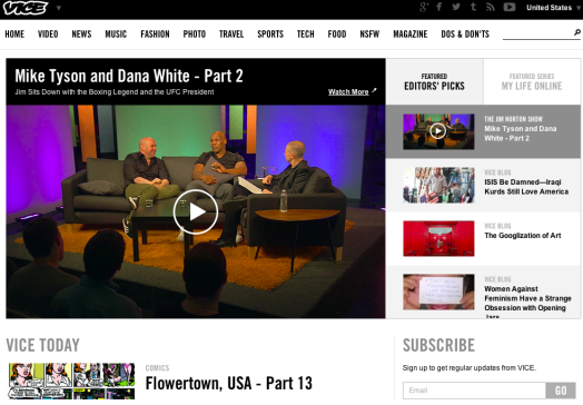
 While digital publishers experiment with website design features like “sticky” navigation menus and infinite scrolling, one element is being overlooked or overplayed, depending on your perspective: logos.
The New Yorker‘s recent redesign, for instance, saw the legacy magazine “keeping its logo front and center and sizing it at 601 by 70 pixels,” Ricardo Bilton writes in a recent Digiday piece.
But still more sites, such as Vice‘s and Quartz‘s, are shrinking logos in order to enlarge other visuals, as well as to strengthen aesthetics for mobile screens. This also inoculates magazines from too closely conflating their logos with their brands.
“Oftentimes brands get full of themselves. When a publisher makes its logo bigger, it’s letting a small part of its brand do the work for it rather than its content,” Charming Robot CEO Dan Maccarone told Digiday.
“The thing that people are going to gravitate to or remember you by is what they’ve read and how impactful it was for them. If the content works, they’re going to want to know who they got it from.”
To read more about magazine logos trending smaller, visit Digiday.
[text_ad]


