If people aren’t opening, maybe they’re worried they might “have trouble viewing this email.”
Some marketers have noticed that the first thing a reader usually sees when their email shows up in the preview pane of an inbox is “Having trouble viewing this email? View this email on the web” or similar wording. That boilerplate line is necessary to ensure a good user experience, but boring and unappealing from an editorial or marketing point of view.
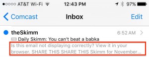
Although our team adores theSkimm newsletter, you can see from the above example that theSkimm is missing out on the opportunity to optimize that precious real estate that appears just below the subject line.
[text_ad]
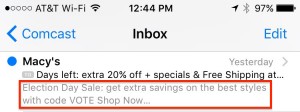
Compare that to how Macy’s is taking advantage of this space (below) and you can see why email pros recommend a shift to more optimized copy:
This subject came up when one of our Gold Members attended a conference and they asked us in turn if they should just delete that boilerplate “Having trouble…” copy. Don’t do it! That language is there for a reason. Many email programs are still set up by users to block images, and without this boilerplate copy and link, those users will never get to see the wonderful email you sent them.
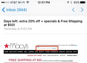
In email speak, this section of the email is referred to as a preheader. A preheader appears just under the email subject line in slightly smaller type. You could then choose to have the boilerplate language appear just after that, so you get the best of both worlds: Compelling marketing copy displayed under the subject line in a preview pane, with the boilerplate still intact, demonstrated in the actual email body like in the Macy’s example below:

Gold Member testing and industry data on email preheaders
As you might expect, preheaders increase open rates. Some of our Gold Members are testing them with promising results. While other factors may have come into play in these early tests, one Gold Member saw their weekly newsletter open rate climb 24.2% and click through rate increase by 15.5%. Another saw open rates increase for their daily newsletter by 8.9% and click throughs increase 5.9%, while open rates for the weekly rose by 18.1% and click through rates rose by 32.3%.
In one A/B test we read about, a series of emails with preheaders increased the open rate over the series without preheaders by 4%. On the first email in particular, the increase was almost 8%. Interestingly, the preheader series also increased clicks and conversions! That’s truly a win-win-win.
In fact, we’ve read about preheaders that increased open rates by as much as 30%! While that’s clearly not going to happen every time, it’s a goal worth shooting for.
Our best practice is to set up preheaders to display only in the preview pane, so they’re not displayed at the top of the email itself. The number of characters a preheader will display varies by device and email program from 35 to 140 characters. Therefore, limiting the preheader to 40-75 characters ensures that it will be seen in most circumstances.
One caveat about preheaders: BlackBerry, Outlook.com, Lotus Notes, and early versions of Outlook don’t display preview text. If these clients are popular with your audience, pay extra attention to testing and optimizing your “from” name and subject line. This list may not be comprehensive.
Here are some ideas you can use in your preheader:
- Write teaser copy, similar to the way we recommend you write subject lines.
- You could include your offer or a call to action, or even personalize it.
- Consider a CTA urging the reader to scroll down in the email to read about something interesting.
Another tactic is to write an extension of your subject line. Here’s an example of combining the use of the “question” email subject line with the “how-to” email subject line:
Subject line: Tired of Making Your Boss Rich?
Preheader: How to start your own business
You can also use the space to include the title of a great article that’s in your daily newsletter, or pitch an article from your paid product. It’s important, though, to write your preheaders along with your subject lines, as they will be seen together and should make sense as well as a compelling reason to open your email. So if your subject line is the title of your features article, it shouldn’t also be your preheader.
The bottom line: We suggest all publishers start A/B testing preheaders as soon as possible, if you haven’t already.


