via App Publisher
A recent roundtable explores the future of digital magazine covers for publishers
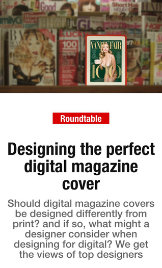
D.B. Hebbard recently conducted a roundtable discussion on digital magazine covers for the relaunch issue of App Publisher and reported the highlights in Talking New Media.
The design options for digital publishers are wide open, whether aesthetically speaking or for navigational purposes. When it comes to tablet and other mobile editions, of course, we strongly recommend the Reflow-Plus – which we’ve quantified as the most reader-friendly model – over, say, a straight Replica.
Otherwise, you’ll often find us advocating for experimentation. One area ripe for advances is digital magazine covers, so we were thrilled to see Hebbard drill down on what industry leaders are saying about this subject. The fact that the roundtable was reported in the digital-only App Publisher magazine made it even more exciting.
We know that digital magazines with a print antecedent can opt for the path of least resistance or capitalize on the opportunities of multiplatform publishing, but Hebbard addressed those who exist only with an app incarnation. And he writes that this latter group is erring when they try to design a product that simply looks like a print one.
At least one of the discussion’s participants agreed.
“I think you can do whatever you like for a digital magazine cover … it’s really just something the user sees as a ‘poster’ really – so perhaps turn it more into a contents page – or something completely different – one image with no words,” said David Hicks, digital publishing consultant. “I think too many designers stick to what they know – ie: print covers. It just looks lazy, to be honest.”
Hebbard cited other publishers who are a little more adventurous, like Type Engine and 29th Street Publishing. The latter uses an image as a “splash page.” Another example, Lights, features digital magazine covers that act as GIFs, with a static image dissolving into a table of contents, for instance.
Video is another popular choice, according to participants.
“Unlike a print edition, the reader can’t pick up the edition and flip through it before deciding to purchase,” said Chris Bond, Creative Lead, Digital Editions, at TC Media.
“Cover videos give us the opportunity to give the reader a bit of that ‘flip through’ feeling by bringing to life what they’ll get inside. While such elements help to amplify the value of the content, you don’t want to overwhelm the reader with too much different kinds of interactivity.”
Hebbard also mentions the possibility of designing different digital magazine covers for the Apple Newsstand interface and the issue itself, since each can serve a different purpose.
Smart phones are another consideration, with an interesting shift taking place: While some publishers are again just replicating print editions, others are designing yet more native mobile versions. The smart move for now? Base your smart phone products – complete with digital magazine covers – on your tablet edition.
Have you experimented with the form and function of digital magazine covers? Let us know in the comments!
To read more about the future of digital magazine covers, visit Talking New Media.


