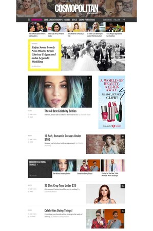
Cosmopolitan.com’s redesigned site debuted yesterday, the first of Hearst’s planned company-wide roll-out of revamped portals for its 18 properties.
Hearst’s Troy Young “explained how the new site is the product of a more nimble, easier to use, system. What readers will get is a sleeker site, which includes breaking news updates, a video banner, an infinite scroll of stories and advertisements that appear seamlessly between videos of male models cuddling kittens and buzzy stories on celebrities,” according to Women’s Wear Daily.
“There is also a native advertising component in the form of a section called ‘Marketplace,’ which is where advertisers can plug their products. … In short, the site, which was developed with creative digital agency Code and Theory, is Hearst’s answer to a post-banner world.”
Editor Amy Odell said that the Cosmo website could publish 20% more content with the new template.
To read more about the Cosmo website redesign, visit WWD.
[text_ad]


