via Digiday
Publishers are trying new tricks and refining old ones to get visitors to stay on their sites for a while.
Digiday recently homed in on four creative examples of content deployment piquing readers’ interest.
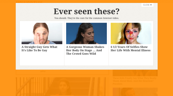
Recommended Content Popup: Upworthy has turned the “more content” model into an “other content” option for readers unimpressed with the current page they’re on. The “Ever seen these?” popup is activated when the reader moves the mouse to click away.
Infinite Scrolling: Publishers like Quartz, Time, and The L.A. Times are “extending the homepage’s content-discovery role to the article pages themselves. Scrolling through one article immediately leads into the next one, which means that readers that click and read one article inevitably go on to scroll through a few more,” Ricardo Bilton writes. “Quartz says that, at its core, infinite scrolling is all about solving the ‘what next’ problem that readers face when they get to the bottom of an article.”
Page-Navigation Arrows: Simple and straightforward, this feature allows readers to proceed to the next story or turn back to the previous one with graphic prompts or corresponding keys. USA Today, The New York Times, and FiveThirtyEight are publishers finding success with this set-up.
Card Stacks: “When Vox writes about a complex topic, it often highlights key words that, when clicked, link to relevant explainer ‘cards’ that offer more basic info about the topic,” Bilton writes. “It’s easy to see how digging into one series of cards can lead readers to discovering even more. It’s the rabbit-hole approach to content.”
To read more about content deployment tactics driving engagement, visit Digiday.
[text_ad]


