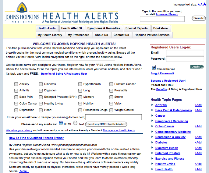
The Home landing page is your first opportunity to make a good impression
Organic landing pages are full of content that is designed to be attractive to both users and search engines. Essentially, an organic landing page is trying to be found by search engines.
Home landing pages are the first page someone sees when they type in your website address. The home landing page should tell your user exactly what you want them to do and how it will benefit them.
If your main goal is to get them to sign up for an email newsletter, the most important graphic, button or section of your homepage should be dedicated to collecting it. A floater can be a quick and easy way add unknown site visitors to your email database.
If your priority is to sell a product, the first thing a user should see is your featured product. An OFIE or OFIN will attract a user to perform the desired action. Placement above the fold is key.
If you are simply collecting page views, you should offer something enticing that will immediately engage the user. Get your audience involved by asking them to vote in a poll, enter a contest, or watch a video clip. By engaging users in these activities, they are more likely to forward your home page to a friend.
[text_ad]
Beauty is in the eye of the beholder
Visitors instantly judge your credibility by the way your site looks. If it looks good, a visitor might take the next step, reading some copy or clicking a link. Don’t underestimate the importance of good design.
With so many options available, where do you start? First, take a good look around at other home page designs within your industry. Next, visit CoolHomePages.com. You’ll find thumbnails of dozens of examples, with links to real home pages. Sites are rated, so you can see which designs are considered good and which are bad.
Keep in mind your main objectives: a professional look, without clutter, that’s easy to navigate.
Here are a two Mequoda Best Practice examples for home landing pages: HRDailyAdvisor.com and JohnsHopkinsHealthAlerts.com


