“Half the money I spend on advertising is wasted; the trouble is I don’t know which half.”
— John Wanamaker (1838-1922)
Building the Best Landing Pages with the Mequoda Scorecard
Evaluating any kind of advertising or sales pitch has always been a difficult task, subject to a host of unruly variables and seasoned by one’s own sense of what might work. The technology available to us today only makes it more difficult, with hyperlinks and streaming video and all the other electronic gizmos available to an enthusiastic programmer/designer. Therefore we decided to develop our own landing page guidelines to help those who use the Mequoda Method in creating powerful sales letter landing pages.
We constructed the Mequoda Sales Letter Landing Page Scorecard by asking a panel of online marketing experts what they believe constitutes a well-done landing page. Each of the experts is a recognized industry leader with an impressive portfolio. As you might imagine it was a lively series of conversations. At the end of the exercise, the panel had isolated 12 essential elements for a landing page sales letter to be successful. Using their recommendations, we created four true or false criteria to use when evaluating each of the elements. The result is an easy-to-understand framework you’ll find below. We’re confident you’ll find it an invaluable tool with in improving the conversion rates of your sales letter landing pages.
[text_ad]
Here’s how the grading system operates. An answer of “true” to any of the four landing page guidelines in each category constitutes a single point, with each category having a possible best score of four points. After answering all of the true or false questions, we average the number of points and assign a letter grade. Four points equal an “A,” three points a “B,” two points a “C” and a single point a “D.” An “F” would be granted if none of the objectives were met.
Here are the categories and landing page guidelines:
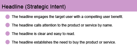
1. Headline (Strategic Intent) Landing Page Guidelines
It may seem hard to believe, but far too many landing pages fail almost immediately by offering up lackluster headlines and subheads. Think benefits and features when putting up your headlines. The visitor who’s reading your landing page wants nothing more than the answer to this question: “What’s in this for me?” Answer that question well and you will make a sale.
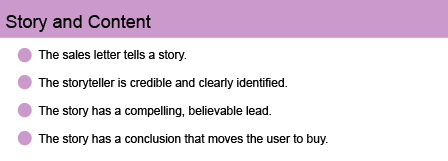
2. Story and Content Landing Page Guidelines
Make sure your landing page contains an interesting, engaging, believable story told by someone your audience can relate to and appreciate. After all, you’re asking them to spend their valuable time reading your pitch… you owe them a good time. Plus, a compelling story will move them smoothly along to the purchasing decision.
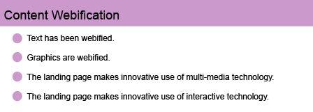
3. Content Webification Landing Page Guidelines
By “webification” we mean the most efficient use of all the multimedia and interactive technology available. This does not, however, mean using technology just because it’s there. Never let the technology outshine the sales message. Don’t let your readers be so dazzled by the bells and whistles that they forget to buy. Technology should be used to enhance the sales message, not replace it.
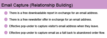
4. Email Capture (Relationship Building) Landing Page Guidelines
Once you’ve captured your prospect’s interest, it’s important to keep your name, product, and/or service in front of them. Offering a free newsletter or a free report is a handy, non-invasive way to accomplish that. These items have a high-perceived value and are amazingly cheap to produce and distribute. Using effective pop-unders as a mechanism for drawing them in once they’ve decided to abandon you is crucial.
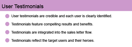
5. User Testimonial Landing Page Guidelines
A good, credible testimonial is an extremely valuable part of any sales letter. The most credible testimonial messages are those told in the individual’s own words and include a full identification of the person giving the testimonial. Kind words from Tom S. in North Carolina are obviously less valuable than those from Tom Smith in Boone, North Carolina. In fact, under-identified testimonials can inspire suspicion and work against your sales message.
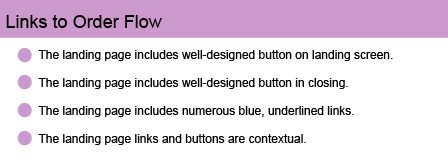
6. Links to Order Flow Landing Page Guidelines
Links and buttons are the vehicles that allow a prospect to navigate your landing page. Make them as easy as possible to understand and use.
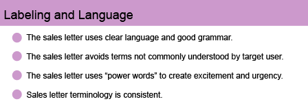
7. Labeling and Language Landing Page Guidelines
Have you ever seen a sales letter that included a bulleted list of items… and the last item in the list said, “and much, much more?” Well, here’s a news flash…nobody with an IQ higher than room temperature believes there is “much, much more.” If you actually have more benefits or features, put them in the list. Clear language and good grammar are part of good storytelling, and so is telling the truth. Don’t try to bamboozle your prospect with tired ad copy cliches.
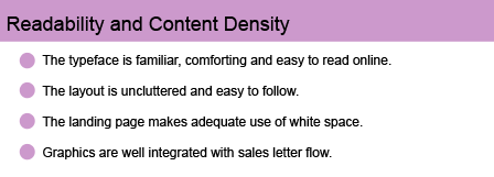
8. Readability & Content Density Landing Page Guidelines
This is fairly self-explanatory. If a page is comfortable and easy to read, prospects are far more likely to keep reading and take in your sales message.
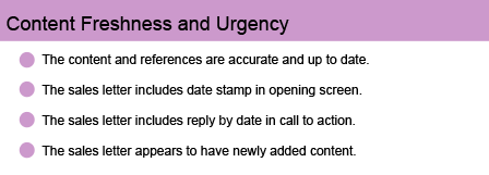
9. Content Freshness & Urgency Landing Page Guidelines
Few things destroy the credibility of a landing page sales letter more quickly and effectively than content that’s out of date. How can we expect the prospect to take our message seriously if we’re not even interested enough in the content to keep it up to date?
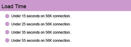
10. Load Time Landing Page Guidelines
Nobody wants to wait for any website to load. Call us spoiled or impatient, but the fact is that the Web-using public doesn’t want to wait at all. If your landing page loads with anything less than instant gratification, you run a serious risk of losing your customer.
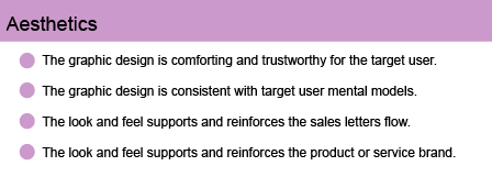
11. Aesthetics Landing Page Guidelines
The way a landing page looks and feels is almost as important as what it says. A favorable decision to purchase your product or service is almost always the result of a sales effort that made the customer feel comfortable and safe.
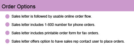
12. Order Options Landing Page Guidelines
Posting a landing page with a confusing or inadequate order mechanism is like opening a new Walmart, but forgetting to install cash registers. What’s the point? In direct mail advertising, it is generally conceded that one of the two most important elements of the package is the order form (the other being the outer envelope). If you get everything else right and blow the order mechanism, your sales letter landing page will almost certainly fail miserably.
Conclusion
The Mequoda Landing Page Scorecard™ encourages you to score your own landing page using each of the 12 Mequoda Best Practice Landing Page Guidelines, add them together and arrive at a cumulative score. The goal is to emphasize the importance of effective landing pages that sell. Your landing page should achieve respectable scores in all areas, rather than over-emphasizing a single area or two, or omitting other areas completely.
This scorecard was written with the help of John Clausen, Peter A. Schaible and Bob Bly.
Mequoda Sales Landing Page Scorecard Index
Mequoda has reviewed numerous sales letter landing pages using the these landing page guidelines. You can access all of our landing page reviews here:
Harvard Health Letter Sales Letter
EzineQueen.com’s Online Success Blueprint Workshop
PerryMarshall.com’s The Definitive Guide to Google Adwords
EzineQueen.com’s Boost Business With Your Own Ezine
The South Beach Diet Newsletter
BottomLineSecrets.com’s The Complete Encyclopedia of Natural Healing
Instant Real Estate Newsletter
Web Usability for Senior Citizens
Doctor Douglass’ Real Health Breakthroughs
American Writers and Artists Institute (AWAI)
The Cleveland Clinic Heart Advisor
Wall Street Journal 20-Free Issues
SuperAffiliateHandbook.com Sales Letter
Rukeyser Mutual Funds Sales Letter


