Effective membership websites employ an access challenge landing page that teases users with a snippet of the content that awaits them beyond the turnstile.
Private, exclusive, premium and paid-only vs. visible, available and accessible. The conundrum for membership website has long been how to have it both ways.
The idea of a pay-for-access website appeals to everyone who owns valuable, premium content. And it’s a viable business model for some publishers. But what if visitors and potential paying customers can’t find your site and its members-only content?
If the search engine spiders can’t access and catalog your membership website content, it virtually doesn’t exist.
An Internet dominated by Google, Yahoo, MSN and Ask.com, means that if your site’s content pages aren’t indexed and don’t appear high on the query return lists, you don’t really have a membership website.
Instead, you have a secret and invisible online club with a headquarters more difficult to penetrate than Fort Knox.
The solution is an access challenge landing page with several indispensable architectural elements. First, generous snippets (representative segments of content documents) that contain enough keywords and keyword phrases to enable search engine optimization.
But the access challenge landing page makes clear to the visitor that a financial transaction is required before the entire article can be read or downloaded. Generally, a hypertext link leads the user to an order flow.
Additionally, online entry forms collect a paid member’s username and password, and enable access to the full article.
[text_ad]
Another element, optional but recommended, is an entry form that enables the user who has forgotten his username and password to request that they be sent to him via email.
Access challenge landing pages aren’t limited to paid membership websites. Sometimes an access challenge landing page is used only to request a user’s name and email address. Like the rapid conversion landing page, this type of access challenge landing page is sometimes referred to as a name squeeze page.
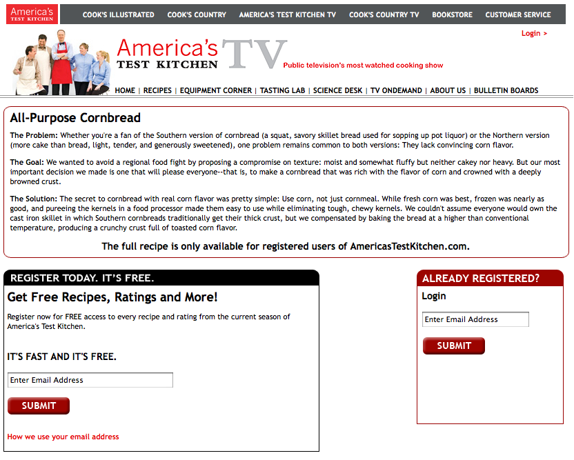
This is an access challenge landing page for the All-Purpose Cornbread Recipe at America’s Test Kitchen.
Entry is easy and registration is free. All ATK wants is your email address and your agreement to receive its free monthly newsletter, along with notification of America’s Test Kitchen specials.
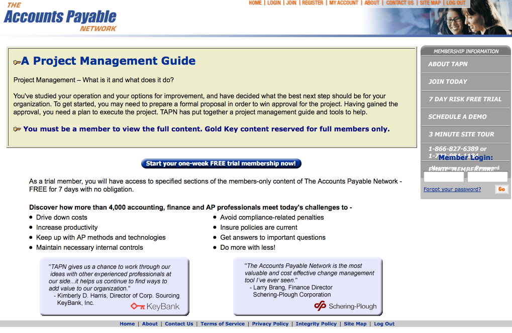
And this access challenge landing page appears on the Accounts Payable Network website. It requests members to log in and invites all others to sign up for a seven-day, free trial membership.
Simple, elegant and effective, both of these access challenge landing pages are examples of Mequoda best practices.


