
When website users are asked whether they like pop-ups, they say no. They’ll say they hate them. They’ll tell you they’re the most annoying things on the Internet. They might even tell you they never fill them out.
Well, we’ll politely call them fibbers, because every A/B test we’ve ever run and researched disagrees. A recent article we published on top email capture rates featured a case study of a publisher showing 26.8% of their email conversions coming from the floater (their #2 source – we find this often ranks in the #1 position for many publishers).
“Pop-up” is a bit of a dirty word though, we agree, and we don’t like pop-ups either. They “pop up,” can ruin the user experience, and they can be blocked by pop-up blockers. What’s the fun in all that?
Floaters, however, don’t do any of those things. And when publishers test them, along with OFIEs, text ads and other elements of website conversion architecture, they see a 20-50% lift in website conversions; in some cases, even more. For many Mequoda System publishing partners, we find that more than 60% of those extra website conversions come through through the floater.
If you’re considering launching floaters, find out your base conversion metrics. Calculate your email capture rate, that is, the rate at which your website converts visitors into email subscribers:
Divide the total number of new email subscribers you acquired via your website in one month by the total number of unique visitors you received in that month. This will give you your site-wide email conversion rate.
If during a given month you have 100,000 unique visitors arrive at your website (according to Google Analytics or a comparable measurement tool) and 2,000 of these unique visitors become new email subscribers (according to your email management program or service), your ECR is 2 percent (2,000/100,000 = .02 or 2.0%).
Most websites have an email capture rate of less than 0.1%. On our client and partner websites, all of which use Floaters and other email capture elements, email capture rates in 2020 ranged from 1.3% to 3.2% with the average being 1.7%.
[text_ad]
Benefits of Website Floaters:
- Floaters have rapidly replaced pop-ups and pop-unders.
- Floaters are not affected by pop-up blockers.
- Floaters can be deployed contextually on a site-wide basis.
- Floaters can be configured to stop bothering frequent guests.
Although a floater looks like a separate document floating on top of a website page, it’s really just a layer in the HTML code. To the user, it looks a lot like a magazine blow-in card.
There are “paid floaters,” as in floaters that promote a paid product. Generally, these floaters only appear after a user has converted from a free floater. Once they’re on the email list, when they come back to the website, they get ads for paid products instead of free ones.
But we prefer floaters that promote free products (freemiums) so that we can build our email list and sell them a magazine, newsletter, event, or information product later on.
We especially like it when they darken the background, which we jokingly refer to as the Death Star Floater.
For Floaters to perform best, they should appear categorically aligned with the content. For example, an article with a cake recipe might show a cookbook freebie to download with 10 great cake recipes.
That said, we also have what are called Run-of-Site Floaters and these are ones that have proven to convert any and all users, and be general-interest enough topic-wise to be used anywhere. An example of this is Cabot’s 5 Stocks to Buy in February freebie, which you’d probably agree is a sure winner for any visitor who comes to the site looking for stocks to buy.

But to arrive at this as the winner, there have been many tests. We’ve tested the image, the copy, the colors, the button, even the text that allows people to close the ad. In one recent test, we tested the incentive against a totally different product—a free webinar—and found that the free report remained the winner. Offering a free webinar instead of a free report was not as compelling to site visitors.
We also did a copy test where we tested the winning floater against a replica that simply added “Please accept or decline your investing benefits now” copy. That “accept or decline” copy is a top performer in Cabot’s email subject lines and so we wanted to see how it’d perform on email capture elements. And alas, it won the A/B test for the Floater, proving that you can extract a lot from your A/B tests and transfer your data to other tests and channels.

If you’re thinking that this is a recurring usability nightmare, don’t worry. The codes for floaters are designed to recognize users who have subscribed and spare them from having to see the floater again.
This provides all the benefits of a pop-up’s high conversion rate without the negative effects on the users’ experience with your website.
[text_ad]
The Rules of Effective Website Floaters
- Except for the home page, floaters should promote a contextual free product, unless using a tested run-of-site floater with a general-interest theme.
- Floaters for freebies must not appear to current email subscribers who are already logged in.
- Floaters for paid products should appear upon arrival for email subscribers who are already logged in.
- Floaters must take a hiatus from appearing after a reader has seen the floater X number of times and has not converted (also known as not annoying your readers).
- Floaters should be replaced with mobile-friendly placemat ads for mobile users.
While printing blow-in cards and inserting them into print products is cheap, floaters, like their pop-up predecessors, are virtually cost-free. Like blow-ins and pop-ups, floaters can irritate users if overused or used to promote offers that seem out of context.
That’s why every good Mequoda System is designed to offer contextual floaters.
We use floaters primarily to build email lists by offering freemiums (like a free white paper). So in order to make our floater contextual, that means that we must have one freemium for every category on our website. For example, on Yankee’s website, a floater for their vacation guide appears when someone is looking for beach towns in Massachusetts.

As anyone who reads their analytics knows, most users don’t enter their website via the homepage. By design, most users enter through content pages one or more levels down from the homepage. This makes floaters ideal for site-wide use to entice users to download a freemium and build email circulation.
[text_ad]
How Online Publishers Use Floaters
There was a very long period when the social media folks – the anarchists of the online marketing industry – refused to use floaters. They relied on their intuition instead of testing. They shamed companies for annoying people with marketing. “Just talk to them,” they said. “Write good content,” they said. Then the social media folks started actually testing.
The fact is, you can’t talk to everyone who visits your website. However, if you can get them on your email list, you’ll have a chance to talk to them later.
Several years ago, I read an interesting case study by Darren Rowse of ProBlogger who added a floater to his site Digital Photography School. He admitted that it took him so long because he was afraid his users would hate him for it. The social media peeps would judge him! “My fear was that they’d annoy readers, page views per visit would drop and that I’d end up with a lot of angry emails from readers,” said Rowse at the time.
But he went for it anyway. Instead of getting an inbox full of angry emails (he only got two), he went from harvesting 41 new email subscribers per day, to 350 new email subscribers per day — more than 127,000 new email subscribers per year. At the time, we had calculated that he was getting an 18% conversion rate on that floater, circa 2008.
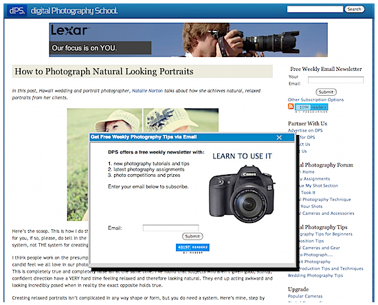
Five years later I checked in again, and he was still using floaters, but they got an upgrade along with his very successful website. Certainly this blogger changed his mind about them.
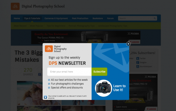
Fast-forward even more to 2021, and the freebies have transformed more, but the floaters are bigger than ever (the full size of the screen).

All of our Mequoda Systems go live with floaters right off the bat, and the floaters are responsible for the majority of their email conversions.
People who continually close a floater and don’t subscribe aren’t your target customers — if they don’t require your information on a daily basis to do their jobs or to improve their lives, then they’re also highly unlikely to buy a product or attend an event.
So, who would we rather please? Our potential customers who we can make happy by writing useful content every day — or our non-customers? We don’t worry about the people who might not subscribe. Instead, we spend our efforts making sure that we’re making new subscribers happy by publishing valuable freemiums that align with the content that’s being read, and by sending email newsletters packed with original, helpful content that always gives a takeaway.
If you didn’t absorb today’s takeaway yet, it’s this: Test floaters!
Do you use floaters? Why or why not?
This post was originally published in 2013 and has been updated.


Fibbers? The only fibbing going on is in this article lol.
FYI,there’s great ad-blocking plugins to block this annoying crap if I actually wanted to stay on a site that uses these in-your-face tactics.
You already know this though, and I suspect, like your automatic floaters, this comment will be blocked
We’re just following the data, like good marketers! 🙂
More email newsletter subscribers is the primary driver for Mequoda System success and floaters are a great way to get more email subscribers…