The Economist sells digital access by getting email subscribers to click, click, click
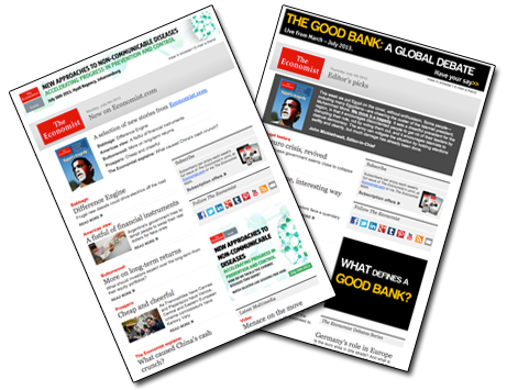
In my recent escapades of combing through the email calendars of publishers large and small, I’ve discovered a few secrets about the brands I’ve been spying on. The biggest secret of all is that rarely do any of them stick to a systematic program of email publishing.
Typically all of our emails are written, edited and scheduled to go out on Friday the week before. We publish at 10 am Eastern when we publish editorial emails (Monday – Thursday) and 2 pm when we publish promotional emails. Sometimes we switch it up to test out which times work best, but overall it’s fairly consistent.
And as I’ve been watching Mequoda Gold clients, I’m sure Don would be tickled to know that they too are fairly systematic.
But once you get out of the niche publishing space and into the world of general interest publishers, email goes crazy. I won’t name any names, but last week I finally wrapped up the editorial calendar of a certain food publisher and decided to give up. There was not a single consistency in days or times, not even in a five-week period.
This type of schedule makes me feel bad for the editors managing them, who must be flying by the seat of their pants to get the email out every day without any room to do any kind of controlled A/B testing. The shame!
This week I analyzed The Economist who was not a major offender of flying by the seat of their pants, thankfully, and is gracious enough to let subscribers know what and when they’ll be sending out.
And it’s always easy to be a judgmental fly on the wall looking in, so I’m adding in some takeaways.
Conversion Architecture
The taxonomy of Economist.com offers subscribers two tabs at the top of the site: “More from Economist” and “Subscription.” Personally, I look for the link that says “newsletters” or for a “subscribe” call to action, but The Economist gets subscribers to their email newsletter by getting them to click on that “More from The Economist” drop-down.

On the homepage, there are three obvious places offered in order to subscribe to their email newsletters.


On the article pages, there are two. Every page has several elements of conversion architecture meant to build email circulation.
Oh, but wait, I almost forgot about the registration wall which pops up after you’ve read a few too many articles and allows you to read six per week. Naturally, by sending you emails, they hope to exhaust your six articles and get you to upgrade to a paid subscription. If not, maybe you’ll click enough links on Twitter or Facebook to get to this page (perhaps even more quickly).
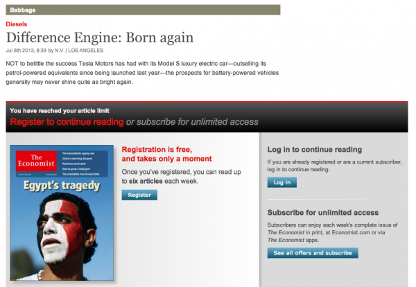
The takeaway: Although there’s nothing screaming at me to sign up and nobody’s giving me a freebie in exchange for my email address, I can probably stumble across a call-to-action pretty easily. In news, social media delivers faster than email though, so without some kind of freemium, I’m more likely to subscribe to them on Twitter or via RSS. Then again, a digest is nice. Maybe I’ll get both – after all, The Economist barely clogs my inbox at all. But just in case I don’t travel down all of those paved roads, The Economist will stop me for being greedy and politely ask me to register. Then I’ll get emails regularly, exhaust my weekly limit, and subscribe to unlimited access. Brilliant!
[text_ad]
Email Calendar
When you sign up to receive email newsletters from The Economist, they offer you two different email newsletters. In their own words:
- Mondays, Wednesdays, Fridays
New on The Economist online: The latest analysis of international issues and events
- Thursdays
Editor’s Picks: A must-read selection of articles from this week’s issue of The Economist, straight from the desk of John Micklethwait
It sounds fairly systematic. I also assumed I’d get some kind of third-party ad on Tuesdays to fill in the gap, but I never did.

There’s a fairly stable schedule that goes on at The Economist when it comes to sending these emails.
On M-W-F, they send out the New on Economist.com newsletter between 2:30 pm and 4:30 pm Eastern, although I speculate that 2:30 is the intended time because it showed up into my inbox at that time more than once.
On Thursday, they send out the Editor’s Picks between 12:30 and 1:30 pm.
The takeaway: Even the biggest teams have a hard time keeping a schedule. But for the sake of your delivery and email reputation, I’d recommend picking a time every day and sticking to it.
Subject Lines
The Economist is uniquely news driven, and their subject lines are formulaic (in a good way). These examples from the New on Economist.com email newsletter show that they pull a topic from three stories and keep the subject line to around 50 characters, which is right around the ideal length for subject lines.
- Diesel engines, pretend dollars, equity returns
- India, the Vatican and Mars
- Document nine, bourgeois Mexican migrants and Arabic
The Editor’s Picks email stays the same every week, beginning with “From the desk of John Micklethwait, Editor”, a dash, and then the date. These subject lines are much longer, but nobody’s looking for the date anyway. The subject line is consistently personal so that people look forward to their weekly curated email from John.
The takeaway: Simplicity and brevity wins. I don’t have any insight into their actual open rates, but they’re doing this part by the best practice book.
Editorial Integrity
The content in both email templates is similar, interchangeable even. Both are curated by somebody, one just happens to have a byline on it. The only real difference from the subscriber’s standpoint is that the Editor’s Picks email comes with a short blurb from John.
John’s email features three major news stories, a story on politics and a story on business.
New on Economist.com features an article from each of the many different blogs, plus some multimedia content.
All of the stories include the title and a subhead. A perfect strategy for an email newsletter built to drive website traffic and get you to trip your weekly limit of article consumption.
The takeaway: If the goal of your email newsletter is to drive website traffic, don’t give away the whole cow.
[text_ad]
Driving Revenue
The Economist doesn’t appear to send promotional emails, third-party or otherwise, but don’t confuse their lack of spamming me with a lack of a revenue strategy.
Both emails are editorial in nature and set up to get a subscriber to do one of three things:
- Click a link to visit the website (drive website traffic)
- Click the ad that gets them to subscribe to the magazine (build circulation)
- Click on an ad (drive event revenue)
I didn’t get a single sponsored ad from an advertiser, but yet there are four available ad slots in each email.
The Economist hones in on events as sponsors of the email. The two above the fold typically promote the same event.
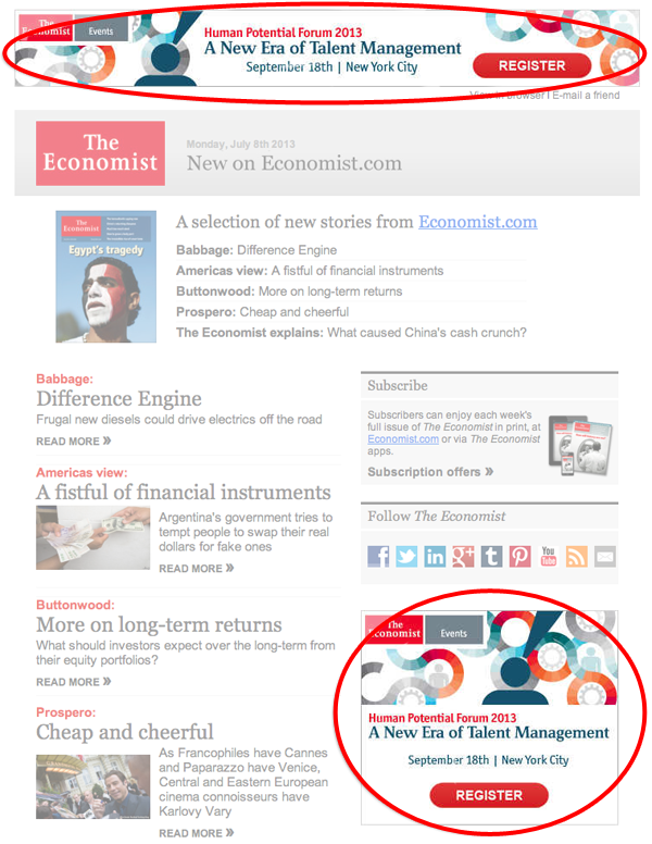
The third ad slot, below the featured articles, usually promotes a second event or a subscription to the magazine. The fourth always promotes another event, not usually the same as the one promoted in slots 1 and 2.
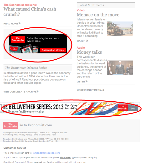
The takeaway: The Economist either sees their events as a larger revenue opportunity than sponsors, or they’re having a hard time selling sponsorships. If you have four open ad slots in your email newsletter, consider offering all four of them up to a single sponsor. Align the sponsor with the theme of your email. For example, if we were ad-driven, the sponsor of today’s Email Marketing email template could have been WhatCounts or MailChimp. Exclusive sponsorships are much easier to sell than one-off banner ads.
Selling Subscriptions
In every email newsletter, the “Subscribe” ad for their magazine is in the right-hand rail. In between the featured articles, there’s also typically a graphic ad to subscribe for the magazine. The copy in those ads remain the same no matter which email it is. Below the print subscription offer, there’s a row of icons asking readers to follow them on their various social networks.
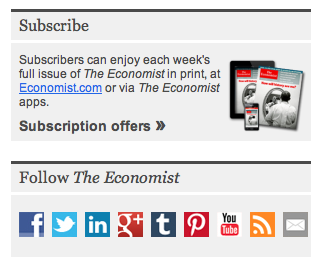
The takeaway: The Economist values subscribers of all kinds. Don’t want to subscribe to the print magazine or get digital access today? That’s fine, just go ahead and subscribe to them on one of their many social networks and they’ll get you to buy another day – perhaps through social networks. If email ads aren’t selling them, maybe a Facebook update will. There’s a real opportunity here for them to test copy in their most prominent ad, but I didn’t witness any variations.
Final Thoughts and Observations
There’s a clear content and revenue strategy going on at Economist.com. They have a registration wall, so they’re focused on getting people to hit the website as many times as possible. They don’t seem overly concerned with which medium they come in on, so they do a fair amount of promotion for their social networks in addition to their emails.
The Economist also realizes they’re a news site, and email isn’t always timely. However, people love curated newsletters, so by hand-picking the best news of the day or week in their emails, they can build an email list of fairweather news readers. By getting in front of readers with at least six new articles at a time, they can easily get a subscriber to hit their 6-article limit within the week. Over time, the frustration of the limit may cause them to drop $2.58 per week for a digital subscription or $3.23 per week to get both print and digital.
Subscribers of all shapes, sizes and platforms are beneficial for The Economist, but they have a solid strategy and template design that offers just enough to snag clicks and get email subscribers to use up credit, after credit, after credit, after credit …


