How to collect emails on your website in style – give me an O, an F, an I, and an E!

If you’ve ever been to one of our events, or you just got dropped on your head when you landed on one of our articles, you’ve probably seen the acronym OFIE here and there.
Around here, using OFIE in a sentence (pronounced OH FEE) is as common as saying the words “website” or “conversion.” Say it with me, OHHHHH FEEEEEEEE. Or you could spell it out… oh, eff, aye, eee!
Or, and only the suckers say it this way, you could say what it really means: Order Form in Editorial. Nobody says that though.
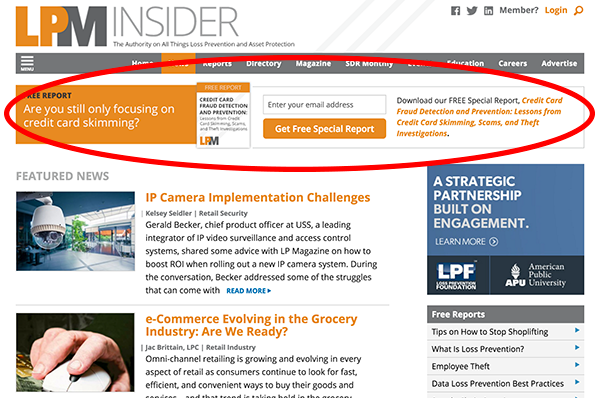
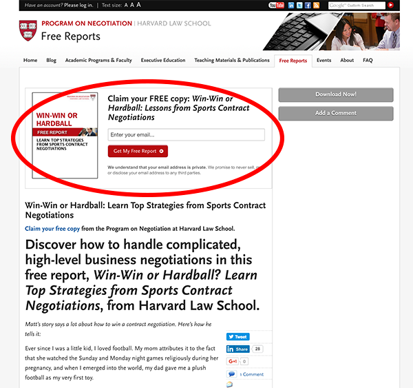
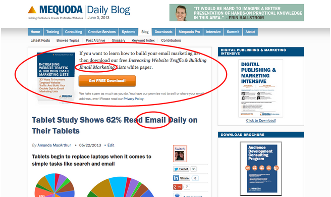
An OFIE is an order form tucked at the top, bottom or in the middle of your editorial, and sometimes your advertorial and promotional content. We’ve had a few best practice versions over the years, but they all do the same thing: collect an email address. If you haven’t read about 3C Zone Architecture yet, read it first.
The Anatomy of an OFIE
The OFIE usually includes four necessary elements:
- An image of the product being given away, with the title font of the image large enough to read
- A boastful headline that includes the title of the product, letting the reader know it’s FREE
- An email capture form and a button to submit, or a button that leads to the landing page where it will be collected
- A notice about whether or not you’ll sell their email address (people don’t like that much)
Optional: When the OFIE is on a landing page, some publishers choose to add a description of the report into the OFIE. We try not to do that on other pages, because it typically pushes too much other content below the fold.
[text_ad]
Where the OFIE belongs
The best thing about OFIEs is that in 2017, Google will becoming more and more mobile-friendly and is asking publishers to refrain from using pop-ups and floaters when displaying content to mobile users. This is something we’re OK with, even though Floaters have historically been so good at capturing email addresses. Why? Because if you design according to our guidelines below, all of your pages will have an email capture in the same place a traditional pop-up would be, except that it doesn’t “pop,” it simply appears front and center above content on mobile devices. It’s still user friendly because all the user needs to do is scroll down to view the content.
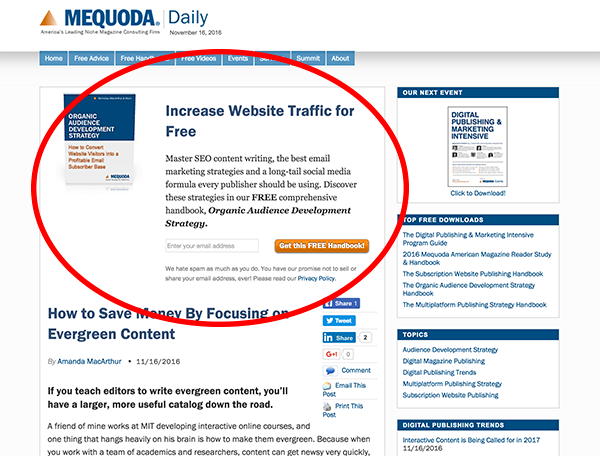
Add OFIEs to your article pages
Article pages make the best places to use OFIEs. Since most of your search traffic goes to article pages, which accounts typically for 65-85% of your web traffic, this is the placement that procures the most number of email addresses.
We don’t just stick it up there and let it go wild (or even sit around like a wallflower), though. On all Mequoda sites, every one of the blog categories has an associated free download — and we recommend you set your site up the same way!
This way, when we write a post about audience development, the reader gets an OFIE that offers a free handbook about audience development. If we gave them an ad for a handbook on how to fix a car, the email capture rates would be dramatically reduced. It’s all about alignment.
OFIEs on your category pages
Category pages get a lot of traction too, which is why we recommend it as a no-brainer to add them to the top of those. This page is especially targeted because the person looking at your category page is seriously honing in on a single topic.
And if you really want to collect their email address and convert them into a subscriber, a white paper or other free download that saves them the trouble of parsing through all your articles will offer a better answer that they might even thank you for.
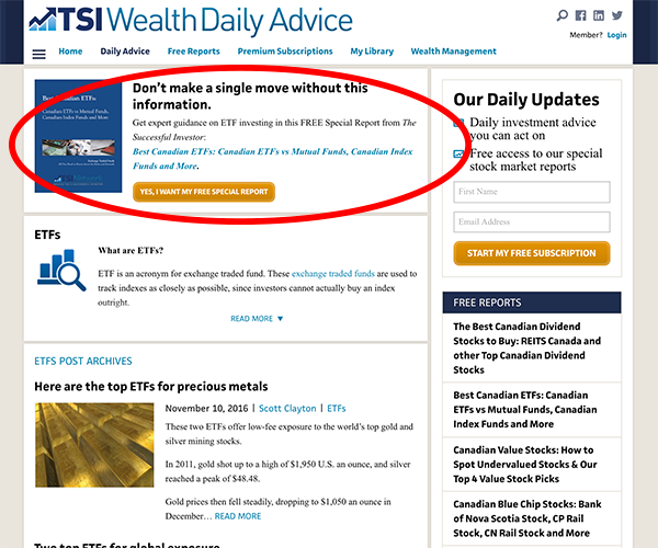
In this example, TSI Wealth Network promotes their guide on buying ETFs on their ETFs category page. Like many publishers, TSI isn’t using a traditional “order form” formula for this OFIE, but it brings the user directly to one, which is actually what the order form style OFIE does as well.
[text_ad]
OFIEs on your home page
Since you can’t display ads based on a category when someone arrives on your homepage, many publishers will rotate through all of their OFIEs in this position. Over time, a publisher may choose to default to one OFIE if it’s generating significantly higher capture rates than the others. A floater is the highest converting piece of website architecture for a home page and is usually paired with an OFIE (except for mobile users).
OFIEs on your landing page
Maybe this is obvious, but the OFIE also belongs on your landing page. It’s consistent with the design of your white paper proposal that they came from and offers an easy transition from the article / home / category page to the landing page where they’ll make the final decision to download it and sign up for your email list. Writing a long landing page is great for SEO, but if someone just wants to subscribe and get their free report quickly, an OFIE at the top of the page will help them do that.
You might be noticing now that, hey, I’ve seen those before, you didn’t invent them!
Nope, we didn’t! We just popularized the acronym! And although you’re seeing them become popular in the past few years, we have been telling you guys to do this for, like, a decade.
Turning OFIEs into emails
According to studies about email capture rates from past and present, most websites see an email capture rate of less than .1%. For publishers who use OFIEs and 3C Zone Architecture, they can expect to see an increase of 21X.
If you have no idea what your email capture rate is, that’s OK too.
Your ECR is a simple ratio: The number of unique visitors who come to your website during a 30-day period, divided into the number of visitors who join your database by signing up to receive your free email newsletter during that same 30-day period.
If during a given month you have 100,000 unique visitors arriving at your website (according to Google Analytics or a comparable measurement tool) and 1,000 of these unique visitors become new email subscribers (according to your email management program or service), your ECR is 1% percent (1,000/100,000 = .01 or 1.0%).
We can confidently guarantee that by adding OFIEs to your site, on these pages, aligned with the content on them, you’ll see a drastic increase in email captures.
And what comes next, well, is turning those email subscribers into buyers, right? Another topic for another day.
