When you’ve gotten past the daunting tasks of getting your emails delivered and opened, your next task is to get your readers to actually read your email newsletter or promotion
The preview pane is the juicy snippet that people see when they click on your email, before the “fold”. Depending on how their email client is set up, they might see the top inch or two of your email, or if you’re lucky, they have the preview pane set up on the left or right, enabling them to a good chunk of the beginning of your email. Most email clients don’t have that last feature as an option (and your users may or may not be informed enough to change it), so don’t go for the gold on that one.
So today I got an email in my inbox that looked like this:
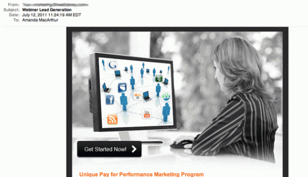
Let’s talk about what a user gets from this email and why they may never scroll down to find out more about the webinar that they’re offering:
- Vague subject line
- No branding
- No description of what I’m supposed to “get started with”
- A confusing non-descriptive graphic
- A jargony headline, at the bottom of the fold
From the preview pane, a user has no idea what’s being offered here and the sender has given the email subscriber no reason to scroll down to learn more.
Now here’s a promotional email from Tim Carter of AskTheBuilder.com, who is promoting a few products and a white paper in this email:
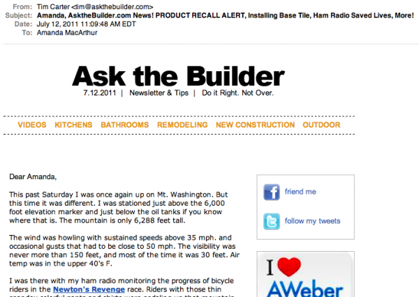 So here’s what a user gets from this email:
- Prominent branding, so the subscribers know if they want to read it
- A conversational introductory letter
- Calls to action for readers to subscribe on Twitter and Facebook
- An ad
- No headline, but a jam-packed subject line
As an Ask The Builder reader, you’re likely to open this email because you know who it’s coming from. You’ll probably also click on the links that Tim tells you to, because he’s just so gosh darn friendly. Overall, this preview pane does a great job at getting the reader to scroll down by starting with a letter, but the only sneak-peek they get as to what’s inside is in the subject line. Truncated to the usual 50 characters, most subscribers won’t get past the PRODUCT RECALL ALERT in his subject line.
Design Arts Daily has no problem drawing attention to their headline with this one:
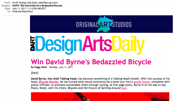 A subscriber to this email newsletter sees:
- Huge, prominent branding
- Bright and readable headline that draws the eye in
- A sneak peak of a photo, likely to get a user to scroll
While the branding elements of this email newsletter may be a little large and pushing down the rest of the content, they certainly don’t hide the headline.
[text_ad]
This next email newsletter is from eMarketer Daily, so it’s no surprise that they’ve got all the right things in all the right places.
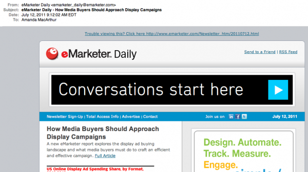
Here’s what the user gets from the preview pane:
- A prominent link to view the email in HTML
- A snippet of an article AND a link to the full article
- Two prominent ads, likely to get great click-through rates
- Lots of opportunities to subscribe via social networks and share the email newsletter
- A huge ad, that may be confused with a headline
eMarketer does a great job at giving subscribers as much as they need above the fold to make a decision, and gives them even more opportunities to take an action before they even need to scroll. The only issue in terms of copywriting is that the ad in this email (which goes to AOL, not eMarketer) is so bold that it may confuse subscribers. The real headline here is “How Media Buyers Should Approach Display Campaigns” which, in dark grey, competes with the bold red font from their graph that follows.
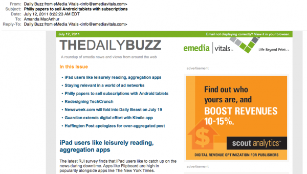
The Daily Buzz from eMedia Vitals offers a jam-packed email newsletter, offering all of their stories right in the beginning, to entice readers to scroll down. As an ad-driven website, they’ve also given ample space for a big square ad to the right as well.
- Prominent branding and a descriptive tagline for the email newsletter
- A whole digest of what’s in the issue
- A bold headline that leads readers into the first article
Overall, this is a great preview pane for a multi-post email newsletter. There is equal space given to every important section of the email newsletter and subscribers should have no trouble finding what they want here.
Photojojo’s super simple and clean promotional template does a great job at amplifying the headline:
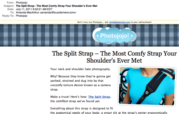
The user gets all of the essentials
- Face-forward branding
- Big, bold, centered headline
- A descriptive text opening
- A teaser image
In terms of a promotional email for a publisher who is product-based, it doesn’t get any more straightforward than this.
In terms of email newsletters go, Real Simple does what they do best – keep it real simple.
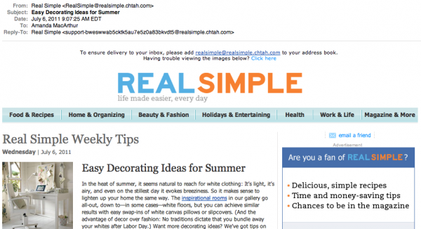 A reader opens this email and immediately sees:
- The brand that they trust and subscribed to
- Easy navigation links to different sections of the website
- A headline for the name of the email “Real Simple Weekly Tips”
- A headline for the featured article “Easy Decorating Ideas for Summer”
- A link to their Facebook page and the ability to share the email
Overall, this email does a fine job at keeping the content rolling. I wouldn’t say that anything in this email jumps out at you, in terms of copy, but they do supplement their headlines with a more intriguing photos, as you can see here.
As a publisher, have you forgotten about the fold, or is your email newsletter and promotional template designed to intrigue a user to read more and consequently take an action?
