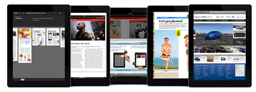
Pros and cons of adding bells and whistles to a basic replica of your magazine
Once upon a time, Mequoda was wowed by Forbes digital magazine.
But, of course, things keep changing every day in digital publishing, and magazine apps are the most volatile of all. Since that time, other publishers have taken apps far beyond mere replica-plus versions, of which Forbes is still a fine example.
The most basic kind of app you can create is the replica magazine. Upload a PDF of your publication to the internet and voila! You’re a mobile publisher.
A digital replica is a version in which print content appears on the tablet screen exactly as it appears on a print page. The layout, advertising, and content are exactly the same as the print version, no more or less, and the pages are accessed by swiping horizontally.
A replica-plus is a replica with some extra bells and whistles added. And normally you’d think that adding things such as video, audio, HTML links, and other technology-rich features would be an improvement to the simple replica. We’re not so sure that it’s a good enough upgrade, and here’s why.
The problem with adding bells and whistles to a simple replica to create a replica-plus lies in one of the disadvantages of the replica that we’ve discussed before. But first, let’s look at the pros and cons of the replica plus.
[text_ad]

Replica-plus digital magazine: Pros
The advantages of the replica-plus are similar to the replica, in that consumers increasingly expect digital versions of their favorite magazines, either because of convenience or because of the “green” factor. What’s more, consumers are also becoming more willing than ever to pay for digital content, though there is still some hesitation about prices that are higher than print.
Also like the replica, a replica-plus edition is easier and cheaper to produce than fancier versions. This makes it a good starting point for any publishers who are late getting to the digital party because of a lack of resources.
Finally, replica-plus editions create an even more audience-engaging environment for advertisers than the simple replica, with all those interactive features. Finally, renewal rates are gradually showing themselves to be higher for mobile editions.
 Replica-plus digital magazine: Cons
If you’ve read our comments in other posts about replicas, you probably recall the major drawback is the small type necessary to shrink a print page down to tablet size. You can pinch out to enlarge the type, but then the page no longer fits in a tablet screen.
This is more than just an inconvenience; it’s a major source of complaint for many consumers we’ve talked to. And it makes your app magazine largely inaccessible to anyone over the age of 40.
So here’s why we believe the replica-plus is not enough of an improvement over a basic replica: It doesn’t solve the type size problem. It just increases the user’s frustration by creating more things he or she can’t see. And when you’re in enlarged mode with part of each page missing, you probably overlook the links and tappable buttons that leads to the videos, audio and other fancy features anyway.
In short, the replica-plus is akin to adding fancy whipped cream, chocolate syrup, and cherries to a bowl of sand. It may look nice but it costs more to create and does little to make the sand more appealing.
Solution to the digital magazine replica dilemma
Instead of dressing up a plain replica with whipped cream, for most magazines Mequoda advocates for something we call a reflow native edition. The reflow native edition allows the type to resize and reflow around ads and images in order to fit on a tablet screen while still being readable. Nothing shrinks. Your fortysomething readers are happy.
Best of all, the reflow native edition isn’t as costly or time-consuming as you might think.
A visual difference
In one replica-plus digital edition we know, there’s a sharing function called “streaming,” which is just a fancy name for social media sharing. You can tap an article title in the TOC (but not on the cover) to go directly to that article. You tap and hold to find all the available links on a page. Oh, and there’s a smooth interface that takes you to the website — from which I never did figure out how to escape. Rather maddening, that. And above all … you still have to squint to see the replica content.
This is what we could call an “eye exam.”

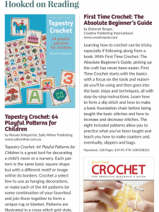
Now check out a page from I Like Crochet, a Mequoda client. Does the original page fit into the tablet screen? Nope. It fits horizontally, so there’s no need to push the content around with a finger to find the beginning and end of sentences. But vertically, the content runs off bottom of the tablet screen, and the reader simply scrolls down to read the entire piece. And, blessedly, even a 50-something can read the type.
If you want to improve your basic digital replica, we do not advise going with the next step that so many publishers seem to believe is logical, the replica plus.
Instead, invest your money in a reflow native edition. Your lovely, user-friendly mobile magazine is going to increase revenues, after all, and it won’t be long before you can afford to add the bells and whistles you long for.
Do you agree that a replica plus is annoying for readers? Or do you think it is, in fact, the perfect next step up from a simple replica? Tell me about it in the comments – but if you love plain replicas, be sure to reveal your age.
This article was originally published in 2014 and is updated frequently.


Reflow technique seems to be very effective way to make great magazine replicas. I’d like to point out that linking photos and screenshots with relevant YouTube videos provides another pragmatic way to tune things up.
Some digital publishing apps interpret YouTube links and play video in the magazine app itself.
For a good example of a “digital replica” take a look at National Geographic on the iPad. The orientation is landscape and the basic design mimics a double-page spread from the print magazine with subtle modifications. Text is scrollable. Video and animations are included as a bonus. Key point is that the reformatting fits the electronic medium while maintaining the inherent quality of the print version.
I’m not an expert on that product but it appears it is is a product that will create replica or reflow editions.
hello, I run a small arts culture magazine in Hull UK
We have published 28 issues on a software called readymag, is this what you mean by ‘reflow’
I’m exploring options of either keeping this format or going to yumpu when I release my print issue that will publish parallel with the readymag version