These six publishers are nailing sponsored content, but all in very different ways
Last week we talked about the guidelines for writing native content advertising, also known as sponsored content. Now let’s take a look at some great examples of publishers who create this sponsored content for their advertising clients.
These particular examples of sponsored content were selected because they were done in such a way that makes a clear distinction between advertising and editorial. Full transparency is achieved between publisher and consumer, which is the number one goal.
[text_ad]
What is sponsored content?
Sponsored content is created by a publisher’s in-house advertising team for an advertiser, and publishes on any number of the publisher’s sites or publications. The content is not promotional in nature, however it is highly designed and branded. For example, when coffee brand Gevalia came to Conde Nast looking for a sponsored ad package, they put their in-house native ad team, 23 Stories, to work (named after the number of floors Conde Nast occupies in the World Trade Center). 23 Stories created an informational and entertaining multi-channel content series called “The Art of Coffee,” establishing Gevalia as a luxury coffee brand, which was distributed through video, print and interactive tablet execution.
Although most often this content is created by the publisher, sometimes the advertiser comes with their own content. And on that note, although most native ad content is sponsored by a third-party advertiser, publishers also write native ads for their own products.
Regardless of who creates the content, we’ve identified eight things every piece of sponsored content should accomplish:
- Create sponsored content that’s as good as your editorial content
- Optimize for search so the advertiser sees the return on their investment
- Write subtle links back to the advertiser
- Include an advertiser and author’s bio section
- Let sponsored content live outside your paywall
- Don’t go for the direct sell
- Do keep style consistent between sponsored content and editorial content (content has proven to perform better)
- Do include the logo of your sponsor (12% increase in click-through-rate)
New York Times
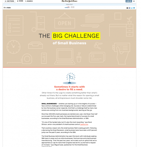
By far one of the best looking native advertisement styles we’ve seen is produced by none other than the New York Times. In this example from Capital One, the content speaks to small business owners and their financing struggles, while using quotes from executives at Capital One to help and support their pain points. Meanwhile, the design is outstanding, while still clearly labeled as sponsored throughout. It’s more than an article, it’s a work of art that any reader would enjoy reading. It’s broken up into sections, animated, with pull quotes and graphics that bring readers from beginning to end. It’s produced by NYT’s internal team, called BrandStudio.
There was minor backlash on Facebook about this ad, calling it click-bait, but the article wasn’t the issue. The NYT changed the title of the article in the Facebook meta data to be about how to keep employees satisfied, when the post content was very different. Lesson learned: By all means test headlines when you promote sponsored content in social, but don’t trick people into clicking. It doesn’t look good for you or your advertiser.
Wired
But this isn’t the first good-looking native ad we’ve seen, in fact Wired and Netflix teamed up for this hugely interactive (possibly a bit too interactive and somewhat distracting) native advertisement. This ad was an incredible branding effort, with interesting insight on the state of television right now. It almost reads like a digital magazine, with pagination at the top of the page. A bit over the top, but it got a lot of buzz, and as you can see, is FTC compliant with all its labeling. Netflix also signed up for native ads with the New York Times, which are less flashy but more readble, like the example above.
Quartz
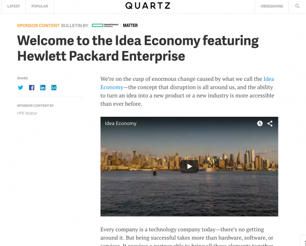
In this sponsored content for Hewlett Packard on Quartz.com, it’s clear that the content is sponsored. The IT industry-related content may be relevant to their tech-savvy readers and is informative. At the bottom they make it clear that the native ad was written for the sponsor by the Quartz marketing team and not the editorial staff.
The best practice today is for native ads to be written with full transparency. It’s crucial for the native ad to have content contextual and relevant to the publication, disclose itself as sponsored content, be subtle, display signs of its sponsors, and provide some kind of expertise so as to help inform consumer decisions about possible purchases, among other best practices. These will earn mutual respect between publisher, advertiser, and consumer.
Metro Parent
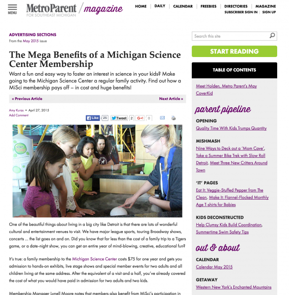
In this native ad for the Michigan Science Center on Metro Parent, the content couldn’t be more relevant to its audience of parents in southeast Michigan. The ad has just one link back to the advertiser, but all the while convinces parents of the reasons why they should buy a membership. This is a great example of why native ads should have helpful content. Other stand-out examples from Metro Parent include Raising a Critical Child, a native ad by a local private school, or Pediatric ER vs. General ER: How Do They Compare? a native ad from a local hospital, or Finding the Right Fitness Club for Your Family, a native ad from a local fitness club.
In an article on native advertising best practices published in 2014, Contently reports that 33% of consumers respond favorably to native ads on reputable apps and websites. Yet the opposite was true for those publications. A reported ⅔ of consumers lost faith in those publications that promoted sponsored content. Why? They’re probably not doing it very well. IAB’s recent consumer survey on sponsored in-feed content showed that 82% of consumers enjoy native ads as long as they show clear subject matter expertise, and 60% of consumers enjoy sponsored content as long as it tells a relatable human story.
The Atlantic
Despite The Atlantic having the most notoriously critiqued native ad in the history of native ads on their site several years ago, they’re doing much better now. This native ad for IBM is similar to how all native ads on The Atlantic look. There’s a banner ad for IBM up top, and more ads down the right rail. The words “sponsor content” is highlighted in yellow at the top, and David Laverly of IBM bylined the article. There is one link back to IBM in the middle of the post, and two links to the IBM blog, where the article was originally published, at the bottom. There’s a concise author and sponsor bio.
All of these markings are key to meet FTC guidelines, who has been actively reviewing native advertising rules and regulations due to their popularity, invoking Section 5 of the 1914 FTC Act. When it comes to native advertisements publishers should familiarize themselves with Section 5 and the “Deception Policy.”
USA Today
In this example on USA Today, which we’ve used many times because it’s so well structured, the news article is being sponsored by G/O Digital, and it’s clearly stated at the top of the article, in the byline and at the beginning of the article. G/O Digital also receives a banner ad on the article itself. The article is completely wrapped in advertising so that the content itself isn’t compromised and can remain high-quality for the user.

At the bottom of the article, there is yet another clarification that the article is sponsored.

Taking all of this into consideration will allow you to write effective native ads for a sponsor, while making sure your audience doesn’t feel exploited or deceived. When your readers win, your advertisers win, and you win too.
If you have more examples to share, please add them in the comments, we’d love to see them!

