TIME’s new app upgrade makes a good read also an easy read
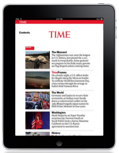 At last.
We’ve noted here that it seemed simply astounding that a publisher with the vast resources of Time Inc. was putting out a blurry product. TIME magazine – granddaddy of all American news publications, 90 years young, and one of the few major players with a healthy OMI, was, until its Nov. 4 issue, publishing non-retina display enabled issues.
According to Webopedia, “Retina Display” is an Apple marketing term that refers to devices and monitors with a resolution and pixel density so high – roughly 300 or more pixels per inch – that a person is unable to discern the individual pixels at a normal viewing distance. That makes for crisp text and gorgeous photos.
And by not supporting the technology of the world’s most popular mobile devices, TIME has been shooting itself in the foot. Of course, as one industry observer noted, “TIME has always been way behind the trends in iPad editions.”
Still, we do wonder why TIME has been so slow in adding this technology when it clearly had the resources to do this all along. (I read a lot of digital magazines, and I can only remember one other that was pixelated. And it certainly wasn’t a magazine of the stature of TIME.) Do you have any thoughts on this? Or do you think it doesn’t make a difference to such a well-known brand to be behind the technology curve? Let us know in the comments below.
In any case, if you read TIME before its new app was released, it was an astonishing experience. Both images and text appeared as if in soft focus … in an age when highly sophisticated technology is available in the cheapest toy in the store.
TIME was “pixelated,” that is, serving up imagery with a resolution far lower than the pixel density that iPads – by far the most popular tablets, as we all know – were designed for. If, for example, TIME was designing in web-based imagery at 72 dpi, its magazine would look dreadful on the base model iPad at 132 dpi, and even worse on a retina device at 264 dpi.
TIME may also have been creating its magazine only for a non-retina iPad and trying to scale the same issue up to retina display, which is a cost-saver, but again, results in serious pixelation.
Says Mag+ co-founder and creative director Mike Haney, “Each publisher has to determine what level of investment makes sense for the mobile app at hand, but designing specifically for the device in question whenever possible will lead to optimal viewing quality.” And Time Inc. certainly had no excuses when it came to having the resources to design for the leading iPad model.
SO welcome to the 21st century, TIME! Mequoda believes that in this era of industry transition, publishers must do everything within the limits of their resources to shine, so we’re happy to see this critical improvement.
The upgrade also includes bookmarking capabilities – another shocking omission from the old app – and a “seamless auto-archiving feature.”
Now we can take a look at the rest of app’s features to see how they stack up to Mequoda’s Best Practices.
TIME digital magazine publishing – Best Practices
Before we get to the Best Practices, it’s worth taking a quick look at TIME’s faltering circulation. Its biggest spike since 2009 came in the year after the digital magazine was first launched.
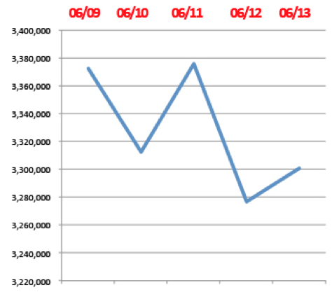
We’ve already given our best shot at advice to TIME on surviving when weekly news magazines seem to be a dying breed. And industry observers are dubious about the most recent decision to have editors report to the business side of the organization, rather than to the editor-in-chief. While it might be a good thing for revenues, these things never end well for journalistic integrity.
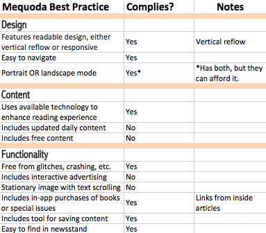
That said, here’s how TIME’s digital edition now stacks up to our Best Practices.
Design
1. Magazine features readable design, either vertical reflow or responsive, plus retina display. YES
We’re adding the retina display feature to this category, and of course TIME now meets this criteria. It also features horizontal reflow to make the text large enough for comfortable reading.
2. Magazine is easy to navigate (tap from cover teaser directly to article, user’s guide, scrubber bar and instructional icons). YES
We’ve added a new criterion – which comes from our experience producing digital magazines for a client – that allows readers to tap on a teaser on the cover and go directly to that article. After all, how often have you picked up a print magazine, lured by a particular article touted on the cover, and been frustrated by the effort to find it?
Not only does TIME have this feature, it also allows readers to go directly to articles by tapping in the table of contents. That has always seemed like the most natural thing in the world to expect from a digital magazine, but few offer that function.
TIME also meets our other criteria for navigation. Nice job!
3. Magazine uses either portrait or landscape mode, preferably portrait. NO*
TIME, with the resources most publishers can only dream of, has spent the extra time and money to enable both modes. Our Best Practice to choose just one is aimed at the niche publishers we work with, who don’t need to waste resources on getting both modes enabled. (* TIME does both, and did them well, so we’re going to cut them some slack on this one.)
Content
1. Magazine uses available technology to enhance the reader experience. YES
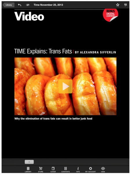
Videos, extra content and photos that are not in the print version, and more populate the TIME digital edition. In the latest issue, you can even view parts of the infamous Zapruder film of President Kennedy’s assassination, if you can stomach it.
2. Magazine includes updated daily content. NO
While this is less crucial for audience engagement for a weekly than it is for a monthly, TIME couldn’t do itself any harm by adding such content, and it assuredly has the resources to come up with some content.
3. Magazine app includes free content. NO
TIME can afford it, and free sample issues are also powerful marketing tools. This is a disturbing oversight, and a real missed opportunity.
Functionality
1. Magazine app is free from glitches, crashes or other technical problems. YES
Although dozens of reviewers pan the new app for losing their archived issues, I had no problem whatsoever. The new iOS upgrade is also one of the factors in other glitches I saw mentioned (as it is for many other magazine apps), which can’t be held against TIME.
2. Magazine with advertising includes interactive advertising. NO
After recently exploring interactive advertising in Bonnier publications, static ads seem practically 19th century to us. Again, TIME has the resources to create and sell this advertising, so why wouldn’t it? Then again … just getting the retina display has taken them forever, so I suppose TIME isn’t about to become cutting-edge any time soon.
3. Magazine features images that remain stationary when text is scrolled. NO
This is fantastic technology, used by many a smaller brand, and in addition to the coolness factor, it can be used to sell pricey advertising – what buyer wouldn’t want their ad to remain in front of a reader throughout an entire article? Another missed opportunity.
4. Magazine offers in-app purchases of books and/or special reports. YES
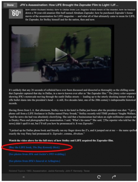
TIME hits a home run here – which we would certainly expect given the vast supply of books and special issues Time Inc. has amassed over the decades. And instead of just slapping an icon into the app’s store, TIME includes links to other products inside related articles, ratcheting up the desirability factor for readers.
You’re much more likely to buy the LIFE book The Day Kennedy Died when a link is placed right inside TIME’s reflection on the Kennedy assassination and you’re already deeply engaged in the topic. (All the more reason to offer free content in the app.)
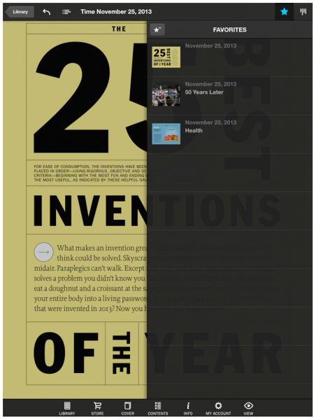
5. Magazine has a tool for saving content. YES
It’s a good thing we’re reviewing the upgraded app, because the “Favorites” function was just added. Still, give TIME credit, this seeming no-brainer of a feature is elusive, even in otherwise stellar digital editions.
6. Magazine is easy to find in the Apple newsstand. YES
Of course it’s easy to find. It’s TIME. The news category is at the top of the newsstand, and TIME is naturally one of the featured magazines in the category.
Again, we’ll congratulate TIME for entering the 21st century at last, and making improvements that were long overdue. Hopefully some additional technology will be added in something less than the three years it’s taken since the last significant upgrade.


Thank you. I’m glad you liked it. We spend a good amount of time researching and writing these posts.