Off-the-shelf design includes plenty of bells and whistles
Now that Mequoda has quantified its current list of best practices for digital magazine publishing, I can present to you a sterling example of a digital magazine that meets most of our standards.
Popular Science, founded in 1872 and now owned by mega-publisher Bonnier Corp., is the fifth-oldest continuously published magazine in the United States. But as old as it is, its focus on cutting-edge technology has served it well, allowing it to stride into the digital age with authority.
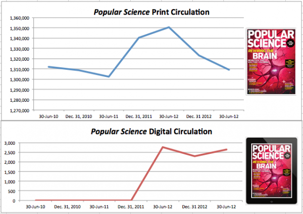
Of course, like most magazines, PopSci suffered from the usual decline in overall circulation in the past few years. After hitting a low in the first half of June 2011, and with its digital app fully up and running, circulation recovered in 2012, only to decline again from 1,350,685 this time last year to 1,309,176 as of June 30 this year – still lower than circulation as of June 30, 2010.

Early versions of its app were, predictably, buggy – and PopSci raised consumer ire by selling single issues only at $4.99 a pop, while a print subscription was still $12. But things have improved; though digital circulation has declined slightly from a year ago, as of June 30 it has recovered from a low six months earlier.
[text_ad]
A look at the state of the PopSci digital edition:
Subscription offers are a mixed bag.
A print subscription is still (sigh) a measly $12. On the iPad, a combo subscription costs $19.99, a digital-subscription only is $14.99, and if you’re already a print subscriber, you can add the digital edition for $5.
This iPad combo offer on the website has the added advantage of harvesting PopSci customer emails, credit cards and other marketing data that Apple doesn’t share, notes Subscription Site Insider. Unfortunately, the offer hasn’t been particularly popular, which Subscriotion Site Insider speculates is because “it’s not prominently featured on the site.” I would concur: If you subscribe to the print edition on the site, there’s no mention whatsoever of digital editions.
As for other newsstands, Amazon and Google offer no combos, just the digital-only price. Zinio sells all versions, again without a combo offer. And Barnes & Noble only sells single issues, now priced to sell at $1.99.
The low subscription prices are dismaying in an age when other publishers are finding consumer now willing to pay more for their digital magazines, and some have even managed to occasionally raise their print prices, too. My bet is that the early barrage of complaints from consumers in 2010 about what is now an average single-issue digital price is what drove this bargain-basement decision. With the quality problems worked out, we would encourage PopSci to test raising this price.
PopSci digital is a Mag+ off-the-shelf (OTS) product, which offers a limited number of choices in design, as opposed to its Software Developer Kit, which offers unlimited design choices. As I’ll show you in a moment, though, the OTS version is perfectly capable of meeting Mequoda’s Best Practices.
As for the website, unlike other large publishers, PopSci doesn’t offer all of its magazine content for free there. Instead, two-month-old magazine content is available to non-subscribers in its own category, readily accessible from a tab in the navigation bar.
Measuring PopSci by Mequoda Best Practices
| Mequoda Best Practice | Complies? | Notes |
| Design | ||
| Features readable design, either vertical reflow or responsive. | Yes | Vertical reflow |
| Easy to navigate | Yes | instruction page, scrubber bar, instructional icons |
| Portrait OR landscape mode | No | Both used; some features require landscape viewing |
| Content | ||
| Uses available technology to enhance reading experience | Yes | Possibly too much technology |
| Includes updated daily content | No | |
| Includes free content | Yes | |
| Functionality | ||
| Free from glitches, crashing, etc. | Yes | Updated July 2013 |
| Includes interactive advertising | Yes | |
| Stationary image with text scrolling | Yes | |
| Includes in-app purchases of books or special issues | Yes | |
| Includes tool for saving content | No | |
| Easy to find in newsstand | No |
Design
1. Magazine features readable design, either vertical reflow or responsive. YES
PopSci uses vertical reflow. According to Subscription Site Insider, another nice feature is that PopSci offers two different iPad versions, one for high retina display, and one for non-retina display, so that no user has to suffer the blurred images and type that high-retina display can cause when viewed on a low-retina device.
2. Magazine is easy to navigate (instruction page, scrubber bar and instructional icons) YES
PopSci features all three.
3. Magazine uses either portrait or landscape mode, preferably portrait. NO
Mequoda believes that spending money on both modes is a waste of resources, and PopSci does have both, including layouts that must be viewed in landscape mode. Perhaps, Bonnier has resources it can afford to waste.
Content
1. Magazine uses available technology to enhance the reader experience. YES with caveat
Among the smart uses of digital technology utilized by PopSci are a dropdown table of contents that’s accessible from every page in the magazine, and videos to illustrate how things such as robots work in motion, instead of still photos.
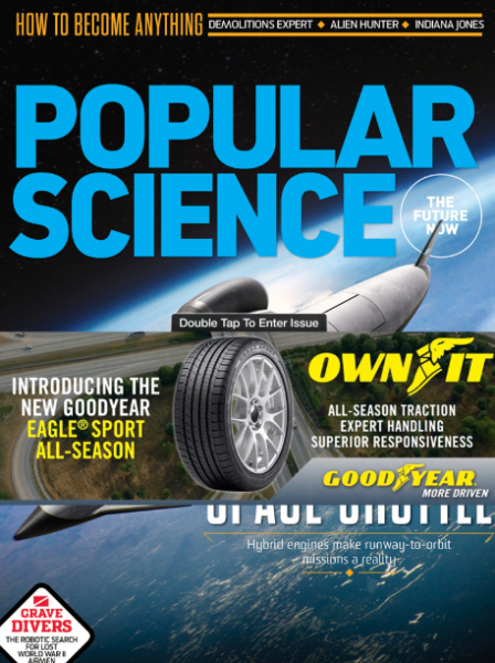
Caution: PopSci is also using technology in ways that are probably annoying to more readers than just me. One is the use of videos to bring the cover alive, which, while entertaining the first time, is aggravating in the extreme when you’re forced to watch them every time you “open” your issue.
Another is the use of video advertising … on the cover. Again, this video can’t be stopped, and it leaps into action every time the reader accesses the magazine.

2. Magazine includes updated daily content. NO
A rare misstep for PopSci. Mequoda believes that updated daily content, such as that used in New York magazine, keeps readers more engaged and loyal with your brand than simply accessing content once a month. PopSci has the resources to post daily science news, so we’re surprised the publisher hasn’t thought of this already.
3. Magazine app includes free content. YES
As I’ve noted in the past, readers often complain when a “free” app turns out to be nothing more than a sales outlet for the magazine. PopSci includes at least one piece of free content: a compilation of some of the best features of the past few months.
[text_ad]
Functionality
1. Magazine app is free from glitches, crashes or other technical problems. YES
The current version, 4.2.1 dated in July (“What’s New: News and Alerts button no longer crashes the app!”), is too new to have many reviews, but the ones that are there are positive. I didn’t experience any problems.
2. Magazine includes interactive advertising. YES
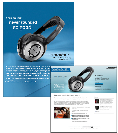
And plenty of it. Tap anywhere in a Bose headphones ad and you get an order form complete with price, which is notably absent in the ad itself.

3. Magazine features images that remain stationary when text is scrolled. YES
PopSci doesn’t utilize this function with advertising, and we hope to see publishers doing so soon, but the function is used cleverly in editorial content. Not only does text scroll, but new sidebars appear next to the stationary image.

4. Magazine offers in-app purchases of books and/or special reports. YES
5. Magazine has a tool for saving content NO
6. Magazine is easy to find in the Apple newsstand. NO
As I’ve noted, it’s just as important to set up your digital magazine for optimized search in the newsstands as it is online. I searched the three separate phrases in PopSci’s website page description, New Technology, Science News, the Future Now, and had no luck whatsoever. And, to my surprise, it’s listed under the newsstand’s Entertainment category, instead of Science!
If your magazine is failing in this like PopSci is, check out Mag+’s tips for improving your optimization here and here.
That said, from what I’ve been reading lately, there’s adequate room for suspicion that the Apple newsstand is a quagmire and not necessarily set up at this point to allow proper optimization. Still, that’s even more reason for publishers to do whatever they can and not be sloppy about it.
All told, Popular Science appears to be doing many things right, and now that earlier problems with their digital magazine seem to be fixed, we can hope that their circulation continues to rise. Check back with me a year from now so we can all see how they do!
In the meantime, let me know how you feel about their digital magazine and our Best Practices. Agree with me? Disagree? I can handle it.


Hi Linton, check out the video survey we recently did about tablet usage, our 60-something aged participant was the one who liked digital magazines the most! 🙂 http://www.mequoda.com/free-reports/mequoda-tablet-study/
Print is past , present and future for older magazine subscribers. I am almost 69 years old and I remember when PS was 25cents at the newsstand and close to 200 pages. I did not renew in July 2013. I decided to opt out before all I would get is a front and back cover – the magazine hardly makes it to 100 pages these days. I did the same thing with ADigest 2 or 3 years ago. Load up the magazines with ads if you have to to pay the bills. For years I would first scan through the ads and pictures before reading articles. Old mags, complete with all my notes and scribblings remain a large and treasured part of my library – emags can’t replace that. In my opinion digital versions should be free advertising for the printed pages.
Well, we like to have faith, Greg. And we certainly don’t believe that print is the future, so we’re focusing on digital going forward!
Wow. 3,000 digital subs out of a total circ of 1.3 million. Less than 0.25%.
That’s what passes for success in digital publishing these days.