I Like Crochet may be a glimpse of the future of magazine publishing
It’s a good thing consumers know their own minds, because the magazine industry might have completely failed its readers in the years since the Internet age was born.
That’s the conclusion you reach if you talk to our CEO, Don Nicholas, about what he believes is the industry’s first-ever website magazine – a complete turnaround from the long-held industry belief that readers would never consume typical magazine content on a desktop or laptop computer.
And it’s the reason Mequoda’s longtime client, Prime Publishing, has just launched that revolutionary website magazine, I Like Crochet. I Like Crochet magazine is available both as a website edition, complete with page-by-page navigation and a linear, magazine reading experience, and as an Apple app edition.
“It’s the next generation of web magazine publishing,” Don says.
“How many times have I said, ‘Your magazine is not a website, and your website is not your magazine’?” he notes. “We simply didn’t believe consumers would ever read magazines on the Web. So we’ve spent years building magazine portals on the Web, with free content and a hyperlinked, topic-based experience.
“We thought readers would only spend a few minutes at their computers reading content,” he explains. Conventional wisdom also held that readers would never do anything other than “snack” reading on smartphones, either.
“But now, after 10 years with the Internet and more than three years with tablets, we found we had data showing that people are reading long-form content not just on tablets, but on smartphones. And that blew all our assumptions out of the water!
“Maybe,” says Don, “we abandoned the Web too quickly.”
[text_ad]
The grand experiment
When Prime founder and publisher Stuart Hochwert, who had been a client of Don’s in the pre-Mequoda days when Don was running Blue Dolphin, decided to launch Prime in 2009, he naturally called on Mequoda to help him build his group of advertising-supported cooking and crafting websites. And by now, Hochwert has learned the Mequoda multiplatform publishing method so well, he’s become a Mequoda Master. Prime boasts a whopping 5.7 million subscribers.
None of Prime’s 17 craft websites and 13 cooking sites have a legacy print magazine behind them. So, in a move that’s also highly unusual in the industry, Hochwert decided to take a step backwards, so to speak, and add a digital magazine to his stable.
Says Hochwert, “Until now, we had no premium product to offer our readers who wanted a higher level of access to unique and exclusive patterns and advice. With the launch of I Like Crochet, we now have a paid subscription magazine to meet that need.”
It was the right moment to ask Don to help with a digital magazine. With his new idea about website magazines on his mind, he enlisted Prime to be “a grand experiment in digital publishing.”
“I’m excited beyond imagination about this,” Don says, “and I’ll be forever grateful to Stuart for being willing to enter this grand experiment with us. We couldn’t ask for a better partner – one with an incredibly high quality of content, who is an out-of-the box thinker and willing to take risks.
“Prime has been a phenomenal partner for last nine months, with us sharing all of our thinking and data about the best web magazine, and with them asking questions, making critical improvements and executing this next-generation, revolutionary product.”
Don notes that he doesn’t consider flipbook magazines available on the Web to be true website magazines. These magazines, he says, are certainly a good first effort by publishers to use the Web as a magazine platform. “The industry has always been on the right track.”
Unfortunately, flipbooks tend not to be particularly reader-friendly, offering a poor user experience, which is reflected in the reader engagement data showing readers usually only stick around for 8-10 minutes with a flipbook edition of a magazine (versus 50-70 for a typical print magazine). But more importantly, flipbook content can’t be reformatted into an associated library, as I Like Crochet’s content is. “Flipbooks were the first generation of digital magazines,” says Don. “This is the second generation, and a big step forward.”
Mequoda and Prime have literally reinvented the magazine on the Web, with I Like Crochet’s page-by-page navigation and searchable library. Says Don, “We believe we’re making history here … we can’t be sure, because few turning points are ever recognized at the time, but I hope I Like Crochet will be a historical turning point in the magazine publishing industry.”
Of course, if someone else believes they’ve gotten to this point first, we’d love to hear about it, so please let us know in the comments! We’d certainly be thrilled to acknowledge someone who caught on to this consumer desire for a true website magazine even sooner that we did.
[text_ad]
Reading I Like Crochet on the Web
Unlike a portal, the I Like Crochet website is designed to be experienced exactly like a magazine. At a portal, the user generally arrives as the result of a question she wants answered. Once at the page her search for answers led her to, there are also related articles available by hyperlink that she may also read.
But having answered her question, the portal user is usually done with the website after only a few minutes. At Mequoda we think of this as an “instructional” or “how-to” experience. But at I Like Crochet, a reader finds the issue date and a table of contents, and is invited to enjoy a linear “discovery” experience like any other magazine, in which there is a table of contents and she can navigate page by page (although without the page turning sound and graphics that make the flipbook magazines so user unfriendly), instead of by topic, to find out what’s next.
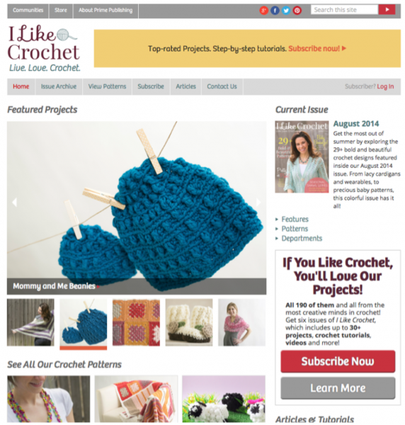
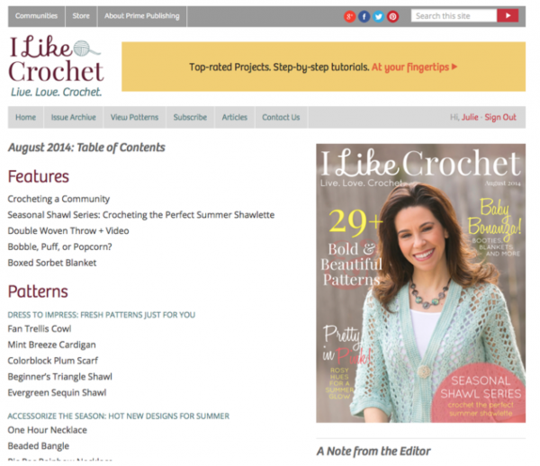
Clicking on the issue cover at the top of the right rail brings you to the table of contents, where the reader can click any link to go directly to a particular article.
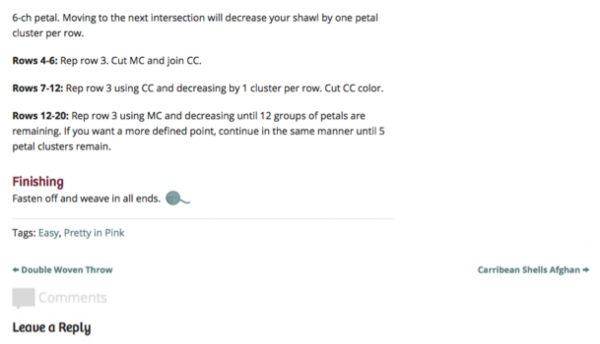
Clicking to the first item on the list gets the reader right into the issue, and from that point, all she has to do is click on the title/arrow at the bottom of the page to go forward or backward one “page.”
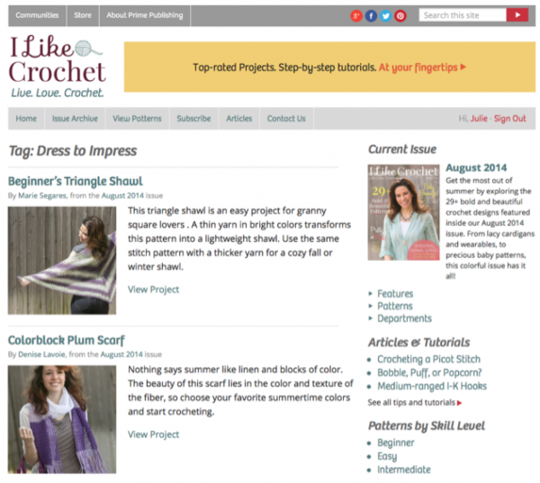
Of course, she can also click on the section titles to get thumbnails of all the projects in that section.
And there are still more navigation choices: Click on “View Patterns” in the navigation bar, and everything is organized by type – afghans, baby items and so on.
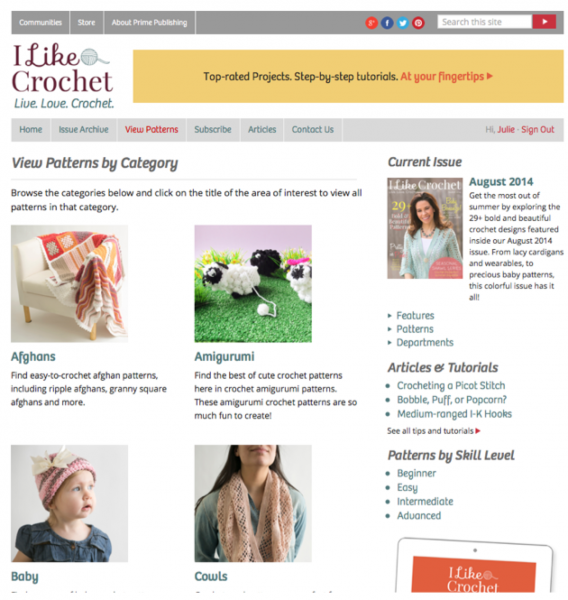
The reader can spend an hour or so with the I Like Crochet website magazine, just as she would with an app edition. But she can also access the pattern library to access all of the magazine’s past content via search, which makes I Like Crochet exceptional.
The library is exclusive to the website edition and is not available within the tablet edition – though, of course, many readers will actually access the website edition from a tablet, which is why Mequoda now refers to the tablet edition as the app edition.
The content in I Like Crochet is something that subscribers to Prime’s free website, Allfreecrochet.com, have requested: exclusive, high-end designer patterns, available first or only to I Like Crochet subscribers; professional photography and videos; and no advertising.
The magazine is also aligned with three Mequoda-format portals to drive subscriptions.
The Web edition offers access to I Like Crochet for every browser. The tablet edition is available on the iOs 7.0. It is powered by technology provider Mag+ and by Mequoda’s Haven Nexus CXMS to control access and entitlements.
At Mequoda, the project was led by CTO and Lead Architect Aimee Graeber. Graeber notes that this project was unusual because it’s not bound by any expectations from a legacy print magazine.
“Usually, when we’re talking about a tablet magazine we have to reconcile future goals and technology with current design, editorial, and staffing. In this case, we worked with Stuart and the team at Prime to create an entirely new magazine from the ground up, taking advantage of all our current best practices,” she says.
Naturally, the new magazine is priced according to another of Mequoda’s Best Practices – contrast or decoy pricing: $19.97 for the tablet, $29.97 for the website edition, and $34.97 for both. This pricing policy makes it easy for the subscriber to choose the most expensive option, which appears as an undeniable bargain.
[text_ad]
Reading I Like Crochet as an app
Naturally, the Mequoda team was thrilled with the opportunity to implement our app magazine Best Practices. These are some of the highlights:
Use of technology to enhance the reader experience
You can’t do this on paper: As you scroll through the instructions, schematics and stitch diagrams appear that you can tap to enlarge. Even older eyes will have no trouble seeing the diagrams properly. No squinting required!
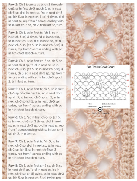
There’s also a professional video for one of the projects in every issue.
Finally, a simple tap on a cover teaser takes you directly to the table of contents with the article you tapped appearing at the top of the page. Tap the title, and off you go directly to that project. A magazine reader’s dream come true.
Includes free content
In this case, the included free content is a free newsletter. This is a new idea for Mequoda, and one we hope other publishers will adopt. If you’re familiar with the Mequoda Method, you know we always try to capture the email addresses of random visitors to subscription websites to keep them engaged with our free newsletter, and to build a list to which we market our paid products.
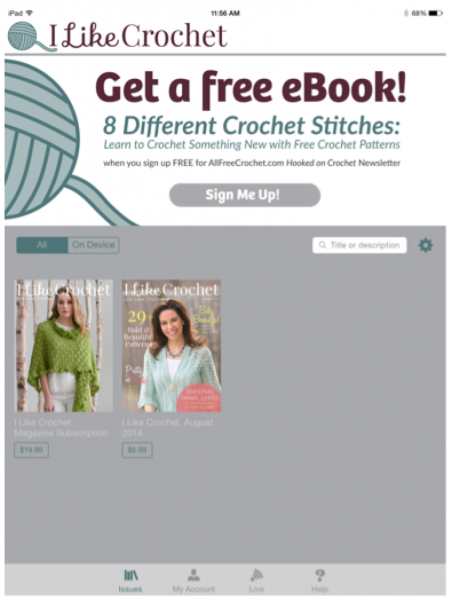
I Like Crochet has stepped it up a notch: The first thing you see when you download the free app on your tablet is a large banner, similar to the floaters and OFIEs we use on websites, that promises a free ebook and newsletter – in this case from I Like Crochet’s free sister site, Allfreecrochet.com – in exchange for an email address.
Even if a potential customer doesn’t buy an issue, you still have a shot at getting her email address to do all of the good things I just mentioned.
Features images that remain stationary when text is scrolled
That professional photography of the finished product mentioned above? On the website edition, it’s to the right of the instructions. In the app, it’s also to the right, and that’s exactly where it stays while the instructions scroll merrily by. You never have to flip back from deep in the instructions to doublecheck on the finished product photo!
BONUS: After you’ve scrolled a bit, the image changes to a lovely closeup of the piece, so users can see those tiny stitches in larger-than-life size.
DOUBLE BONUS: Tap the image twice (as instructed along the edge of the page), and the text disappears so you can get a good look at that part of the piece that’s normally covered by the text. Double tap again, and the instructions reappear.
Easy to find in the Apple newsstand
Well done! On its first day on the newsstand, and in an incredibly crowded field (I never did reach the bottom of the search results for “crochet”), I Like Crochet is already on the third page of results.
Altogether, this pairing of traditional app and revolutionary website magazine should be fun to watch. In fact, we invite you all to watch with us, and we’ll certainly be reporting back to you on our progress. “Unintended things will happen, and we’ll learn from them. And some things we expect won’t happen,” says Don. “But in the end, we’ll keep revising I Like Crochet to get the perfect linear magazine experience on the Web.”


We recently adopted a similar approach without the app and chose the 100% free to reader model (advertiser supported)
We integrated our digital only magazine with our website http://www.unsealed4x4.com.au, directing each feature to the appropriate section/page of the magazine. Each feature has both categories and tags which allow our readers to effectively filter the content that they are interested in at that time, from any issue regardless of volume/edition.
We will allow the scope to narrow even further over time once the content builds.
Another aspect of publishing in this way is that it allows us to have some of the content available for engines to index whilst still keeping the traffic where we want it (in the magazine)
This allows our organic traffic to have a better experience of our magazine and only leave the site experience to view a fullscreen version of the magazine if they choose, otherwise the environment stays the same.
This is very new for us and I would really appreciate thoughts, feedback or suggestions on how we could improve further.
Thank you Bill and Les.
Les — the merchandising will be a work in progress. The Apple edition does have free content, even though it doesn’t have an actual sample issue. As we accumulate some back issues the offer will almost certainly evolve.
Sounds great, shame there was/is no “free example issue” or link to one in the article (or indeed on website/subscription page that I could see) “try before you buy” has always worked well in my book of subscription building 😉
I am wondering how well it works on smartphones ? iPhone in particular if accessing website (or maybe the App versions are for that?).
Really need to see and experience it to add worthwhile comments feedback (link appreciated) – or maybe this is a clever guise to generate paid subscriptions ?? lol
All I read about this niche hit all the right notes – I compare my niche (printmaking) with crochet so this is a great metaphor for our future online magazine for printmakers. Thanks, Mequoda, for passing it along.