When it comes to digital magazine publishing, Men’s Health is quite robust
This digital product is hot, hot, hot
It’s always a good time when a woman gets to read a men’s magazine as part of her job.
I swear I was researching whether Men’s Health advertises their digital edition on their website when I got sidetracked by the “100 Hottest Women of All Time” feature – I just had to know what millennials know or care about anyone not currently starring in primetime TV or the latest action movie.
(Quite a lot, it turns out: silent star Clara Bow, 1950s glam Hollywood hottie Rita Hayworth and a dancer I never even heard of from the 1930s were all included, right along with all the usual supermodels and Hottie #1 Jennifer Aniston. Color me surprised!)
But back to Men’s Health digital, the scholarly subject of today’s blog. Christopher Pine graces the print cover, and the iPad edition boasts some fun behind-the-scenes photo extras of that exceptionally hot young Captain Kirk and … OK, I really got sidetracked there.
Right, then.
With a digital circulation of 76,462 reported to the Association of Audited Media as of December 2012 – 4.5% of its total circulation of 1.9 million – Men’s Health is a leader in the digital space. It was one of the earliest magazines to go digital, and its experience shows. This is one hot digital magazine.
[text_ad]
Digital magazine publishing for digital natives
Men’s Health has a fairly young demographic, meaning their primary audience is what we call digital natives – people who’ve never known a media world without computers, laptops, smartphones and tablets. The Rodale publication appears to be meeting that challenge well.
There are hundreds of reviews of the digital version, almost all of them from loyal Men’s Health readers, judging by their comments, and almost all of them glowing. Trust me, this is not the norm. Every week I see scathing commentary from regular magazine readers of various apps from around the magazine industry. Digital magazine publishing isn’t as easy as it looks.
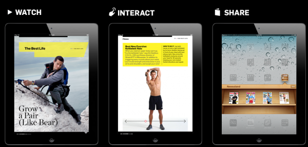
It’s easy to see why readers love digital Men’s Health. Excellent use of the technology shows up the minute you download the app. While there’s no free content in the app – which is a shame, as I opined last week – you do get something I haven’t seen anywhere else, at least not yet: An awesome video preview of the newest issue featuring the magazine’s editors extolling the highlights of the issue.
This makes one ponder the sad possibility that even magazine editors will now be judged by how young, good-looking and camera-friendly they are instead of being hired for their actual editorial skills, like all those plastic TV “news” anchors … but I digress. It was certainly a more compelling preview than just scrolling through a static table of contents.
Interestingly, Men’s Health also employs a digital layout we’re only just beginning to see in the industry. Instead of horizontal, right-to-left swiping throughout, Men’s Health uses the traditional swipe only for the first page of every article and for all ads. To read the rest of each individual article, you swipe up and the article itself is laid out vertically.
New York and Consumer Reports both use this layout, and I personally find it easy and intuitive, despite the fact that it’s completely different from the print experience.
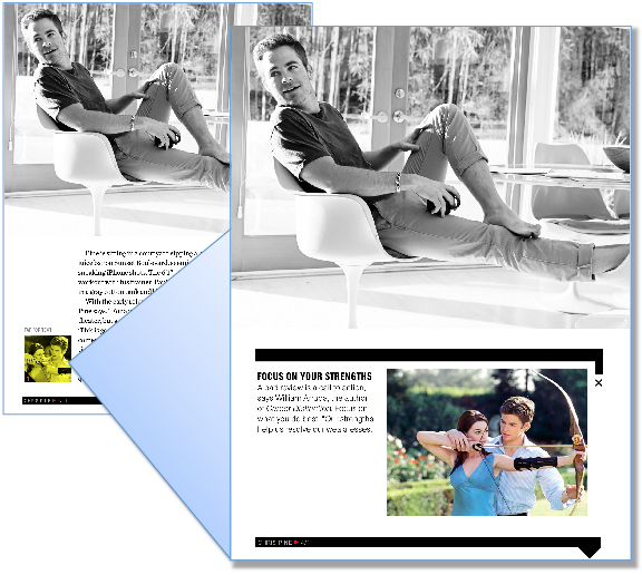
In addition to the behind-the-scenes photo gallery from the main feature that I mentioned above, the digital version also offers other fun things. The Christopher Pine feature, for example, is supposed to be telling readers how they can achieve their career goals in the same way as the actor. When Pine explains how he over came certain challenges, on the same page you’ll find a small image in the corner that you tap, and you’re rewarded with related advice from a career expert.

[text_ad]
Price, promotion and partners: More than healthy
When it comes to other crucial components of this product, the magazine is in pretty good shape. Men’s Health is thankfully not giving away its content, at $34.77 for print and $23.99 for the digital edition. Of course, at Mequoda we believe the digital product should be priced the same or higher compared to the print product if you’re putting in the extra cost and effort to produce fun stuff like videos and other extra content, but this is a debate within the industry that’s probably years from being settled.
And Rodale’s promotion of the digital product is fairly fit, showing up in the digital newsstand, social media, email, the app itself, and the Men’s Health website … although I had to Google “Men’s Health digital” to find the page. You won’t find any digital subscription promos at the Men’s Health website any other way that I can determine, and I hate to see this product being left only to those readers eager enough to read it digitally that they’re Googling for it.
Another fitness faux pas: The print subscription includes the digital version, but you wouldn’t know it. The print subscription offer page makes no mention of even the existence of a digital product, and I only figured out that it’s included with print by reading about it on an FAQ page … which I only found via that Google search.
Still, Rodale’s very healthy digital product is being seen these days in all the right places, including the Apple newsstand (including an iPhone-specific app that’s included with the iPad version), Zinio, Google Play, Windows and Amazon. The Kindle version is a simple replica at this stage, though, so we look forward to seeing it gain the fun bells and whistles that the iPad version boasts.
If you’re not in the digital space already, you should be making your move soon. I recommend that you buy an issue of Men’s Health on your iPad pronto – strictly for research purposes, of course! – and find out how you should be doing your own publication’s digital edition. And be sure to tell me what you think of it or what your own plans include – horizontal layout? Videos? Better promotion of your digital product on your website? I’m dying to know what our readers are up to!


