Is the madness planned, or is it just growing pains?

The last time I read MAD magazine was as a young teenager. The thing I loved the most, besides Spy vs Spy (the Wikipedia link is included for you young people), were the tiny cartoons that showed up randomly throughout the magazine. I literally loved the randomness and the need to search each page from top to bottom, like an I Spy book, then turning the magazine whichever way was necessary and holding it up to my face to make it readable.

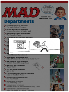
MAD still has the tiny cartoons. But now all you have to do is tap the little red circle with the plus sign inside it to get a good look.
I think the world is a better place knowing that sophisticated, interactive digital technology can be used to enhance the MAD magazine reading experience.
According to the descriptions for each issue in the store, MAD launched its first digital issue (“non-interactive issue”) on April 1, 2012 (get it?), with simple replica editions. And based on the dates of publications, thereafter the company uploaded its back issues as fast as it could, whenever it could. Interactive editions appeared in March 2012, an issue that’s now excerpted as a free preview in the store.
Of course, discovering the information above took me a good 20 minutes, because the now-enormous store inventory starts with issue #114 (1967), rolls back through time to issue #1 (1952), and then scatters issues in no apparent order. I just kept scrolling until I found the highest number, #522, nestled among special issues and #s 109-111.
Talk about random. Good thing there’s a search function. But don’t try to search by month of issue. You have to type in “Mad Magazine #129” to find what you want.
Could it be possible that the publisher does this on purpose … in typical MAD style?
[text_ad]
It’s a mad, mad, mad, mad world: Prices and circulation
When it launched in 1952, America was tired of the unending Korean Conflict and of a homogeneous, conservative society that worked tirelessly to hide its troubles behind a mask of perfection. It was perfect timing for a comic book that took nothing seriously, laughed at all, and blasted that mask into smithereens.
If you know nothing about MAD, think of it as the Saturday Night Live of its era.
According to print subscription records compiled by accounting professor Mike Slaubaugh (MAD sells no advertising and does not report circulation to AAM), those early days were good ones: 1962 circulation – when the publisher first started recording it – including subscriptions and sold single copies, was 1.2 million.
MAD hit its historic high point in 1974 at 2.1 million. But by then, society had learned to mock itself, Watergate had destroyed that complacent 1950s trust in government, and the need for a comic/magazine to spoof society was disappearing.
As the New York Times noted in a 2009 article, “Mad once defined American satire; now it heckles from the margins as all of culture competes for trickster status. What is left to overturn?” Circulation dropped precipitously from that heady 2.1 million until it hit 205,441 in 2002.
A brief, unexplained uptick took place between 2003 and 2005, and there was another blip in 2007, but the all-time low came in 2008 at 150,829.
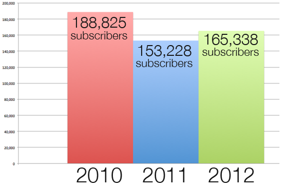
MAD struggled back to 188,825 in 2010, dropping to 153,228 in 2011. Then came digital in early 2012: Circulation rebounded to 165,338 for that year, the biggest single-year increase since the decline began in 1975. But, these numbers reflect print data only; I haven’t been able to find any digital circulation data.

As a bi-monthly (after being a monthly for decades, and a brief period in the late ‘00s as a quarterly), MAD prices an annual digital subscription at $9.99 (well, it does say “MAD magazine – CHEAP!” in the search results) and a bi-monthly subscription at $1.99, a price clearly intended to drive subscribers to the overall cheaper annual subscription. A print subscription is $19.99, and there is no combo offer.
Back issues are sold individually for $1.99, and individual new digital issues are $4.99.
Still the wackiest kid in school
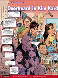
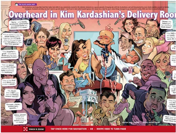
Sixty-one years after its birth, MAD is still the rebel in the room, spoofing everything from Obama’s NSA to Kim Kardashian’s delivery room experience. And it doesn’t always take Best Practices seriously, either. It delivers on some, but not on others. Sometimes it delivers, but only randomly, and in this case, random is not a good thing. But without further ado, here’s how MAD stacks up to Mequoda’s current Best Practices:
| Mequoda Best Practice | Complies? | Notes |
| Design | ||
| Features readable design, either vertical reflow or responsive. | Yes | Vertical reflow |
| Easy to navigate | Yes | With caveat |
| Portrait OR landscape mode | No | Both used, but not user-friendly |
| Content | ||
| Uses available technology to enhance reading experience | Yes | Not consistent |
| Includes updated daily content | No | |
| Includes free content | Yes | |
| Functionality | ||
| Free from glitches, crashing, etc. | No | |
| Includes interactive advertising | No | |
| Stationary image with text scrolling | No | |
| Includes in-app purchases of books or special issues | Yes | Only a few special issues so far |
| Includes tool for saving content | No | Not even social media icons |
| Easy to find in newsstand | Yes |
Design
1. Magazine features readable design, either vertical reflow or responsive. YES
MAD utilizes vertical reflow.
2. Magazine is easy to navigate (user’s guide, scrubber bar and instructional icons). YES with caveat
MAD offers no user’s guide, but on every screenshot that includes a one-page article, there’s a red bar at the bottom instructing the reader to “Tap once here for navigation (a scrubber bar) or swipe here to turn page.”
For some reason, conventional swiping elsewhere on the page is used only on long pieces with vertical reflow. I kept forgetting about the red bar and trying to swipe as I would in any other magazine, somewhere near the middle of the right side of the screen.
MAD does offer helpful icons to remind you how to access those vertical reflows: But instead of arrows pointing down, as in most other magazines, these arrows point up … to tell you how to swipe, not where the rest of the content is.

And without a user’s guide, I discovered several awesome high-tech features only by accident.

3. Magazine uses either portrait or landscape mode, preferably portrait. NO
Both formats are used. However, when the reader sees a full spread that doesn’t fit into the screen in portrait mode, and naturally turns the device to landscape mode, the spread shrinks to fit into the screen vertically … but not horizontally.
Therefore your choice is either to view half of the spread at one time in portrait, or to see most of it in landscape – but squint to read the type, and swipe horizontally to see the last few centimeters of content.
This strikes me as the worst of both worlds.

Content
1. Magazine uses available technology to enhance the reader experience. YES with caveat
Every cover of the new interactive versions features a video. For the most recent issue, Black Spy and White Spy enter the screen from opposite sides, as a sinister-looking President Obama, resplendent in a trench coat, fedora, and evil grin, rises up behind them to put a hand on each one’s shoulder, laughing maniacally.
In case you couldn’t guess, this is an illustration for a satirical piece on Obama and the NSA.
Also, the reader can tap on any title in the table of contents to go directly to the article. Many of the high-end digital publications I’ve read lately can do everything including wash the dishes for you, but they don’t feature a tapable TOC.
Another high-tech touch: In some of the cartoon stories, the user can tap on a speech bubble and see it magnify for easier reading. But … only in some pieces, and only on on some pages of that piece. More randomness.

And as I mentioned, MAD has always featured teeny little cartoons sprinkled randomly throughout the magazine, and has taken advantage of the technology to allow the reader to magnify them.
But once again – only some of them. The rest are just as tiny as they always were. But hey, at least the reader can view them in both portrait and landscape mode!
And there’s one thing that truly takes paper and makes it digital. An absolutely classic MAD feature is the Fold-In. In print, this involves literally folding a page together in the middle to change one image and related text to something different.
Digital MAD allows you to swipe one side of the page into the center, creating the same effect as you’d get with real paper. Only easier: No need to worry about getting your fold in exactly the right place and completely straight! (Yes, I speak from experience.)
2. Magazine includes updated daily content. NO
3. Magazine app includes free content. YES
There’s a free preview that’s an excerpt of the first interactive issue that I mentioned above, plus 10 pages from the book Totally MAD: 60 Years of Humor, Satire, Stupidity and Stupidity.
Functionality
1. Magazine app is free from glitches, crashes or other technical problems. NO
At least one reviewer and I experienced the “white screen of annoyance,” in which it takes several moments for the pages to load. Pinch-and-zoom was troublesome, too. In its brief history, digital MAD has been updated three times this year and three times last year. It may take awhile for them to get the bugs out, including the erratic pinch and zoom function, and applying the features throughout the content instead of just here and there.
2. Magazine with advertising includes interactive advertising. NO
MAD has no advertising but its own spoofs (ad for a new “Fox ADHD” cartoon show: “From the mind of a five-year-old …”), and ads for their own products. I’d love to see what they could do with interactive features in the spoof ads … and why on Earth there’s no way to buy a subscription, special issue or book from their product ads – even if it’s just a link to the store — is beyond me.
Oh, wait. You can’t buy the books in the store, either. And the ads don’t tell you where to buy them. Amazon, I guess. Paging the marketing department …
3. Magazine features images that remain stationary when text is scrolled. NO
4. Magazine offers in-app purchases of books and/or special reports. YES
But see above. Only a few special issues are available as yet. Books, prints and T-shirts are advertised heavily, but are not available in the app.
5. Magazine has a tool for saving content. NO
Not even the usual social media icons …
6. Magazine is easy to find in the Apple newsstand. YES
Searching for “comedy” gets you nowhere, but for “satire,” MAD is the fifth result.
The creativity and wit that go into MAD’s content aren’t quite being served as they deserve by this digital edition. Clearly the publisher, E. C. Publications, is making an effort to revive a struggling brand, but we hope they’ll keep updating to get it right.
The creative use of technology, in particular, is commendable, but it’s frustrating for readers to use it in one article and not have it available in the next. Then again, without a user’s guide, they may not even know about these features.
What do you think of using technology randomly? And what about that mish-mash of a store? I know there are some secret MAD fans out there, so let me know your thoughts in the comments below!


