What the best digital magazines have in common, plus best practices in design, content and functionality … written in sand … not stone
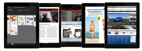
I concede that anything we name as a Best Practice, or refer to as one of the best digital magazines, is purely temporary.
But I’m going to bravely list our current Best Practices for the mobile magazine that I know you’re all going to publish, if you haven’t already. Tomorrow someone might invent something new that blows away a previous Best Practice, so this is an evolving list.
[text_ad]
Of course, no “Best” list is ever complete without dozens of comments from readers who have other ideas, so I invite you to submit your suggestions for Best Practices in the comments below!
And now, without further ado, here’s the official list:
Mequoda’s Digital Magazine Publishing Best Practices: July 2015
Or,
The Absolutely, Positively, Permanent, Final Mequoda Group Digital Magazine Best Practices for Now List.
DESIGNing the best digital magazines
Digital magazines should…
1. Feature readable design.
Whether you reflow the content to fit the screen or use responsive design to reflow content for different devices on the fly, you must make the pages easy to read. Consumers don’t buy tablets and smartphones so they can take eye exams, no matter how young they are.
We offer up two options:
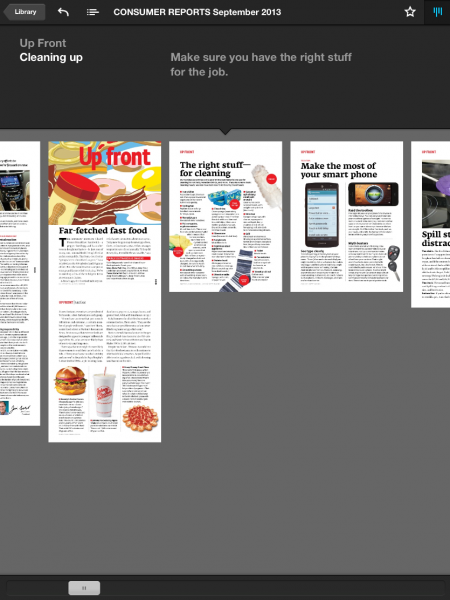
Design your magazine with vertical reflow, like that used in New York or Consumer Reports magazines. The text is larger and fits more comfortably on a tablet screen, and flows off the screen in a long vertical page that’s accessed by swiping. This is also called vertical swipe. The reader swipes horizontally to get to the first page of every article, then vertically to read each article. Consumer Reports’ navigation tool shows exactly how this works.
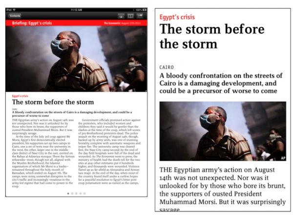
Use responsive design like The Economist, so that text and images automatically reconfigure themselves to fit the device they’re being viewed on.
[text_ad]
2. Be easy to navigate.
One thing we learned from our 2013 Mequoda Tablet Study video was that users are a bit frustrated at having to learn something new with every magazine they read. And a full 89% of respondents in an MPA study agreed that “it would be great if all magazine apps had the same functions and navigational features.”
Since there are no standards yet for digital magazine design, it’s helpful to your readers to include a user guide just inside the “cover” that explains how to navigate your publication.
Many publishers use line drawings of fingers scrolling and pages turning. The Economist has a much fancier version featuring photos.
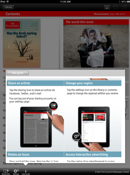
You should also insert tapable links from the teasers on your cover directly to the article; include a “scrubber bar” that’s essentially a scrolling bar of thumbnails for every page to enable browsing; and use icons to show readers what to do, such as arrows pointing down if you have a vertical article that needs to be swiped.
3. Accommodate either portrait or landscape viewing – not both.
We think that making your digital magazine viewable in both modes is a waste of resources better spent elsewhere, so choose one and focus those resources on making it look awesome.
And in case you’re wondering, based on user preference, we recommend portrait mode when you have to choose.
CONTENT in the best digital magazines
Digital magazines should …
1. Use the available technology to enhance the reading experience.
Yes, digital magazine readers notice that you’re wasting the technology if your digital publication is a simple replica of your print edition. They want interactivity: videos, audio, photo galleries, links to outside sources and extra content that’s not available in print.
In addition to adding reader satisfaction, interactivity increases reader engagement, and that’s always a good thing for your advertisers and therefore your advertising revenues.
A good example of this comes in a recent Men’s Health article on a hot new movie star, where the reader can tap an image and get career advice from an expert, based on an observation the actor makes in the article about advancing his own career.

2. Include updated daily content.
You don’t want your reader thinking about your brand once a month. You want them to yearn for you every day, so that their loyalty keeps growing and your relationship thrives. New York magazine keeps ‘em coming back for more with a plethora of daily news, features and analysis.
And if you don’t have a huge news staff like New York, you should be publishing daily tips, or the day’s blog posts that you feature on your website.
3. Include free content.
It’s practically unanimous among users: A free magazine app that’s nothing more than a sales outlet for the magazine is useless. Although tablet users have learned that content doesn’t have to be free and are willing to spend well to get it, they also have dozens of non-magazine apps on their devices that offer something for free.
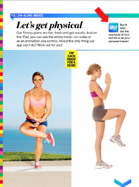
Solution? Give them a free issue or a sample issue to entice them to buy. SELF, for instance, offers what is essentially a good old-fashioned magalog, with sell copy mixed in with the sample content.
[text_ad]
FUNCTIONALITY of the best digital magazines
Digital magazines should …
1. Be free of functional problems.
That means the app opens immediately, doesn’t crash, and doesn’t hang up when loading a magazine. Is this a no-brainer? Of course. But read the reviews on pretty much any magazine app in the Apple store, and you’ll be amazed at how badly publishers are doing in the tech department.
And the very scientific McPheters & Co. backs this up with research from its iMonitor™ product, which tracks U.S. and international mobile publications on more than 100 discrete variables. Its research even breaks down the type of malfunction that readers experience: Authentication of print subscribers is the most frequent, at 22% of all malfunctions tracked. Display issues come in second at 10%.
What to do? Mag+ and Woodwing executives told McPheters that the responsibility for malfunctions can reside with the publisher, the development platform, or even the device. For authentication problems, blame can also fall on the fulfillment house or even on the publisher’s subscription server.
No matter what the issue is, the experts say it’s your job to test, test and re-test your app before it’s published. Nothing will kill you faster than disgruntled consumers.
2. Offer interactive advertising.
The possibilities for this are endless, which is a good thing because consumers say they want to be able, among other things, to make a purchase directly from ads. (Fifty-nine percent in the MPA study I mentioned above.)
In fact, they just plain old want to play with the ads. According to a recent survey by Starch Digital, a full 50% of respondents who saw interactive ads listed in the survey actually responded by interacting with them.
Car advertising currently seems to be taking best advantage of interactive features for now – no doubt because selling a big, expensive product that has a ton of information attached to it has never been easy in a simple print ad.

3. Have stationary images next to scrollable text.
Revolutionary: An image stays put while the reader scrolls through text. This is all very nice for content producers, but it’s even more exciting for ad salespeople. Imagine telling your advertisers that their ad will be visible the entire time a reader is engaging with an article! There’s no such thing as a turned page if you’re willing to pay for this kind of design capability.
To get an idea of how this looks in layman’s terms, check out this Mag+ video.
4. Offer in-app purchase of special issues.
Most publishers develop special issues throughout the year, using either existing content or, if they have a large editorial staff, fresh material. Surprisingly, many of these publishers sell these issues in a web store, or at Amazon … but not in their own magazine app.
Why leave money on the table? Consumers might not wander into your store when they’re visiting your website, but if they’re in your app, scrolling through available issues, they can’t help but notice those special issues.
For inspiration, check out the apps of such varied publications as Maxim, Bloomberg Markets and MAD Magazine.
5. Offer the reader a function for saving articles.
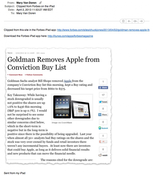
Consumers are accustomed to being able to pin and like Internet content they love, so in addition to the usual social media sharing options, give them an enhanced experience with your magazine by including a “save” function of some kind. Forbes has a fun tool that saves a “clipped” article, and The Atlantic includes a folder where users can stash free content they want to revisit later.
[text_ad]
6. Be easy to find.
As publishers in the digital age, we’re all aware of the importance of SEO on the Internet. But what about the newsstand where your magazine is sold? When it comes to the biggest one where all magazines should be available, Mag+ points out that it’s just as important to position your magazine in the Apple store as it is to drive traffic to your website.
For example, I searched the term “healthy cooking” on my iPad. The #1 result is a cookbook from Time Inc. called Cooking Light Recipes. It isn’t until result #12, well off the first screen, that a magazine actually called Healthy Cooking turns up. Someone has failed to select the right keywords.
Mag+ has some excellent tips for choosing the keywords to make your app stand out in a typical user search, and also for choosing the right category for your magazine – especially as Apple will only allow you to change your category when you submit an app update.
Doing the best you can
Obviously not every publisher can afford to do everything on this list with digital magazines. But it will certainly pay off to do as much as you can, and to plan ahead for adding new features as your profits roll in.
And of course, as I mentioned above, I expect our loyal readers to have plenty of their own ideas for Best Practices! Submit them in the comments, because going forward, this list will be changing more often than a politician’s official positions.
This article was originally published in 2013 and has been updated.


