What apps do people want? Not the kind you’re probably delivering right now

As the first wave of digital magazine apps has passed, we’ve discovered one thing: People hate apps with nothing in them.
And yet, the vast majority of digital magazine apps available today are nothing more than a retail outlet for single copies and subscriptions.
They are labeled as free, but have nothing to offer unless a purchase is made within the app. This practice is the reason why so many magazine apps have low ratings, as can be witnessed by reading the reviews.
While we’ve blogged in the past about magazine pricing, and opining on the dire need to raise them, at the same time, magazine readers are like many other digital consumers in expecting something free on their tablets. And disappointing them right out of the gate when they first download your app is not exactly a marketing Best Practice.
In case you hadn’t noticed, your competition and peers are starting to solve this problem. So it behooves publishers to rethink their app strategy immediately, if not sooner! But fear not, we have some solutions to the app customer service nightmare, courtesy of some very savvy publishers.
What apps do people want, #1: The magalog
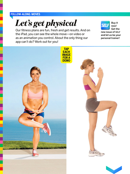
Condé Nast, as we’ve mentioned before, is on the leading edge in digital magazine publishing. So it’s no surprise that they developed an app for SELF (Motto: Tap into your best self!) that combines free content – enhanced with videos and extra “tappable” content, with sell copy urging you to subscribe now.
If that sounds vaguely familiar, it’s because it’s a lot like the magalog of old – a carefully crafted blend of free content and marketing messages. SELF does it with a back issue from 2011. On a page titled Let’s Get Physical, featuring two exercises that are illustrated with video, SELF proclaims, “Buy it now! Get the new issue of SELF and let us be your personal trainer!”
There are variations of this message on every page, from beauty to fashion to healthy eating. One quibble: You can’t get to the “Subscribe” page by tapping on these messages. You have to know enough about apps to tap on the Home icon. One of them includes instructions, at least; “Go to the home screen of this app to buy the newest issue! You’ll find tons of easy ways to eat better today.”
All in all, a clever approach that combines the best of free content with marketing. Watching someone actually do an exercise is roughly 2,376 times more useful than looking at a static image, and that tempted even an old marketing hand like me to hurry up and subscribe.
What apps do people want, #2: The free issue
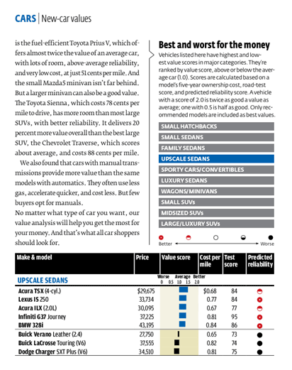 Interestingly, the publisher who perfected the magalog in the olden days, Consumer Reports, doesn’t do an app magalog. Instead, it delivers free issues. This is the most common style of content-rich apps, and you can choose to offer either a free back issue, or a special issue you’ve put together for this purpose.
In this example, Consumer Reports does the latter, although I suspect it’s actually an existing back issue.
Why do I only “suspect?” Because there isn’t a single date in this free issue, not even in the car reviews. The reader has no idea which model year is being reviewed, and that goes for the tablet reviews, the washer and dryer reviews, and everything else in the free issue.
As a marketer, I love it. You get the full flavor of Consumer Reports’ rich content, yet nothing is really being given away – who would choose a car based on data that could be years old, and then decide they already got what they wanted and exit the app without subscribing?
What’s more, at the end of every article is a full-page ad featuring an image of an iPad with a cover related to the content of that article – the Best Tablets, Cameras, TV, Phones, E-readers and More issue after the tablet review, the annual auto issue after the car review, and so on. The text is the same on every ad: Enjoying your free preview issue? Subscribe today and save up to 59% off the single-issue price.
What apps do people want, #3: Updated free content
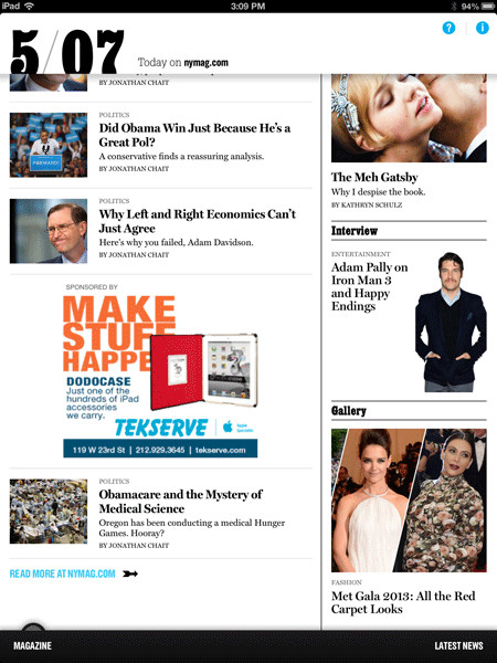
Instead of just offering a free issue, you can really step up your game like New York magazine. This is the most entertaining, awesome digital magazine app out there. I kid you not.
New York has broken new ground. With this free app, you get daily content including news, features and columns. Pages and pages of free, new content. You could easily spend an hour or more reading it.
Then, when you’re done, and you’re thoroughly dazzled, you simply tap on the magazine link at the bottom left, and you get the table of contents and the opportunity to buy.
If you’re already a subscriber, you still enjoy the free content, and when you’re ready to read your issue, it’s only a seamless swipe away. Finally, for the pièce de résistance, there’s a link on the “Latest News” page – the home page for the free content – to the website.
New York’s free news content and paid magazine content are both easily accessible at all times with their unique “window shade” feature – just pull the handle with a finger. And then there’s the thumbnail menu of the magazine’s pages at the bottom when you’re in that part of the app. There are just so many ways to love this app, I can’t list them all.
Everything New York magazine does is readily available, free or for a price, seamlessly connected, and easy to navigate. Clearly you need a fairly large staff of journalists to make this kind of daily content happen for free, but the app is a home run.
Please share your favorite digital magazine apps, and let us know if there’s a model we haven’t mentioned.
This article was originally published in 2013 and has been updated.


