Is gamification the next step in digital magazine design? The medium is certainly calling for it.
Design – its theory and execution – has always been important for publications, and now that importance ranks right up there with technology itself. Major redesigns have taken a back seat to periodic tweaks and refreshers that make digital magazines more nimble in audience development. Meanwhile, there are not very many top ten lists of the best digital magazine design, because…what is good design?
There’s no doubt publishers are split on what makes for good digital magazine design. We’ve been told by one publisher that has an older demographic of subscribers, that a digital replica is fine. In fact, their older audience has adopted digital magazines happily, but bells and whistles are too confusing, they say. And maybe they’re right. But we’ve argued that the ability to increase font size rather than pinching and zooming would increase satisfaction with the app. We’ll see if they take our advice.
[text_ad]
Does a digital magazine need bells and whistles? Well, reading a publication, whether in print or digital media, has always been a hands-on activity. Printed media is interactive because individuals may engage in conversations where they verbally share what they’ve learned from the editorial content they’ve read. In addition, printed magazines provide its subscribers some play, with crossword puzzles, quizzes, and other brain teasers.
When designing a digital magazine, participation is taken to the next level. Some digital magazine apps offer the crossword puzzles on their tablet or smartphone, other apps play videos, others have playlists, games and most have clickable ads. All have heightened the interactive process between the content and the reader.
If digital magazine apps want to be taken seriously, they should be seeking to offer outstanding and hands-on experiences that further invest subscribers. Otherwise, why make an app? Make an online / web magazine instead.

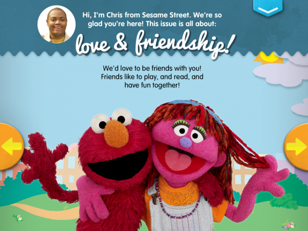
Sesame Street’s S’More is one example of a digital magazine design that outshines other mags. S’More offers an interactive experience for the little tikes that enjoy reading, coloring, and being creative. Kids get the chance to play games, solve puzzles, listen to music and read-aloud narration. The digital mag also offers tips to parents that’ll engage in their child’s learning experiences.
So right now you’re thinking, uh, so, where’s my read-aloud narration and games?
SPIN‘s digital magazine got the music part down when they launched it in 2011. I bet music lovers rejoiced when SPIN launched their digital magazine complete with audio playlists for each issue. If I recall correctly, SPIN used to include a sample mix CD with issues of their magazines—one of the main benefits of becoming a subscriber. So it makes complete sense to add a playlist to their digital magazine subscription. They quite literally added the perfect bells and whistles to their app. Since then, we’ve seen several other music magazines follow suit.
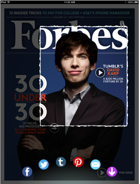
 We’ve always liked Forbes too. The Forbes digital magazine app launched in 2013 and went above and beyond any other app of its kind at the time. The clipping tool was one of the most unique features that any digital magazine app had offered at the time. Subscribers can share articles, or snippets from an article, photos, and more with their social networks.
Condé Nast is on the leading edge in digital magazine publishing. So it’s no surprise that they developed an app for SELF (Motto: Tap into your best self!) that combines free content – enhanced with videos and extra “tappable” content, with sell copy urging you to subscribe now. The videos are of different exercises, so you can actually get both a magazine and fitness videos in one app.
And it might seem simple, but we love New York for their free daily content including news, features and columns. Pages and pages of free, new content. You could easily spend an hour or more reading it. Then, when you’re done, and you’re thoroughly dazzled, you simply tap on the magazine link at the bottom left, and you get the table of contents and the opportunity to buy. If you’re already a subscriber, you still enjoy the free content, and when you’re ready to read your issue, it’s only a seamless swipe away.
Fast Company took the same approach this year when they launched their app – released in the Business category of the App Store – running responsively on both the iPad and iPhone, and combining the magazine’s content each month with continually updated news feeds – drawing from properties FastCoDesign.com, FastCoCreate.com, and FastCoExist.com – and curated articles from Fast Company editors.
And while we know Porter, the brand magazine of luxury brand online retailer Net a Porter, is really a catalog dressed as a magazine, we’re thoroughly impressed that 85% of their (paid) subscribers (who pay $21.99 a year) actually make a purchase after reading an issue of Porter. In case you’re not familliar with Net a Porter, they’re stocked heavily in $4,000 dresses, and $500 shirts, so 85% is a big number.
Bloomberg for iPad offers customizable stock market quotes and market updates for indexes, futures, bonds, currency and commodities. Bloomberg sells advertising to support this free content.
And Mother Earth News (MEN), a top Mequoda practitioner, offers more practical, high-quality apps than almost any other magazine we know of, such as apps to help users decide when to plant, design gardens and can their produce. Two of these apps, in fact, have been recognized by WIRED as top apps in their categories.
Luxury online retail shop Net-a-Porter has Porter, which has been called the magazine that will eat Vogue for lunch. The big tagline on the cover of the Apple store is “Click and Shop Everything You See.” It’s basically a catalog disguised as a magazine, because kids these days don’t know what catalogs are and they’re paying $21.99 a year for it. It’s also sold in 30,000 retail stores.
Since 1925, The New Yorker has been a top-selling magazine around the country, with a rich well of content. The magazine covers arts and culture, politics, and technology, in addition to cartoons, fiction, and other literary reads. Naturally, The New Yorker upgraded into an app that has an incredible digital magazine design. The publication is unique as print; but with technology, there are no limits as to what it offers. Subscribers to this digital magazine have access to every single issue of The New Yorker that’s published, which is located in its archive. If you’re a subscriber that already has the digital mag’s app downloaded, you can also obtain the anthology collection–such as The New Yorker Reader and The Cartoons of the Year.
Is there room for more? Yes. We’re looking for teen magazines that have interactive quizzes, and style magazines that act as mirrors for lipstick shades, and ads from Warby Parker that let you “try on” different glasses, and brain games in Mental Floss. We want all of these things because they’re apps, and the number one thing people do on their tablets is play games.
Making your digital magazine interactive makes sense for the medium. Otherwise, create an online magazine instead.


