How you think about digital magazine software needs to change if you want your subscriber base to grow
“Eventually, they’ll become like sailboats. They don’t need to exist anymore. But people will still love them, and make them and buy them.” – Kurt Andersen, a former editor of New York and co-founder of Spy, on the future of print.
In an recent article called The Not-So-Glossy Future of Magazines, editors of the New York Times review the current status of the magazine industry, pointing out for the umteenth time that magazines are struggling to be relevant with their content compared to the free web, and that print is going the way of the Dodo.
But what isn’t going away, and where more ad dollars are going, is digital. And not just free Portals of content, but the premium content that pays the bills. Your first go-to is probably the thought of digital magazine apps replacing print, and the digital magazine software required to build a whole new platform.
[text_ad]
And when you think about the best digital magazine software, you probably imagine third party digital magazine software solutions like Mag+ or Adobe Digital Publishing Suite which gives you the capability to create magazine apps available in a variety of app stores and newsstands. It would be very difficult and time consuming to reinvent the wheel and try to build a digital magazine app on your own without this software, that is true.
But being the resourceful publisher you are, and knowing that that general population isn’t too keen on digital magazine apps thus far, and advertisers aren’t convinced either, why are you limiting your magazine to a closed ecosystem of an app store or newsstand when you can have more control with less expense?
The built-in audience and marketplace of an app store and newsstand is a definite incentive of the platform, but is a new gadget with a new interface really what consumers want? What we’ve gathered from our digital magazine studies over the years is that users want to be able to digest their digital magazine easily and they want to be able to read it easily. Bells and whistles are bonuses, but only if they feel comfortable with the app, the functionality and the most basic feature – reading content.
So it should be no surprise that the best digital magazine software isn’t really software at all—it’s an extension of your website. From what we’re seeing all around the industry, the magazine app isn’t what’s turning visitors into digital subscribers, it’s web magazines.
What is a web magazine?
A web magazine is built with HTML as a section of your website, and it’s meant to walk, talk and act like a magazine, however it’s built to respond visually to any device. So, much like your website, a subscriber could visit the magazine and read it any way they like as long as they have an internet connection, or have downloaded the associated PDF before they take off on a flight.
Web magazines are done many different ways. Ad-driven publishers, especially those in news media, often experiment with metered paywalls on their premium content to attract more advertisers. Meanwhile, user-sponsored magazine publishers keep content behind the wall.
We do think that there are a few things that user-friendly web magazines should have:
- A table of contents that is always available on screen for the user to switch between articles easily.
- Content that is easy to read and scroll, and may even offer a way to adjust the text size.
- Branding for the magazine so that the user always knows when they’re in the premium magazine content section.
- Sponsored and native content that lives in front of the paywall, for the benefit to sponsors.
Let’s review a few web magazines done very differently.
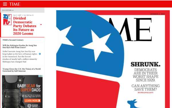
TIME is the biggest consumer ad-driven brand we know of with a web magazine. The table of contents remains on the left, while the article appears on the right. TIME has been testing this web magazine for years. At first they gave it away for free, then a paywall appeared after a few articles. Then they made it so exclusive you couldn’t even see the table of contents without being logged in. Now it looks like they’re back to giving away the milk for free, but after an article or two, you’ll get a pop-up with a free subscription offer. In terms of look, TIME has done a great job with the design, there is no question that you are in the web magazine while perusing content, and it works the same on every size device.
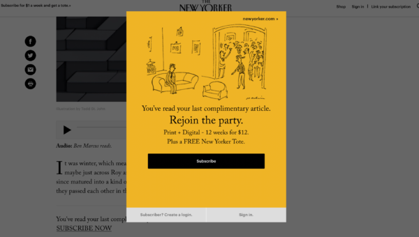
The New Yorker also has a web magazine, but it has a metered paywall. A very small message box that sticks to the bottom of the page says, “You have X free articles left this month. Join The New Yorker for unlimited access. Subscribe now.” Given that they’re trying to reach a goal of 2 million subscriptions according to Editor Michael Luo, we’re surprised to see the content wide open without a more obvious paywall and more aggressive conversion architecture. These pages are heavily ad-driven so at the least they are giving their advertisers more space, while taking away major incentives to subscribe. Finally, after you’ve reached your access limit, you get a big “Subscribe” popup. In terms of design, the user doesn’t always know they’re in the premium magazine section of the website except by the URL and right above the title it will say which issue it is from. In terms of navigation, there is no way to get back to the table of contents except by hitting the back button, and the only related content links in the right sidebar go to articles on the main free Portal. So while we like the attempt at building a web magazine, they have a lot to learn from TIME in terms of usability.
We do admire the structure of these two mainstream web magazines because they’re easy to update, maintain, and user-friendly just like their responsive websites. But unless you’re purely ad-driven, we recommend a paywall for premium content, sponsored content excluded.
An example for a consumer-driven web magazine is I Like Crochet, a web magazine we built that is believed to be the first ever web magazine of its kind, before TIME and The New Yorker. Like TIME, I Like Crochet keeps consistent navigation in tact so the user never forgets they’re inside the premium magazine. This consistent navigation is what reminds readers where they are, and is crucial to usability. Using this magazine, a reader finds the issue date and a table of contents, and is invited to enjoy a linear “discovery” experience like any other magazine, in which she can navigate page by page, instead of by topic, to find out what’s next.
The best part about building web magazines instead of using third-party digital magazine software to build apps, is that it’s so much easier to create because you’re using the same content management system as you do now.
If you would like to learn more about building a magazine subscription website that features a robust web magazine and archive. And you want to learn how our clients have used this new business model to double and triple their profits in their first few years, please schedule a call with me.


