When WIRED went live with the world’s first iPad magazine – a mere six weeks after the iPad’s debut – it sold 24,000 copies in the first 24 hours. For a few years, most magazine publishers and consultants, including Mequoda, focused on the 20% of tablet users reading digital magazines every day on their devices.
What we now know is that while the iPad may have introduced users to the concept of digital magazine subscriptions, the magazine industry didn’t do as well of a job designing apps as they could have. Even now, they are often clunky and confusing, and interfaces from magazine to magazine are all different. What we’ve come to understand is that the format of a magazine shouldn’t be tinkered with too much, because people want a table of contents and an easy way to get to and from that TOC to browse around an issue. They don’t want all the bells and whistles, they want the content and they want to digest it easily.
The simple answer to this interface problem sounds like “flipbooks” – PDF and other types of renderings that look like the print issue. Unfortunately, users don’t love those either and they don’t want to pay the same price for a simple PDF as they do a physical magazine. Plus, “unlimited magazine subscription” companies like Magzter and Next Issue cannibalized the industry by offering a $10 subscription to people where they could get unlimited access to a variety of magazines for one low monthly price.
Despite some success with tablet apps, we’ve found that the best digital magazine examples aren’t downloaded to a tablet, they’re built in HTML and are responsive so they can show content dynamically on any device.
People are fluent in reading news and articles on websites. They know how to search, how to hit the back button, click links, and get to the content they’re looking for on a magazine website. They’ve been doing it for years now. So why should we ask them to download an app and learn a new interface? Because we think it offers perceived value, or because it’s a better product?
What we’ve found is that eleven years after the release of the iPad, the best-performing digital magazine examples are developed to be a part of a magazine’s website, with a metered paywall, or not, but they are rarely tablet apps.
[text_ad]
Digital Magazine Formats
It’s instructive to take a closer look at the variety of digital magazine formats and subscription choices that are now available since the iPad blasted onto the scene, and which ones are actually attracting and keeping subscribers happy.
Digital Magazine App
The digital magazine app is what users read on their iPad, Kindle, or other tablet-like device. Ads may link to web pages (a great advantage to advertisers), and articles may include videos. The most popular digital magazine examples, in order of least interactive to most interactive, are digital replica, replica-plus, and reflow-plus. A digital replica is typically a PDF of your magazine that has been formatted for a tablet reader, whereas a replica-plus offers much more interactivity (the videos and ads previously mentioned.) Magazine publishers who create a reflow-plus tend to add new functionality to the magazine that makes it act uniquely from any other digital magazine, and more like an app.
Digital Magazine Website
A digital magazine website offers free and premium content, with the premium content often behind a metered paywall that subscribers can gain access to. Free content may be quicker-to-read, less substantial content. Many of our Mequoda Publishing Network Members produce “Library Previews,” which are advertorial articles that share bits of premium content, and direct readers into the premium magazine library to view the full content. When metered, this is a great way to meet free visitors in the middle, because they are given access to premium content, but after a few articles, they are asked to pay. By frequently attracting these visitors through free content, they convert at a higher rate to subscribers and members because they interface with the content more often than if everything was behind an unmetered paywall.
A Digital Magazine Library
A library is an archive of your content going back many years, likely since the beginning. When done right, you can upsell a substantial number of would-be magazine subscribers to this higher-end, and higher-priced membership. Typically, a digital magazine website comes packaged with a web library, so when someone subscribes to your web edition, they get monthly HTML issues, and access to everything published prior through the library.
Subscription marketers must relearn and rethink how they promote content in the age of the Internet. Instead of promoting the next 12 issues, you can promote back issues, special collections and categories of content that can span decades if you have a library. This provides many options for launching a diverse marketing program. One empowering a content marketing frequency that would be unthinkable if you were only promoting the next 12 issues.
[text_ad]
A Best-Practice Digital Magazine
Let’s skip over talking about app editions because it’s not something we’d advise any publisher to focus on anymore now that we’ve seen other ways work better. But if you are curious to check out some great apps, we’d recommend looking at The Atlantic, Scientific American, and Vogue, which are all highly rated magazine apps in the app stores.
But first, Food Gardening Magazine.
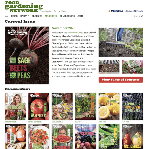
Food Gardening Network, the home of Food Gardening Magazine was built based on all the best practices we’ve learned from the examples below. For a full, and in-depth case study of what we consider the Perfect Digital Magazine Template based on Food Gardening Network, please read our in-depth review.
To build Food Gardening Magazine, the best practices we followed were derived from the examples you’ll see below, such as:
Design:
- Readable design with reader-friendly type
- Easy to navigate with the table of contents always available
- Readable from cover to cover by using a hyperlinked table of contents
Subscription-based web magazines—hosted on a subscription website and viewed on HTML-based web pages—can be linear as long as the template maintains consistent navigation that includes an always-present table of contents. Web magazines that display a magazine article, that doesn’t have a TOC on the right-hand side of the page, are confusing to users.
Content
- Images and video used to enhance the experience
- Free content included in front of the paywall
- Native advertisements placed in front of the paywall
- Access to a library of all past articles and issues instantly available with just a click
For a gardening title like Food Gardening Magazine, offering access to a library of back issues is a substantial benefit. Subscribers enjoy the benefit of a comprehensive archive of past issues—something a print subscription simply can’t offer. If you’re a new launch, the ideal scenario is to have 12 months’ worth of issues available in your archive. But if budgets are tight, you may decide to launch with as little as 3-6 months of back issues and allow the benefits of the archive to grow over time.
Functionality
- Scrolling text and images
- Hyperlinks to other products and articles
- Sharing tools available for all content
In other words, we’re leveraging the tools available that the web provides for us. We are not making people download a PDF that can’t be searched or scrolled without pinching and zooming. We are making the web edition more useful with internal links, and we’re making metered paywalled content available to share.
The 5 Best Digital Magazine Examples and Why We Love Them
Below are five examples from our Mequoda Publishing Network Members and beyond.
I Like Crochet Digital Magazine Example
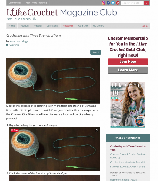
A far cry from simple replica versions of a print product comes from one of the new breed of digital-first publishers. I Like Crochet is a digital magazine that was launched in August of 2014 by Mequoda client Prime Publishing, publisher of a large catalog of craft websites and cooking sites. It was the first premium magazine published by Prime. It’s also what we at Mequoda believe was the magazine industry’s first-ever true website magazine.
I Like Crochet’s magazine website delivers a linear magazine experience complete with a table of contents and page-by-page navigation. Naturally, it’s also enhanced via technology so readers can click to go directly to specific projects. And even more importantly, all content is also available in an actual library, so subscribers can search back issues for, say, afghan patterns, all with a few clicks. Access to a library is what sets it apart from most digital magazines. Because the magazine is available on the web, this library-enhanced digital edition is accessible on any device that consumers use to access the Internet, regardless of platform.
And that is truly revolutionary, not only for readers, but for publishers who don’t have the vast resources required to create digital editions for every platform that different consumers use. We only know of a few publishers who are leveraging technology to serve this kind of experience to their subscribers, and most of them are our Mequoda Publishing Network Members.
Reading this next-generation digital magazine on the web is a gratifying experience. The I Like Crochet website is designed to be experienced exactly like a magazine. At a portal, the user generally arrives as the result of a question they want to be answered. Once at the page that their search for answers led them to, there are also related articles available by hyperlink that they may also read.
But having answered their question, the user is usually done with the website after only a few minutes. At Mequoda we think of this as an “instructional” or “how-to” experience.
But at I Like Crochet, a reader finds the issue date and a table of contents, and is invited to enjoy a linear “discovery” experience like any other magazine, in which there is a table of contents they can navigate page by page (although without the page turning sound and graphics that make the flipbook magazines so user-unfriendly), instead of by topic, to find out what’s next.
Clicking to the first item on the list gets the reader right into the issue, and from that point, all they have to do is click on the title/arrow at the bottom of the page to go forward or backward one “page.”
The reader can spend an hour or so with the I Like Crochet website magazine, but they can also access the pattern library to access all of the magazine’s past content via search, which makes I Like Crochet exceptional. It delivers access to all past articles and special curated collections, instantly available with just a click. All of the articles on ILikeCrochet.com are premium, but visitors can access three per month before they are asked to subscribe. Their library previews are 100% free and tease premium content.
I Like Crochet is always testing offers, they have used decoy pricing in the past where they price their premium Gold Club all-access pass at an irresistible rate, and are currently testing others, like a 92 cents per week offer, billed annually. Read more about digital magazine examples of offer testing.
Yankee Digital Magazine Example
Yankee magazine is best known in New England for its spot-on travel advice and restaurant recommendations. Subscribers enjoy guides to the cutest coastal towns, drives for foliage, the best places to grab lobster rolls, and even how to make the best apple pies. If you’re a New Englander, or someone who loves New England, you simply aren’t getting the most out of the region without consuming every new issue of Yankee.
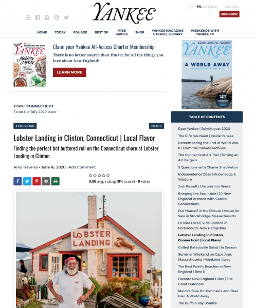
And that’s not just our opinion as New Englanders, just ask their 25,000+ digital magazine subscribers. A huge number for such a niche and regional magazine, Yankee has a lot to brag about, and their digital magazine design is a Mequoda best practice.
Yankee’s All-Access membership package includes six issues of their print magazine, their digital web edition with a massive travel library of back-issues, their Weekends with Yankee television show, and three curated Library Preview newsletters per week that guide premium members through the travel library and its 25+ digital collections.
Online editors at Yankee have worked with Mequoda’s content marketing team to create special collections that draw directly from our magazine archive. This allows Yankee’s magazine content to be showcased in a way that gives it a new life. Brook Holmberg, publisher of all things Yankee, says “we generate more than five times the page views from our archive content than we do from the most current issue in any given month.”
Yankee All-Access members pay $39.97 a year for the complete multiplatform suite of content. Yankee uses credit card continuous service with strong conversion and renewal rates that are powering a rapidly growing new revenue stream for this legacy brand.
The Atlantic Digital Magazine Example
At the beginning of this article, I mentioned that The Atlantic has a good, highly rated app, so I think it’s worth mentioning that their web magazine is even better. The Atlantic’s robust archive dates back to 1857, and we like that they’re transparent about what’s been digitized in their archive. For example, from September 1995 to the present, you’ll find all the articles in each issue, excluding articles where online rights are held exclusively by the authors. Older issues, like those from 1857 only include the feature articles.
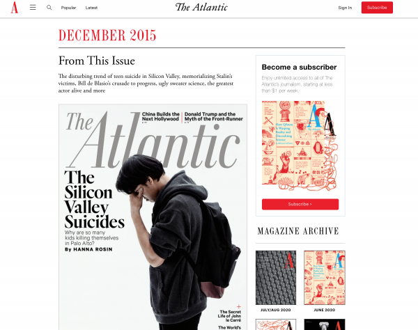
Articles in the web magazine and archive are bold and attractive. The feature article contains a large main image, and always citing the original issue at the top of the page, which makes it easy to navigate.
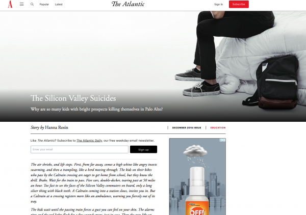
While The Atlantic web magazine isn’t designed exactly how we’d do it (we have a few pointers that you’ll find from the other digital magazine examples in this list), they do a better job than most other news organizations. In regards to pricing, they offer a digital-only subscription for $49.99 and a print/digital combo for $59.99. For $100 you can get an ad-free version of the subscription, along with a gift subscription and discounts to events and products. We’d generally refer to that offer as a membership “club” offer, but at the extra $40 price tag, it’s unlikely to be their top-selling product. To achieve that, they’d do better to test some best-practice super club pricing. For one of our Mequoda Publishing Network Members, orders for their super club now accounts for 34% of all subscription/continuity orders.
Biblical Archaeology Society Digital Magazine Library Example
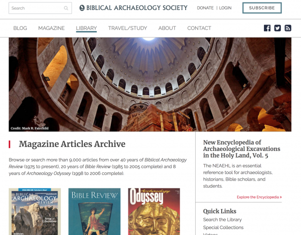
There’s nothing quite as robust, though, as the Biblical Archaeology Society’s digital magazine and library. For $29.97 per year, subscribers to their BAS Library can search over 7,000 articles from 45 years of Biblical Archaeology Review (1975 to present), 20 years of Bible Review (1985 to 2005 complete) and 8 years of Archaeology Odyssey (1998 to 2006 complete).
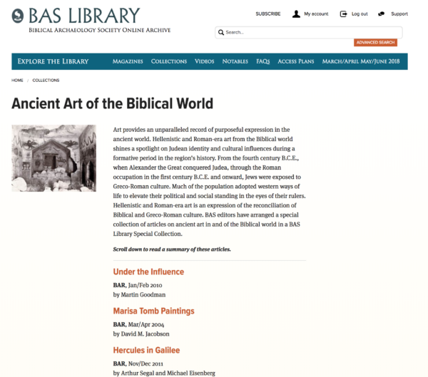
BAS does a great job at promoting their library by creating “special collections” where they break up their best content into individual pages that summarize some of their best premium content in the library. These collections are excellent navigational tools within the library and double as marketing tools where they can re-use the copy in email promotions for the content.
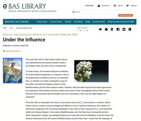
Articles within the library feature the magazine cover to the left and a clickable breadcrumb link at the top displaying the issue month and year which brings users back to the table of contents.
The library itself is indexed by year, so you can choose which year you’re looking for and it will display all the covers and all the featured articles below it in each issue.
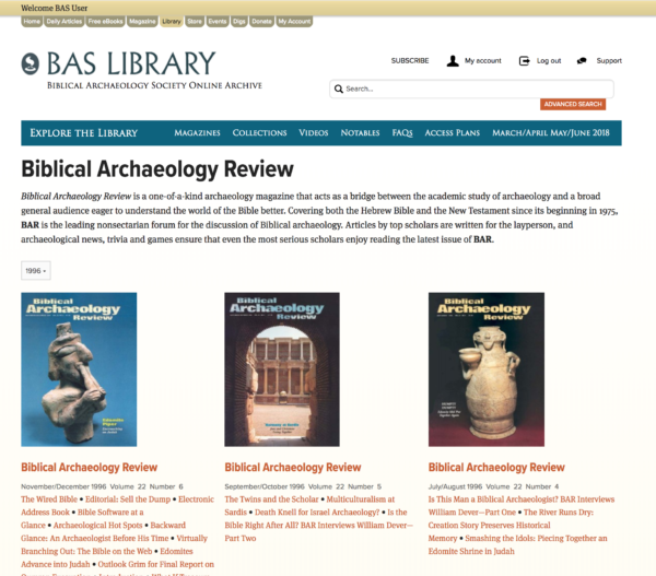
The BAS Library is a comprehensive multi-publication library that stands out for the depth of its archive, ease of reading, and also has a library of videos paired with it that is accessible to any library subscriber.
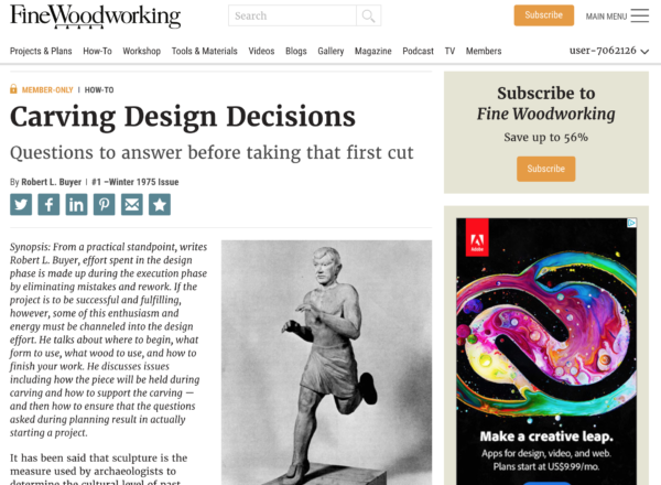
Fine Woodworking Digital Magazine Example
In a list of great digital magazine examples, we must include Fine Woodworking. We’ve worked with Taunton in the past, and still today, they follow a lot of our best practices when it comes to a web magazine and library, almost to the letter, and can even be compared to I Like Crochet above in design in many ways.
Subscribers to Fine Woodworking can either subscribe to get print issues for $34.95 or choose an all-access membership for $99 which includes digitized HTML issues going back to 1975. The articles in the archive feature 500 words of content before asking the user to download the article. Membership also includes a library of videos, over 700 project plans, and a reference of downloadable books.
New issues of their web magazine have a familiar interface with the table of contents consistently displayed in the right-rail, making it easy for the user to peruse the issue how they please.
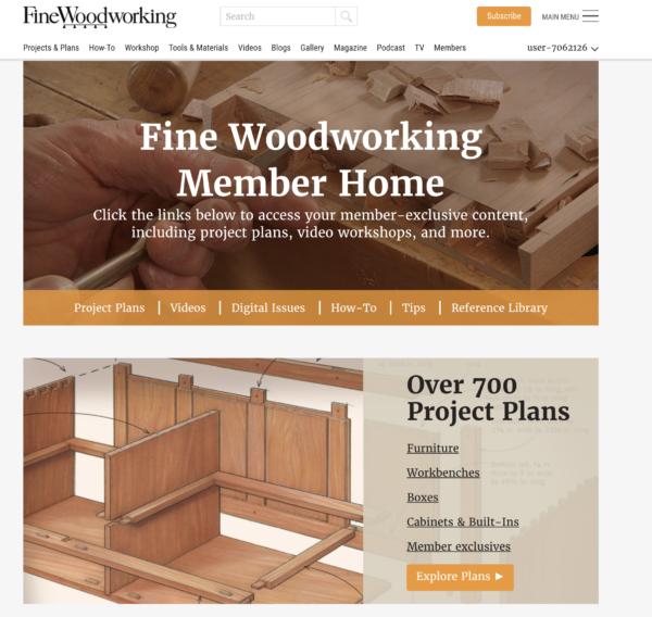
Having a web library and collections allows you to dramatically increase your promotional frequency which leads to even higher online revenues. When building your digital magazine library consider how you can make it a true resource.
We’d love to explore how our expertise can help you grow your business and leverage your audience, content, and brand to create a digital-first business strategy.
