The other morning I woke up, ate a bowl of Rice Krispies, and sat down at my laptop like I do almost every day of the week. Except, on this particular day, I opened my inbox to find more than sixty email newsletters waiting for me. We’ve all been there, right? On most mornings I’ll sift through, read a few things, and hit delete on a lot of other things.
Well on this morning, the sheer volume of distractions that kept me from getting to my most important emails triggered me to call it quits for any newsletter that A. didn’t help me do my job or B. hadn’t intrigued me enough to open for as long as I’d been subscribed. When I was done, it seemed like I’d subscribed to every daily deal newsletter from vacations to products, to service and wedding stuff.
For businesses that I still wanted to hear from, I followed them on Twitter, or “liked” them on Facebook. Or, I stayed subscribed.
The point isn’t my logic behind unsubscribing though, because we all hit the wall every once in a while, even as publishers who also send out email newsletters. Guilt only gets a brand so far in my inbox. And besides, who would want me, when I’ve strayed off the path of being a valuable customer?
The point is that in my (very calculated) procedures to unsubscribe, I came across some brilliant unsubscribe pages, even ones that got me to resubscribe.
From there, I just went on to subscribe and unsubscribe to over forty email newsletters just so that I could see their techniques. Here are two that were particularly impressive and you might even want to adapt.
1. Groupon Makes You Feel Guilty & Gets You To Resubscribe
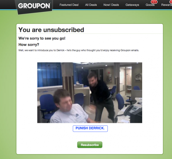
While I don’t stand behind all of their business practices or sales tactics, you can’t deny that they have a pretty hilarious unsubscribe page. On the page, Groupon blames a guy named Derrick for sending you emails. Below his image, there’s a button that says “Punish Derrick”. If you click it, a guy walks in and throws a drink at him. You can see it here.
When the skit is over, the video says:
That was pretty mean… I hope you’re happy. Want to make it up to Derrick? Resubscribe!
[text_ad]
The main reason why this is great? Even beyond the dramatic guilt trip, the resubscribe button is not used often enough on unsubscribe pages!
2. AppSumo Creeps You Out & Gets You to Follow Them Elsewhere
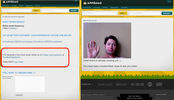
Winning the award for creepiest unsubscribe page is AppSumo and their founder Noah Kagan for this shot. Their how to unsubscribe page is complete with guilt trips too.
Before you get to the below page though, they do try to keep you on their list. They ask you to change frequency, subscribe to offers that are more relevant to you, and follow them on Twitter and Facebook. Smart.
The main reason why this is great? The photo is hilarious, but the links to get subscribers to follow them on Facebook and Twitter before they take the plunge is brilliant. And let’s see, how many editors can you get to frown in one photo?
How much effort are you putting into your unsubscribe page? Sure, you want to let people unsubscribe quickly and with ease; but clearly there are lots of ways to personalize this. Guilt tactics seem to work.
Stepping out of the publisher’s box for a moment, there are lots of untraditional marketing tactics that are easily adapted to fit your business.


Don, really, you don’t already have all the fun you can handle? Hard to believe. Amanda, great post! Thanks for doing that legwork. You’ve inspired me to unsubscribe—I mean resubscr—I mean. Oh, heck, I’ll just go read your post again.
Brilliant, practical and fun… and we all need more fun!