If you want to improve email capture rates, you have to know three things: What it is, and the many ways you can test to improve it. But it’s always helpful to see what other publishers are doing in order to get their best conversion rates, so today we’ll review all of the above, including a few test results from a top investing publisher.
Learning How to Calculate Your Email Capture Rate
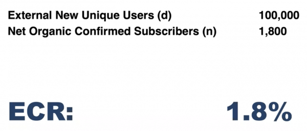
In order to improve your email capture rate, you should first know what it is. To find out, look at how many net organic email subscribers you added last month, and divide that number by the number of organic website visitors who came to your website last month (not through paid media, ads, or email). In the example below, if a publisher gets 100,000 external new unique users per month and adds 1,800 net organic confirmed email subscribers, they’d have an email capture rate of 1.8%.
[text_ad]
Determining When A/B Testing is Appropriate and When Sequential Testing Should Be Used to Improve Email Capture Rates
The most disciplined way to do a test and get the most accurate results, is through A/B testing. You take one landing page (or email, or any other ad), make two versions, and change only one thing about it, then test them at the same time, split between a 50/50 audience, to determine a statistically significant result.
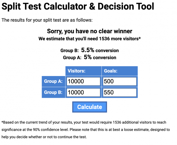
There is a tool called the Split Test Calculator & Decision Tool that will help you determine if your numbers are statistically significant, or if you need to keep the test going longer in order to get valid results.
Sequential testing is less exact—what you’re isolating is not an A and a B cohort at a single point in time, but you’re isolating the actual time. For example, you’d run a test for the month of March, and then in April, you’d change your test element and compare the months of March and April to see which test performed better. Sequential testing isn’t as accurate as A/B testing, because you’ve got the differential of time. But this can be a good alternative if your site isn’t set up from a technical standpoint to support A/B testing. There are challenges, for example, your original results could be based on seasonality that isn’t reflected in the second test.
3 Conversion Elements to Test
Testing website conversion architecture is one of the many duties we perform on behalf of our publishing partners when building and growing their niche membership websites. We also maintain a robust independent research operation that identifies and documents membership marketing best practices being implemented at mentor organizations that include more than 100 of America’s top content producers.
There are 13+ email capture elements in use across our partner websites on a regular basis, but today I’ll focus on just one partner, Cabot Wealth Network, where we tested a number of these elements, and reveal the three that perform best.
Cabot Wealth Network has been an independent source of stock investment advice for the last 50 years, and they publish a suite of investing newsletters, which I can attest are both enjoyable to read, and offer great, specific advice on investing.
When we ran the numbers on which channels collect the post email addresses, they were:
- 28.8% Rapid Conversion Landing Pages / Free Report Index Page
- 26.8% Desktop Entry Floater Ad
- 14.8% Mobile Placemat Ad
Now let’s take a look at all three.
Rapid Conversion Landing Pages / Free Report Index Page
A Rapid Conversion Landing Page is essential to building a database of free email newsletter subscribers. It, along with the Free Report Index Page act as the team that builds an email list. However, the RCLP is extra special in that its main purpose in life is to drive a ton of traffic from search in order to build your email list by giving away a free product. While you don’t always optimize sales pages for products, we almost always optimize RCLPs for search. And we don’t develop freebies without seeing if anyone is searching for the type of product we want to develop.
We do however, also optimize for maximum conversions, which means that in some cases the title of the report may take precedence over the keyword, and this is exactly the type of thing you can test on an RCLP—the title of the report. If you can win a test with a title that is also optimized, that’s the ideal scenario. However, if your more catchy title is running circles around your optimized title, go where the conversions are and come up with another SEO title to test.
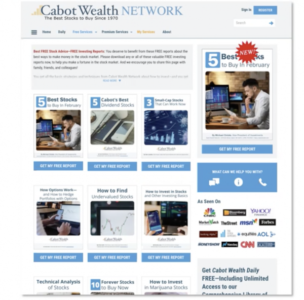
Combined with their Free Report Index Page, which links to all the RCLPs, this element drives the most conversions for them, capturing 28.8% of their total emails.
Desktop Entry Floater Ad
Desktop Entry Floater Ads, which look like pop-ups, but are designed in HTML to be Google-friendly, are subscription forms that float over a webpage, and can be triggered right away, on scroll, after a certain period, only on certain pages, and a number of other very test-worthy ways.
In the case of our partners, they offer a free download for new visitors, and if a user is logged in, they either get a Floater for a paid product, or no Floater at all. For Floaters to perform best, they should appear categorically aligned with the content. For example, on Cabot’s site, a post about marijuana stocks might show a marijuana freebie to download.
That said, we also have what are called Run-of-Site Floaters and these are ones that have proven to convert any and all users, and be general-interest enough topic-wise to be used anywhere. The example of this is Cabot’s 5 Stocks to Buy in February freebie, which you’d probably agree is a sure winner for any visitor who comes to the site looking for stocks to buy.
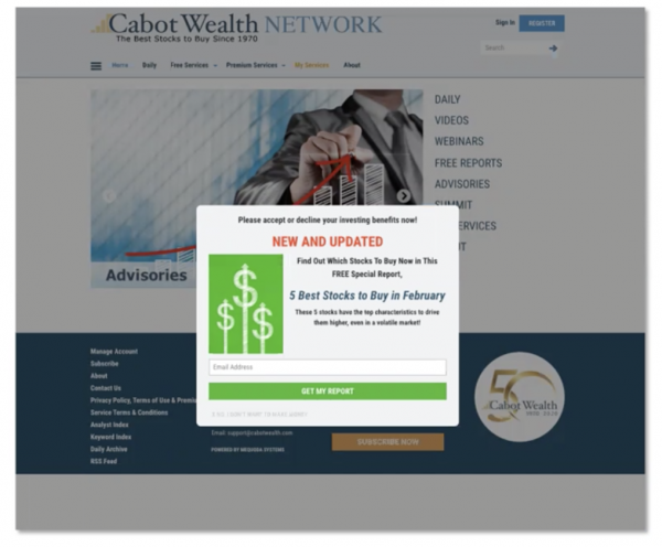
But to come to this winner, there have been many tests. We’ve tested the image, the copy, the colors, the button, event the text that allows people to close the ad. In one recent test, we tested the incentive against a totally different product—a free webinar—and found that the free report remained the winner. Offering a free webinar instead of a free report was not as compelling to site visitors.
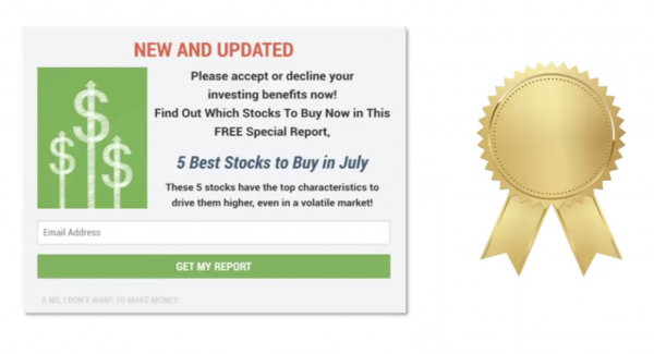
We also did a copy test where we tested the winning floater against a replica that simply added “Please accept or decline your investing benefits now” copy. That “accept or decline” copy is a top performer in Cabot’s email subject lines and so we wanted to see how it’d perform on email capture elements. And alas, it won the A/B test for the Floater, proving that you can extract a lot from your A/B tests and transfer your data to other tests and channels.
Mobile Placemat Ads
A few years ago, Google started cracking down on publishers serving floaters to mobile users. They told us that we needed to remove any pop-ups or floaters from mobile pages, or at the very least, from the first page a visitor sees. As a result, we have moved to placemat ads, a Google-friendly solution for mobile. If you haven’t implemented them yet, you should get these key conversion elements in place on mobile.
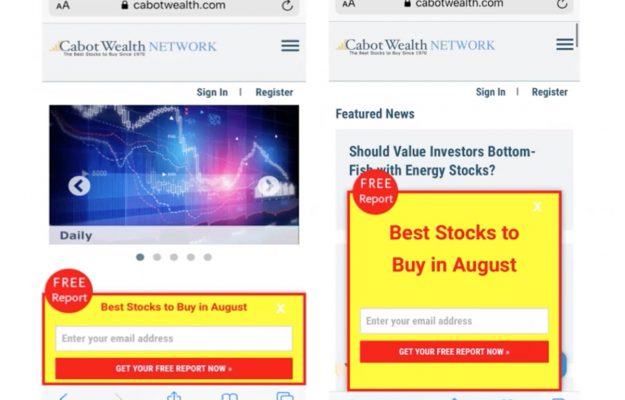
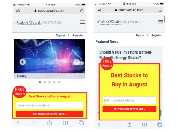
For Cabot, we tested the color scheme on a different mobile ad element called the mobile scroll floater, and much to our dismay, the yellow and red-colored test won by a large margin for conversions. So we decided to transfer that winning color combination into the mobile placement element and on other elements across the site like the top hat ad and the exit floater. On the mobile placement ad (control on left), we decided to test a taller version of the placemat ad (test on right). No surprises there, the taller mobile placemat ad won.
These three email capture elements are almost always in the top three for the publishers we work with, so if you don’t have them yet, implement them. And if you do, get testing!
Once your testing has been completed, carefully review the results of your tests. Then implement the successful tests on your site in order to improve your email capture rates.
If you have any interesting testing results to reveal, we’d love to hear how you’re improving your email capture rates.


