An easy update to email unsubscribe best practices shows how adding descriptive copy to your unsubscribe page can increase retention rates
When is the last time you looked at your unsubscribe page or researched new email unsubscribe best practices? If you have a high unsubscribe rate and your answer isn’t “recently,” it’s time you reviewed what people see when they try to unsubscribe from your email newsletter.
Take your time, I can wait.
In the worst-case scenario, you have clicked on the unsubscribe button in the footer of your email, and your unsubscribe page offers visitors a simple box, pre-filled with their email address. All they have to do is hit unsubscribe to say goodbye and leave your list. We’re not against making it easy to unsubscribe, but sometimes, when someone hits the link in their email, what they’re really saying is “I want to hear from you less.”
[text_ad]
So the next-best scenario is where you offer a link at which they can either unsubscribe or adjust their contact preferences. On this page, they are offered a list of segments they can subscribe to or unsubscribe from. This is where having a weekly newsletter comes in handy because those who would have left you forever can now decide to let you pop into their email inbox on a weekly basis.
To further improve upon this, one of our latest best practices is to increase the amount of copy on these unsubscribe pages. Meanwhile, for the clients who have started to do so, we are seeing significant decreases in their unsubscribe rates, which is improving their email retention rates.
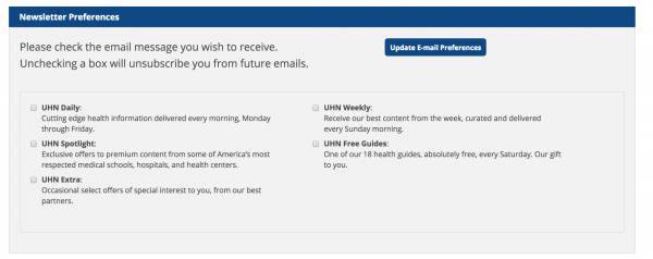
Below is an example of one such client, University Health News. The options not only explain what comes in each newsletter or spotlight but also says how frequently they will get email from each segment. Previously, only the segments were named, and there were no one-line descriptions below each one.

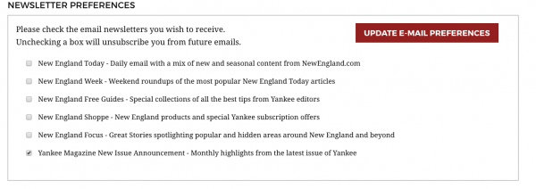
Another example from Yankee offers similar use descriptive copy and includes new issue announcements for current subscribers:

It is also important to be descriptive with the name of the segments they are subscribed to.
For example, the UHN Spotlight is pretty clear—this is a promotional email list. The same goes for New England Week—a weekly email newsletter. Without the corresponding descriptive copy, users could surely figure out what each segment is, but adding more information makes it clear, and from what we’ve seen, it makes a huge impact.
If you’d like to explore how we could double or triple your online magazine, newsletter, and membership sales through extensive testing such as the one above and Six Sigma email marketing, please schedule a free consultation with a member of our marketing services team.


