Publishers are paying more attention to social media optimization through their featured images and seeing higher reach

If you’re simply choosing stock photos from a library and using them as the featured graphics in your Facebook posts, you’re way behind the times, baby.
If there’s one thing social analytics are telling publishers, it’s that if content is king, the graphic that goes with it when promoted in social is the queen. It’s what makes people click, even if the headline is so-so.
After a few months digging deeply into social media analytics for several of our clients, I’m finding that clicks on an article improve the reach of a post even more than likes or comments. And from chatting with other social media managers, that first minute a Facebook post is up is crucial. The more clicks in gets in those first 30 to 60 seconds, the higher overall reach it will receive. In fact, some organizations have gone as far as using company chatroom app Slack to share their Facebook posts and asking employees to click the Facebook post right when it publishes. And it seems to be working.
[text_ad]
One way to improve clicks on your Facebook posts is by spending more time choosing the featured image for your articles. Many publishers are now creating custom graphics through tools like Canva and Pablo (and in-house designers) and seeing improved engagement metrics through their efforts.
Your brain processes images 60,000 times faster than text. That’s why you click on Facebook posts with great imagery before you even read the headline of the post. Maybe that’s why blog posts using images are read 94% more than posts without images. Breaking up text is always a good thing.
That must be why Facebook posts that use photographs get 53% more likes than posts without and account for 93% of the most engaging posts.
However, if you’re a publisher you know that using stock photography photos do not equal social media optimization and do not have the same effect, and may actually have the opposite. Instead, we’ve found creating custom graphics for each post can attract clicks, likes and shares in the same way.
1. Pull a quote from the article
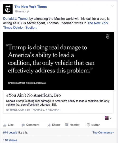
The New York Times frequently uses “quote” images to pull out a shocking or simply intriguing quote from the article. They don’t do it for every article they publish, as I’m sure readers would get used to the white on black text, however it’s in their regular rotation and appears to be performing well. If anyone at the Times is reading this, I’d love to know more about the strategy and results!
2. Use the featured graphic to accentuate the title of the article
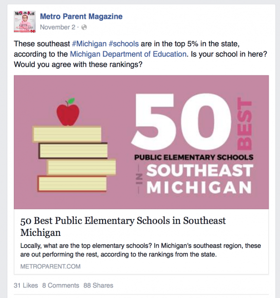
Metro Parent mixes it up also, using highly branded graphics that match brand colors and style in every graphic. Metro Parent mixes it up, using photos when they lend well to the content, but otherwise it’s all custom graphics which highlight the title of the article. In fact this post below got thousands of clicks and is one of their highest reaching posts of all time.
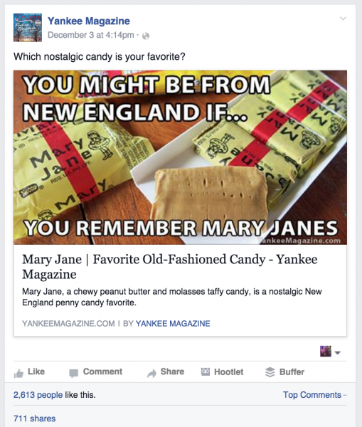
Yankee Magazine does a lot of things right with their Facebook page. They use real photos of beautiful places to draw your eye to the post while you drool over each location. Yankee is definitely one of my magazine crushes, so I could give you a handful of things they do right in social that appeal to the New Englanders they serve. I thought this example below was a fun and successful attempt at using the “meme” format. Judging by the much higher than average 300ish comments, 2600 likes and over 700 shares, it caught the attention of their readers too.
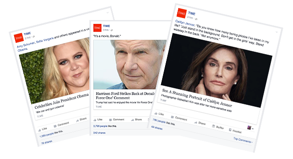
TIME rotates through images in their Facebook posts, but has a notable preference for close-up faces. According to Researcher Dr. Owen Churches, from the school of psychology at Flinders University in Adelaide, “Most of us pay more attention to faces than we do to anything else. We know experimentally that people respond differently to faces than they do to other object categories.” And according to Buffer, “on Instagram, pictures with human faces are 38 percent more likely to receive likes and 32 percent more likely to attract comments than photos with no faces.” We’re guessing this number is similar on Facebook. Fast Company is another magazine who uses this technique often, and at times almost exclusively, although not always up-close.

According to Inc, “the optimal size for post (shared) images is 1,200 x 630 pixels … will appear with a maximum width of 470 pixels in Facebook feed … and will appear on a Facebook page with a maximum width of 504 pixels.”
These graphics can be used on other social networks like Twitter, too. In fact, if you start including them as your featured image in posts, you’ll find they appear all on their own, now that Twitter added inline image previews. According to Buffer, images can increase retweet rate by up to 150%.
I think one thing to keep in mind when writing any social post is: would I click on this? Since people see images first, ask, if this image is the only thing someone sees, is it enough to warrant a click?
Now it’s your turn — what’s working for you? Let’s talk in the comments because I’m dying to know!


