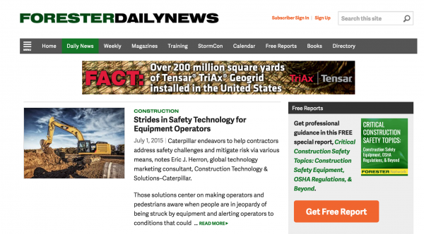
One game we used to play at every Mequoda staff meeting, was to look at some of the top publisher websites and play “find the email signup form.” People.com was always our favorite fail, because they were so big, even at that time, but we knew they could be even bigger if they attempted to build relationships with website visitors through email.
Now they have a fairly prominent email capture, although it’s still below the fold. They also weren’t so hot at telling people to subscribe to their magazine, but as you can see below, they’re doing better. And the ad paid for by their advertiser is positioned quite well among the gossip, so much that it almost blends in. We’d love to see the click stats on that to see if that’s a good thing or a bad thing.
[text_ad]
What’s a call to action?
Did the example above give you an idea of what a call to action is? A call to action, is the method you use to get someone to perform a desired task. For example, how do you get visitors to:
- Subscribe to your magazine?
- Join your email list?
- Click on ads?
- Download a free report?
- Leave a comment on articles?
- Follow you in social media?
If you want your visitors to perform these actions, then you’ll need to get together with your best copywriters and designers to develop places on your site where these goals are clearly defined, and can be measured.
For example, your email capture/conversion rate is determined by a simple ratio: the number of visitors who join your database by signing up to receive your free email newsletter during a 30-day period, divided by the number of unique visitors that come to your website during that same 30-day period.
You can also use this ratio to determine your magazine subscription capture rate, and it can be modified for all of the other actions above. Below, we’ll cover some of the best call to action examples for getting email addresses, new magazine subscribers, and clicks on your sponsored content and ads.
Email capture call to action examples
At Mequoda, email is our priority. Such a small percentage of buyers are first-time visitors, so we make it the goal of our clients, to build their email lists by developing freemiums. More on that here.
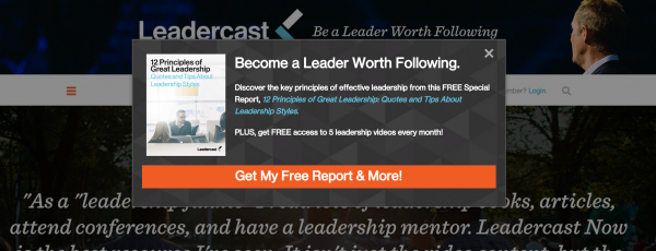
“Become a leader worth following,” says Leadercast to visitors to their website. They’ve created a free download called 12 Principles of Great Leadership: Quotes and Tips About Leadership Styles that readers can download when they subscribe to a free email newsletter.
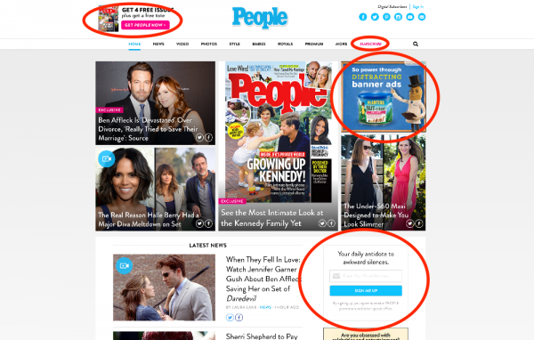
Forester Network has a hugely prominent call to action for their featured Critical Construction Safety Topics: Construction Safety Equipment, OSHA Regulations, & Beyond special report, which drives the growth of their email list.
And the place we find to be most important for a good call to action, is right within the article itself, before the article, and below the first two paragraphs of the article. That’s twice above the fold. Since most traffic on your site will arrive through an article, this is where it makes the most sense to optimize.
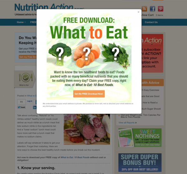
Here’s an example of Nutrition Action’s text ad, promoting their What to Eat: 10 Best Foods free download.
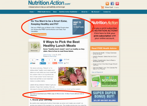
But guess what happens when a new visitor arrives? They get the triple whammy. They arrived at the site while looking for how to buy healthy lunch meats. Nutrition Action will give them that and a whole curated booklet on the best foods to buy.
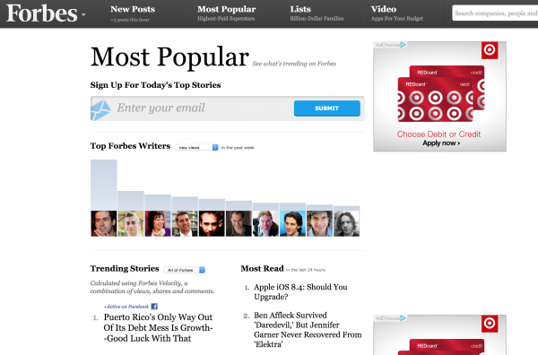
We’ll hand it to Forbes, too. They have probably the biggest call to action we’ve ever seen on a page. When you enter your email address, it must be in 24-point font or higher. It’s like they read all of our articles and said, “Take THAT, Mequoda!” (Yes, we like to think these big whigs are reading our blog daily.) This call to action is present on their homepage, below the fold, but if you click on “Most Popular” in their primary navigation bar, it shows up right at the top of that page, front and center.
Magazine subscription call to action examples
Most of the above examples were for Mequoda clients, but let’s take a look into the wilderness of other magazine publishers to gather a few good examples of magazines with great calls to action.
As mentioned, we’ve been calling out People for quite a while (only because we like them), so it’s no surprise they finally took up our unsolicited advice on using text ads. Right smack dab in the middle of their articles, you’ll find a call to subscribe to their magazines.

In fact, you’ll find they’re often contextual. YES!

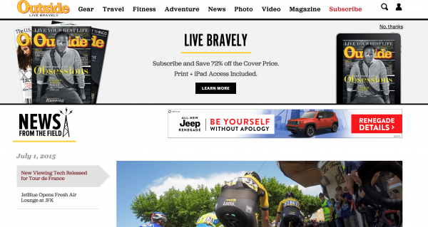
Another great example is Outside Magazine, who, like Nutrition Action and Leadercast above, are getting their results from a “pop up” of sorts. Only, Outside‘s ad doesn’t pop up. When you visit an article, from search, or just browsing around their site, after a couple seconds, their “LIVE BRAVELY” ad drops down from the top. Like a pop-up, it gets your attention. As you can see, they’re using Universal Access pricing with the digital access included, and although we’re not such fans of that pricing model anymore, we’ll hand it to them for being on their game.
Personally, I could read Outside‘s website and magazine all day, I only wish they had an online magazine, like TIME, below, because one of the best calls to action we’ve seen to gain new magazine subscribers barely looks like a call to action at all. TIME.com is now broken into three platforms, if you choose to browse that way: Latest (news stories), Magazine, and Videos.
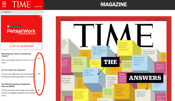
By clicking “magazine,” you’ll see a full view of their online magazine. On the left-hand side is their table of contents and there are a few free articles to get you reading. But next to TIME’s premium content, there are keys, indicating it’s for paid subscribers. If you click on any of the content, it will prompt you with a teaser snipper, and prompt you to either subscribe, or log in.
The actual best part in terms of usability and capturing an already active reader, is the reader can start at the first article, and scroll through every article in the issue. The articles are on top of one another. They could read three free articles, and then the next one is paid. If they continue to run into paid articles, eventually they may pony up the $2.99 per month. The best part? This edition is responsive and works on any device. No newsstand required.
Sponsor call to action examples
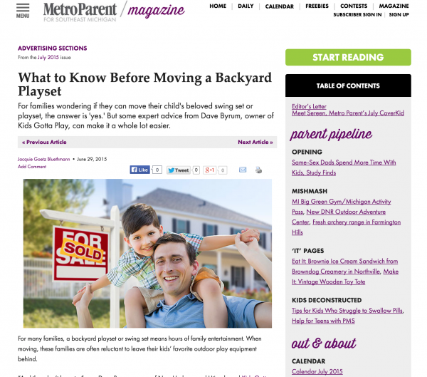
Metro Parent has an online magazine edition, too, but their magazine is free. Users do need to subscribe and log in to view their magazine content, though. To increase advertising sales, and provide a unique benefit to their subscribers, they offer advertorials. The calls to action for these native advertisements are clearly labeled as “Sponsored Content” in their table of contents, but it’s placed in front of the firewall, so, like TIME, this content is available to anyone who is browsing their online magazine. It’s the only content without a lock on it; anyone can read it.
The fact that this content isn’t behind lock and key, either behind a registration, or tucked inside a tablet app, means sponsored advertorial content can be promoted in social media and email newsletters because it’s on the web, and not contained to the box of a newsstand app, or requiring a reader to log in to view it.
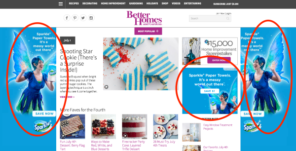
Metro Parent is certainly one of the most creative examples, but for fun, try not clicking on this advertiser’s real estate. BHG has offered up their entire background and an animated square ad. This is similar to what we call the SEA method, in that we prefer when advertisers buy up entire advertising pages, rather than random slots around the website. We recommend bundling whenever you can.
Men’s Health got the memo too.
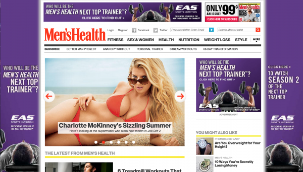
The only tragedy, is that magazine publishers usually see this as a homepage-0nly strategy. When really, you can get category sponsors. If you have 20 categories you publish in, find 20 sponsors, who are highly contextual to each category. Will you sell more toothbrushes for your advertisers on pages with articles about oral health, than on fitness articles? The answer is yes. Let Colgate buy placement on every one of your oral health articles and call it a day. You’ll sell bigger SEA sponsor packages and deliver more clicks in return.
One thing you’ll notice is that almost all of these calls to action are above the fold, no matter what type of page they’re on. We typically recommend adding calls to action at the top, in the middle, and at the bottom of every page, especially your article pages.
We’re so happy to see publishers starting to take our advice. Maybe they think they thought of it on their own, but we know! We know! Or at least we’d like to think ten years of preaching the same sermon about calls to action has made a dent. If you want people to do something, don’t hide your call to action!
What’s the best call to action you’ve seen? What’s your best performing call to action? Let me know in the comments.
