How three top publishers have designed their email newsletter headers to increase open and click-through rates
When someone signs up for your email newsletter, it’s because they like your content and they want to hear more from you. Because of this, one of the best things you can do for your email newsletter is create a well-branded header.
There are tricks to this trade, though. According to the email newsletter scorecard that we developed with email expert Jeanne Jennings, the preview pane of every email newsletter should follow these four guidelines:
- The email newsletter preview pane includes a recognizable logo (or in the case of a text newsletter, a brand or company name) in a prominent position.
- The email newsletter preview pane includes a strong, benefit-oriented headline or title to help pull readers in.
- The email newsletter preview pane includes a link to view the email online.
- The email newsletter preview pane would engage the reader and pull them in even if the images were blocked.
In order to abide by all of these guidelines, the header on your email newsletter needs to be recognizable but succinct enough to fit everything above the fold. Additionally, Jennings recommends that a table of contents is visible upon opening.
Some publishers make the mistake of over-branding by making their logos so large that the subscriber doesn’t get a chance to see what’s inside the email newsletter upon first glance. Others don’t use all of the HTML tools at their disposal to make a headline stand out and draw the user in. Even more, some publishers over-code their emails without including a link for the average user to view it on a webpage.
Let’s take a look at some well designed email newsletter headers worth modeling after:
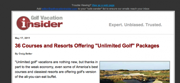
With a prominent logo, bright red font that draws the reader in regardless of whether the image shows up, a link back to the website and a great headline, Golf Vacation Insider‘s email newsletter follows all of our guidelines.
[text_ad]
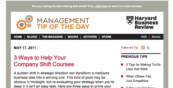
Harvard Business Review’s Management Tip of the Day email newsletter also follows our best practices by double-branding with their primary logo plus a logo for the email newsletter. Additionally, they lead with a strong, bright red headline and link back to a page where the reader can see the full email online.
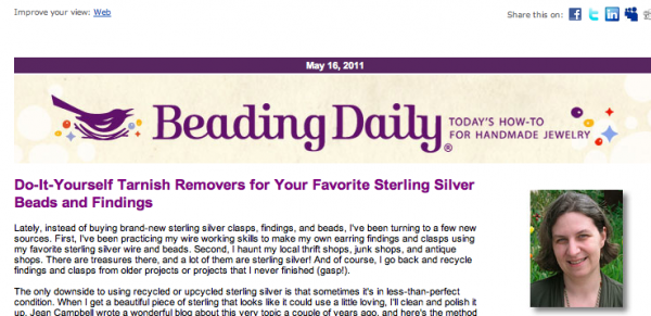
Beading Daily is also a prime example of a publisher using their header real estate wisely. A short branded header, quickly followed by a bright but readable purple headline and a link back to the email newsletter makes this memorable and usable at the same time.
The purpose of these guidelines is to increase open and click-through rates. Within the small area that someone has to decide if they want to read your email newsletter, you need to give them all the information they need to make that decision.


