 As publishers wrestle with engagement for visitors coming in from the side doors of search and social, some are focusing resources on their homepages, which the most loyal readers still use as access points.
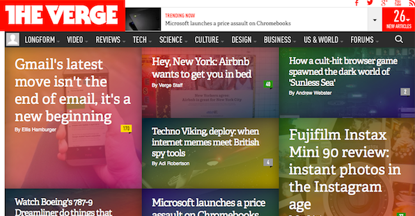
Digiday recently examined the homepages of of a handful of top publishers, including Time property Sports Illustrated, Forbes, Condé Nast’s Glamour, and Vox’s The Verge.
Sports Illustrated: More than half of SI‘s traffic comes from homepage landings, so the magazine has emphasized curating from its editors, up-to-the-minute mobile, and bold design – as with the recent LeBron James essay – to keep its readers satisfied.
Forbes: Playing up its platform leanings, Forbes ranks stories, provides more in-depth information about its contributors, and offers readers the option to register for a more personalized experience.
Glamour: “Catering to your best reader is never a bad thing,” Executive Digital Director Mike Hofman tells Digiday. “The homepage has incredible utility as the billboard for the brand and who you are and what you stand for. I think there’s an important statement the homepage makes that other pages can’t match.”
The Verge: The tech and culture site has redesigned its homepage 53 times in 2 years to find the right mix for its discerning readership. It’s straightforward, modular, and uses muted colors to make sure the quality editorial is up front.
To read more about how publishers are handling their homepage maintenance, visit Digiday.
[text_ad]


