Great email marketing for publishers requires consistency and a commitment to marketing your magazine to the people who have asked to receive your email.
We talk a lot about how to convert website visitors into subscribers when we discuss email marketing for publishers, but once someone is on your email list, what should you do with them? I’m sorry to say, there are lots of publishers out there with large lists who aren’t using them effectively. They don’t want to “sell” to their list, but the consequence is that they don’t sell to their list. And other than a number on your advertising sheet, what’s a large list worth if you’re not marketing to it?
The thing is, if someone unsubscribes from your marketing emails, that’s OK. We don’t want anyone on our lists who aren’t intending to become a customer, because maintaining a large email list can get expensive, and contrary to popular belief, publishers don’t produce content for the fun of it, you’ve got to make money, too.
[text_ad]
When it comes to email marketing for publishers, there are two important email templates we suggest: an editorial (newsletter) template and a spotlight (promotional) template. There can be several others but ultimately these are your bare minimums.
Your editorial template is sent every day you publish content and includes your top published articles from the day. We suggest at least three different types of posts per day:
News content keeps your readers up to date on current events in your industry, and also fares well in social media.
Evergreen content allows you to create new content that can be well-optimized for search and will be relevant for years.
And blockbuster content is the result of hugely successful evergreen posts that rise to the top of search engines and drive a ton of traffic every month. We republish blockbuster posts regularly to update them, re-promote them in social, and keep them at the top of search engines.
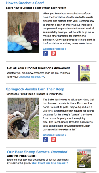
Within your editorial template, we suggest including text ads in between all of your articles that promote related products. So for example, below is an example from Countryside magazine, a farming magazine about farm life. Underneath an article about crocheting is an ad for their crocheting eBook, and then below an article about Jacob sheep is an ad for their free Sheep Guide. The alignment is on point here, and you can view the whole email here to see the full example.

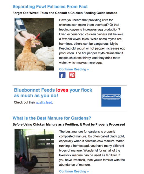
If sponsorship if part of your revenue mix like Countryside, you can also use these spots for related sponsored ads. Below is another example from the same editorial email newsletter. Sandwiched between two poultry related articles is an ad for their sponsor, Bluebonnet Feeds.

So while the ultimate goal of an editorial email newsletter is to engage readers who have subscribed, it also has revenue intentions as well. In order to give our readers the best service, we hand-pick related products for these text ads so that we’re always promoting something we believe is relevant to the reader if they are interested in the content in front of them.
The next step to nailing email marketing for publishers is getting on top of your promotional email game. Promotional emails, which we call Spotlights, can be sent 5-7 times per week. We determine what frequency makes the most sense by creating a 50/50 balance. An example of a typical week might be:
- 5 Daily Newsletters (editorial)
- 1 Week in Review (editorial)
- 1 Circulation Builder (editorial)
- 7 Spotlights (promotional)
A Spotlight email focuses on one product. The idea behind this email is that the publisher is shining a spotlight on one product instead of trying to sell a bunch of things at one time. There are plenty of benefits to featuring one item, for example:
- Creating a promotional calendar that aligns with the topics of your email newsletters
- Better conversion tracking from email because there’s only one product to track
- The ability to track different calls to action and copy and see which one performs best for a single product
- More creativity when testing specific vs. non-specific subject lines
- Easy A/B tests on copy
- Room to support your promises with customer testimonials
- Focus, focus, focus from your subscribers
A non-spotlight promotional email template reminds me of Gordon Ramsay on Kitchen Nightmares. In every episode he does three things: spits out their food, freaks out about how unorganized their cooler is and tells them to chop their restaurant menu down to only a few items.
The reason is because buyers need focus. Having 50 items on a menu only confuses and distracts restaurant guests. Cutting it down to 10 things focuses not only the guest, but also the chefs. Be responsible for only so many ingredients and dishes, and you can excel at all of them. Try to do them all, and you won’t.
The same goes for email. Throw 10 products at an email subscriber and you don’t have the space to talk about each one. The subscriber doesn’t know what to look at first, so leaves by closing the email.
But give him one thing to pay attention to, and not only do you have the ability to add more detail and “reasons why” they should buy, but the customer can quickly determine if the product is of interest and either close the email or keep reading and click through. The one-product spotlight email allows you to be more dynamic every time you send one out.
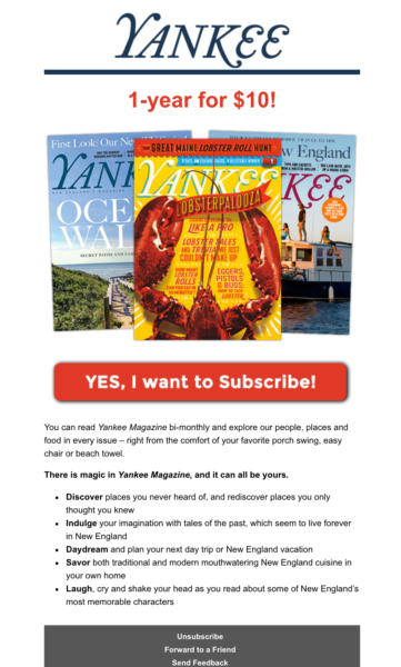
Below is a Spotlight promotion from Yankee magazine who is promoting their $10 offer for the first year of subscription. The images are bright, the offer is in bold, and there’s a big red button to convert. You can’t say a reader is distracted here in this single column design.

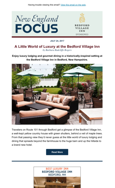
And since Yankee is sponsored, you will also find Spotlights owned by their regional advertisers, like this example of a sponsored spotlight by their local Bedford Village Inn.

If our best practices on email marketing for publishers seems overwhelming and you’re not sure how to come up with five or more promotional emails per week, consider these different template ideas, which can be used for your magazine, products, third party and sponsored promotions:
- A short one, straight to the point with a super-charged call to action.
- A long one, including bullet points about every benefit they get as a magazine subscriber, and many calls to action.
- One with video, featuring exclusive content only available to magazine subscribers.
- One with a large image above the fold that provokes the email subscriber to keep reading to the call to action.
- One that’s highly designed and has more images than text.
- One in the form of a plain-text email from the editor.
- One that polls them on their favorite content from your site (with a more subtle CTA for the magazine).
- One that includes a “once a year” offer on the rate.
- One that includes reader testimonials.
- One that includes a list of links to premium content that would be immediately available to them, if they signed up for your web edition.
- A “bonus gift” offer.
- A free trial offer.
The trial offer is last on the list, but not least! We have even more expanded ideas on the many ways you can offer trials, which we’ll be tackling in the coming weeks.
If you’re looking for guidance on email marketing for publishers and how to turn email subscribers into customers, look no further. To discuss how we can help you grow your audience, revenue and profits, schedule a free introductory conversation with Don Nicholas, our Chairman & CEO.


