This email template increases clicks and conversions
Want to increase the click-through rates on your email newsletters? I’ll give you a couple hints: the first is to start using snippets of your content, and linking back to the full-length content on your site. That’s a test we ran two years ago when we were running full content previously, and it’s a test I for one, was happy won, because it makes creating daily email templates much faster on a day to day basis.
But beyond that test, our latest email design was provoked by the need to create mobile-first email templates.
Removing the right sidebars was the first step. However, these sidebars had historically been generating revenue for publishers, so we needed to develop a template that would drive traffic to our articles, but also put featured products and/or ads front and center too.
[text_ad]
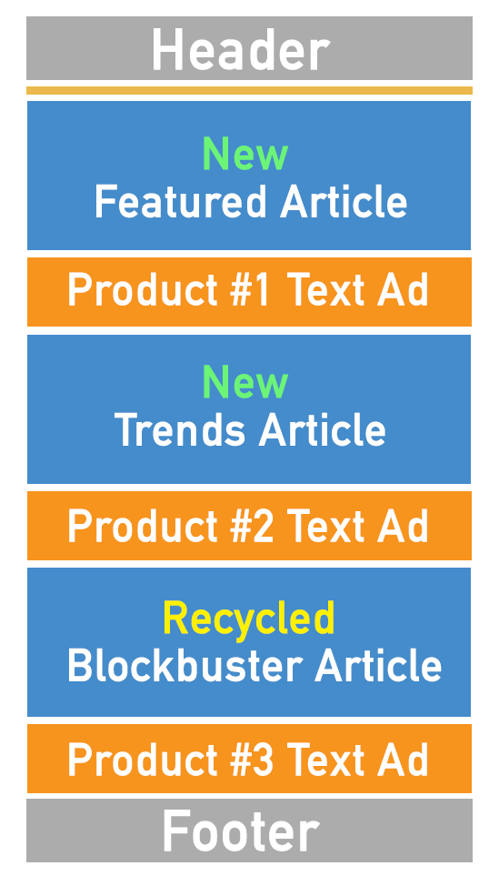
So we came up with the email stack, which stacks content and featured products like a club sandwich. The best part is that this template has consistently improved click rates and email revenue per M for the clients who have implemented them so far (keep reading to see how much).


Designing the stack email template
When we design mobile-first email newsletters, we focus on simplicity and thin width so that the content resizes easily on any size device. Apple’s gadgets are more forgiving in their automatic resizing, but a good rule of thumb is to stick at under 600 pixels to optimize for any phone or tablet. We do 580px, which will scale down well to even 300px wide on Androids and other phones.
Our emails use simple media queries, which have two breakpoints. Breakpoints are basically the point that your site’s content will “respond” – it’s when the content decides how you’re reading it, based on the screen width, and then adjusts the dimensions and readability accordingly so that the reader can digest it best.
As I’ve already mentioned, our emails are also designed as a stack, where we use one column and stack content on top of one another. This way the user can scroll down though their email from one story to the next and avoid any kind of horizontal scrolling.
In this stack you can see how the above template works in practice. We have three editorial snippets for the three articles we published that day. A featured post, a news post, and then a blockbuster post.
In between each editorial snippet, we also place an ad, either from a sponsor, or for a featured product. One Mequoda publisher who made the switch from a two-column email template to a one-column mobile-first design has seen a RPM increase of 3.6x.
And click rates increase too. At Mequoda we’ve seen click rates increase by 27% since switching to a mobile-first design. Clicks to our most important ad went up 250%.
Since mobile-first design is easier to read and digest, more of the content, including your ads, get seen.
Perfecting the text ads
The goal of any email is to increase your click rate back to your articles, and also to increase your RPM by writing more effective calls to action in your ads.
At Mequoda, we publish into four different primary categories, and we publish them over the course of four days, Monday through Thursday.
For example, on Mondays we publish Multiplatform Publishing posts from Don (plus a news post by Kim, who writes them daily.)
All of our text ads on Mondays are tailored to the theme of multiplatform publishing. And each Monday ad slot has four multiplatform publishing-themed copy variations. Let me explain.
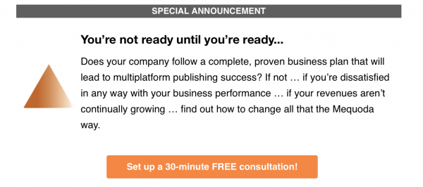
Ad#1: Business Development
Every Monday, we publish a text ad in the first position that promotes a 30-minute call with Don. On Mondays, this ad uses copy that is multiplatform publishing focused. We have four variations of this ad, so that subscribers don’t see the same ad every Monday. Over time, we measure the click rates on these ads to determine the high performers and the low performers. The low performers get swapped out for new copy.
If the product you want to sell most is your magazine, this is the position you’d want to put it in. It’s typically above the fold, and everyone who opens your email will see it.

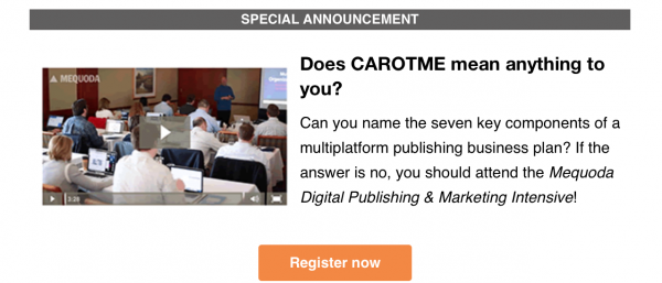
Ad#2: Mequoda Intensive
The second ad slot is for your second most important product, which could be a handbook, or even an event registration like we’ve done here. Just like the first ad, we have four variations of this ad that we rotate through over the course of four weeks.
Alternatively, your first position could be a book, especially if you can easily align paid products with the topics of your emails. The more alignment between the featured article and the featured product, the higher conversions you’ll have.

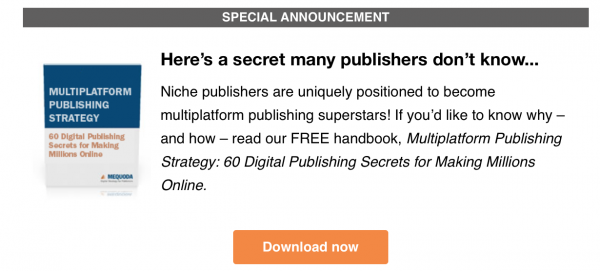
Ad #3: Free Whitepaper Download
In the third spot, we offer a free download. We put this at the end because the primary goal of our free downloads is to gain email subscribers, and anybody reading the email is already an email subscriber. With that said, we use this position just in case our readers haven’t downloaded all of our free handbooks yet, and also because they may forward our email to a colleague who has not yet subscribed. Again, this handbook has four unique text ads.

On Tuesday, we publish articles about Digital Magazine Publishing, and so the copy in our text ads speak to digital magazine publishing instead, and we have four variations of those, which we rotate through over the course of four Tuesdays.
Are you seeing some alignment trends here? That’s our whole deal here at Mequoda. Align your content with the products you promote, readers will not only find your ads more relevant but they’ll click on them more too.
Currently, we’re working on switching up graphics, and a few other tweaks. When we’re done testing these elements I’ll report back with any increases (or decreases!) in clicks and conversions.
What do you think? Will you try a content stack?


Is your email stack template available? I want to create one and looking for a template.